In visual analytics, data interaction can be as important data visualization. This tutorial is about adding interactivity to Tableau visualizations, specifically using Filters and Parameters. Filters Filters, you guessed it, let you filter data. In Tableau, they can be either static or interactive. An example of a static filter would be a condition that was set in worksheet mode to display a certain subset of the total data (eg. only.
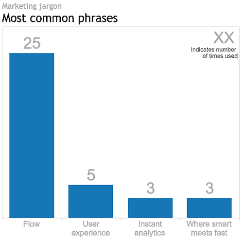
Tableau v9.0 virtual launch party overFLOWs with marketing jargon Tableau hosted an east-coast/west-coast Virtual User Group launch party to introduce their newest version, v9.0: the Flow release, as they coined it. __ First impression At the risk of sounding shallow, I expected a bit more polish from Tableau. They are a worldwide leader in the BI market and they boast impressive revenue and growth numbers. But with too much blunt.

I created this data viz course and have delivered it four or five times now. As you might imagine, I didn’t get everything right the first time (“no guff!” I hear the first cohort saying) and, as a result, the course evolved from one iteration to the next. I have learned a thing or two about teaching along the way. The students in Continuing Studies are already pretty highly motivated.
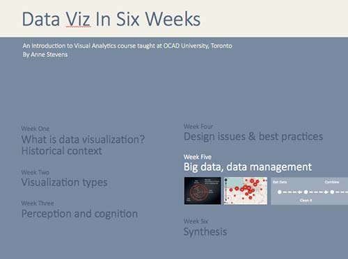
The practice of visual analytics and data visualization involves a lot more than making compelling visuals and graphics. Typically, it also involves hours of grunt work to get good data and then make it useable by whatever program you have in mind. Possibly the most pragmatic class of the course, Week 5 is about the challenges of Big Data and some pragmatic solutions. What is Big Data Big Data is.

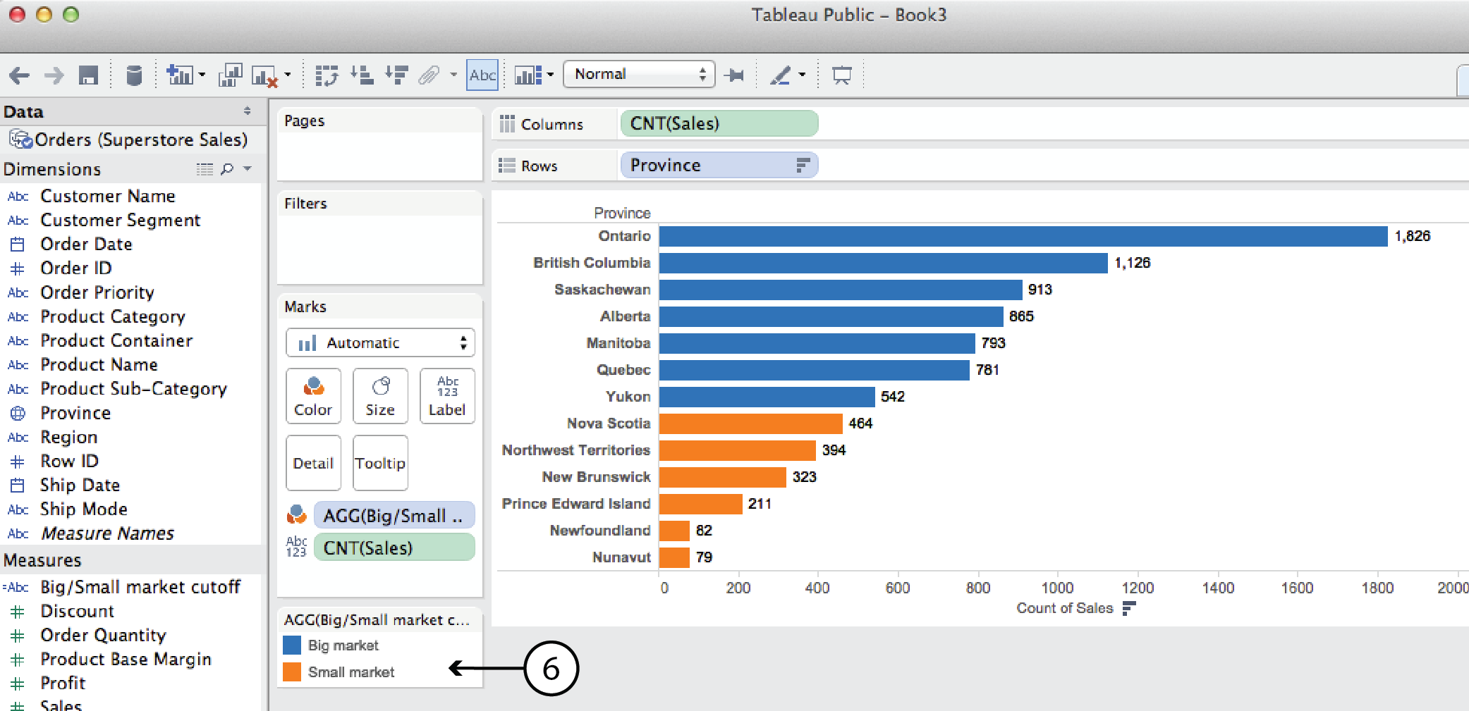
For many Tableau beginners, making high density, interactive visualizations can be a challenge. Tableau woes – Part 1 addressed this challenge with three strategies for combining data variables into a single display rather than plotting them in individual rows and columns (Tableau’s default mode, that makes direct comparison difficult to impossible): Measure Values Blending Axes Dual Axes This post will explain two more tools that can be used to add.
Naturally, Tableau Public’s Getting Started vidoes and tutorials make creating compelling visualizations look smooth and easy; as though you can simply download the program and hit the ground running. But from what I’ve seen in class (as well as my own experience), it ain’t necessaily so. Common frustration Once you connect to some data set and start placing Dimensions and Measures on Rows and Columns shelves, Tableau has a frustrating.
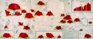
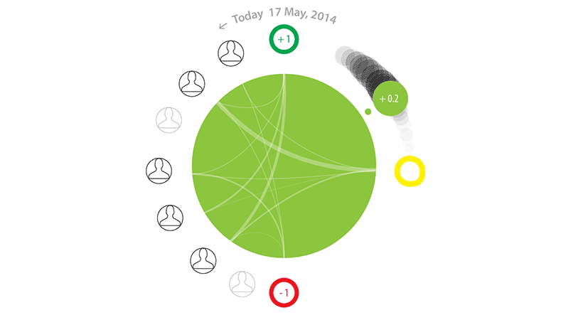
Began the class with a game of Ripping Yarns. Working in small groups, the students’ challenge was to deconstruct a data visualization whose meaning wasn’t immediately obvious – i.e. that didn’t hand them an answer on a platter – based on the visual info, hints and clues provided. Then, to construct the best story possible about what the viz meant, keeping just this side of implausibility. The result? This clockwise.
Just launched version 2 of DataViz in 6 Weeks, a blog about teaching the Introduction to Visual Analytics course at OCAD University in Toronto. First class, fall term, was disrupted by brand new classroom projector technology that worked until it didn’t, and a fire alarm evacuation that kept us huddled under an awning across the street to keep out of the rain. An hour later, we schlepped back up the.
It seems to me that cartography is a lot more comfortable with metaphor (maps as metaphors; the metaphorical use of maps) than either data viz or visual analytics are. Data Viz and metaphor So what does data visualization have to say about metaphor? Edward Tufte, with his less-is-more, no-nonsense approach to numbers, statistics and data visualization, dismisses the metaphor as a cutesy and gratuitous device and a sign of ”loose”.
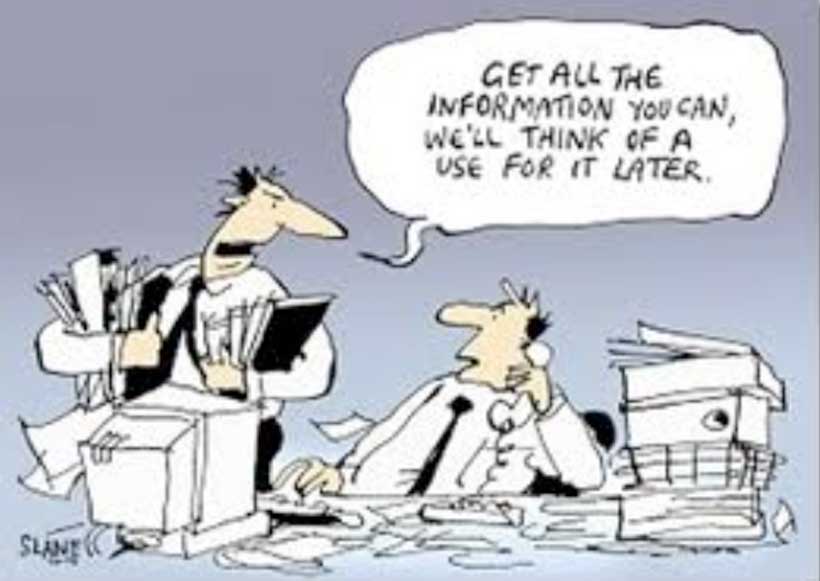
Data Data Viz isn’t just about cool visualizations; it’s also about data. This week we tackled the subject of data: Big Data, Open Data, curating data, data wrangling tools, as well as a little bit of stats. What is Big Data? I’ve always found the term Big data a bit curious because of its similarity to Big Pharma, Big Oil, Big Sugar and Big Tobacco; all largely pejorative terms that.
Last week’s topic, Perception and Cognition, dealt with perceptual processing at the level of basic visual forms: shape, size, colour, value, texture, pattern etc. However, visual design and communication are much richer and more complex than that. They involve metaphor, wit, irony, surprise, narrative, interaction, animation and both 2D and 3D form. This week’s class, and the next, addressed these kind of design issues. Interaction William Playfair’s bar chart of.

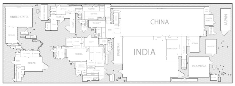
The Good, The Bad and the Ugly This week’s icebreaker was The Good, The Bad and the Ugly. Working in groups, students picked apart sometimes strong but mostly weak InfoViz examples, such as: The Shrinking Family Doctor, that uses one symbol to represent three different variables and represents the closest in time as being the furthest away in perspective. Tallying Troups, that maps quantity to colour. Pie charts whose segments.
Icebreaker: Ripping Yarns Before diving into the serious content below, the class was divided into groups and each group given an enigmatic or obscure visualization like the one below. In the absence of helpful labels, legends or other explanatory information, their challenge was to study the visualization, use their imagination, come up with their best ripping yarn to explain the meaning of the viz and then present it to the.
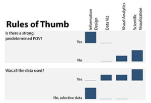
Last week, seventeen new students and I launched the new Intro to Visual Analytics course at OCAD U. We started by asking: what is visual analytics anyway? And how does it relate to data visualization and info viz – not to mention info graphics, information design and scientific visualization? Think outside the screen We looked at a range of screen and non-screen based work, comparing their input, output and context.