Data Viz in 6 Weeks. Wk 6: Metaphor: good or evil?
It seems to me that cartography is a lot more comfortable with metaphor (maps as metaphors; the metaphorical use of maps) than either data viz or visual analytics are.
Data Viz and metaphor
So what does data visualization have to say about metaphor?
Edward Tufte, with his less-is-more, no-nonsense approach to numbers, statistics and data visualization, dismisses the metaphor as a cutesy and gratuitous device and a sign of ”loose” thinking:
- Largely descriptive metaphors … don’t contribute much to the substance at hand. Such metaphors are inevitably dequantified, turning data into vague, cute shapes. — Edward Tufte
Fernanda B. Viégas and Martin Wattenberg describe metaphors as mere surface treatment:
- First, the (data) artworks must be based on actual data, rather than the metaphors or surface appearance of visualization. — Viegas and Wattenberg
I agree with Tufte that sports announcers and politicians have been known to abuse metaphors (we can’t all be so eloquent). Equally, some information designers have been known to play fast and loose with data, often disguising the facts with one form of distracting surface treatment or another, including visual metaphors. In either case, the fault lies with the speaker or the designer – not with the metaphor, so let’s not throw the metaphorical baby out with the bath water. In data viz, the role of metaphor deserves a deeper look.
Cartography and metaphor
Maps, like metaphors, are simple things that help us understand bigger and more complex things (such as the earth or the New World). Marshall McLuhan said that all media are metaphors in that they translate one thing (raw experience, data, the earth) into another form (speech, visualization, a map). But, he said, no medium is a neutral carrier of content. What one hides, another reveals. World maps flatten curved space, distorting one dimension to preserve another; maps necessarily conceal as much as they reveal. After all, a 1:1 scale map of the world would be useless. In these respects, maps and data visualizations are no different.
But more than that, we think spatially – even about non-spatial concepts (more on this below). So extending spatial and map-related metaphors to information in other domains comes naturally to us.

Metaphor and cognition
Metaphorical thinking is fundamental to cognition. According to Metaphor Theory, in the course of normal early childhood development, we internalize basic spatial metaphorical concepts such as:
- • up and down: people who are active are upright; things that are resting, sleeping, sick or dead are flat
- • big and little: babies and kittens are little. Parents, old people, big brothers and full grown cats are big – ‘cus they’re older
- • inside and outside: being inside your home, blankie, parents’ hug is safe and warm; being outside or far away is not
Subsequently, according to metaphor theory, as language skills develop, we acquire more complex conceptual concepts but they are all built on simpler metaphors. Metaphors, then, are the building blocks (another metaphor) of language and meaning.
So it is with our visual languages, including data viz. Complex visualizations evolve from simpler precedents and rely on the viewer’s familiarity with what came before. We expect our older brother to be bigger and taller than us. Similarly, we associate bigger values with bigger shapes and higher positions on a bar graph. That’s why the following visualization is so sneaky. It reverses the y-axis convention to mislead the viewer into thinking the crime rate has fallen since 2005.
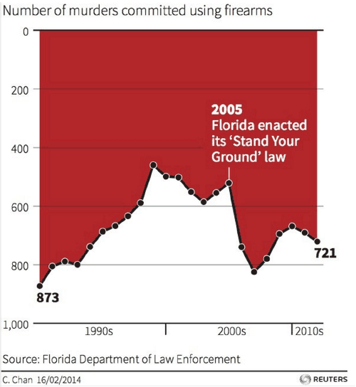
Number of murders committed using firearms: reverses y-axis convention, while using dripping blood metaphor for gory effect
In my Week 3 post, I described how our brains evolved ways to make perception highly efficient while minimizing the load on our visual working memory—so that our heads did not have to be the size of beach balls to handle all that visual processing. As I said then, I’m no psychologist, but it seems to me that we similarly rely on metaphor as a light weight carrier of meaning to reduce the overall cognitive load on our brains.
Four more reasons to pay attention to metaphor
In the interests of space and time, here, briefly, are four more reasons to study metaphor in data visualization:
- Data Viz is a visual language and like all our languages, it is richer and more meaningful thanks to the use and presence of metaphor.
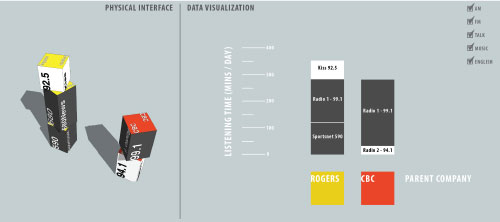
Data Blocks
- Thinking metaphorically, a designer can approach an old subject in a new way. For example, the Data Blocks project came about because I asked: what if people could play with data like playing with building blocks, or what if people could strategize about data the way they gathered around the war room table in World War II movies.

- Familiar metaphors can be used to play with the viewers’ expectation and create surprise meaning.
Modern Landform Series. Westward Spread of H5Ni (avian flu). Kim Baranowski. The trappings and conventions of a childhood scene conceal serious subject matter
- Challenging metaphors can engage viewers by making them use their imagination and problem-solving skills to make the connection necessary to complete the concept.
So are metaphors only acceptable in infoViz and graphic design? Is there no place for them in dataViz and visual analytics? You know where I stand. Please chime in.
This week’s tools
Over the course of six weeks, we have used a range of data visualization tools, starting with the more ubiquitous (Excel), and progressing through a number of more or less user-friendly and more or less open source tools (Many Eyes, Tableau, Gephi, Scrape Similar). Today we demonstrated two open source tools at the more code-savvy end of the spectrum: Processing and D3.js. Both programs let you parse data and design original visualizations entirely from scratch, thus providing more freedom than some of the pre-packaged tools.
Design charrette
As in Week 4 we played the design charrette card game, this time adding one additional category: data type (ordinal, nominal, in/formal, un/structured, qualitative, quantitative etc.).
DataViz in 6 Weeks is my blog about teaching Introduction to Visual Analytics at OCAD University in Toronto. Comments, follows and shares welcome. #DataVizInSixWeeks
Anne Stevens I am a multidisciplinary designer working in data visualization, interaction design, innovation and critical design. I am particularly interested in non-screen based physical representations of data and tangible user interfaces.