Data Viz in 6 weeks. Wk 1: Introduction to Visual Analytics
Last week, seventeen new students and I launched the new Intro to Visual Analytics course at OCAD U. We started by asking: what is visual analytics anyway? And how does it relate to data visualization and info viz – not to mention info graphics, information design and scientific visualization?
Think outside the screen
We looked at a range of screen and non-screen based work, comparing their input, output and context and sometimes asking whether they even belonged in a discussion on data visualization or visual analytics:
• David McCandless’ Left vs Right
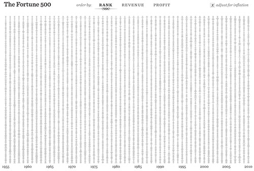
• Ben Fry’s Fortune 500
• Image analysis: Jason Salavon’s Late Night Triad
• The sublime and intangible, making the invisible visible: Immaterials: Light Painting WiFi
• Visualization tools for decision making and problem solving: Visualizing Health and the London Cholera Map
• Medical imaging: The Visible Human Project
• Data sculpture and physical visualization
Not all visualizations are created equal
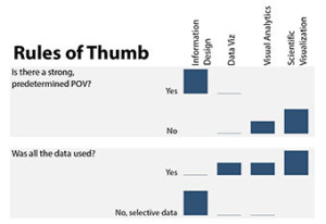
The point of all this wasn’t to arrive at a set of precise boundaries or definitions, which is impossible anyway because there is so much overlap and so little consensus. It was to identify some rules of thumb for beginning to analyse visualizations. The first issue that came up was whether the visualization included all the relevant data or just selective data; i.e data selected by the designer to send a particular message or predetermined point of view. Other rules of thumb included whether the visualization could be repeated with different or more data; whether it was interactive or there was a disconnect between the data processing and the representation; whether it was more a tool for decision making and problem solving or simply for representation; and whether we were approaching it from popular media, design or computer science?
Afterward, I tried to sum up our discussions with the following info graphic, which I made using the Excel Sparkline tool from the second half of the class.
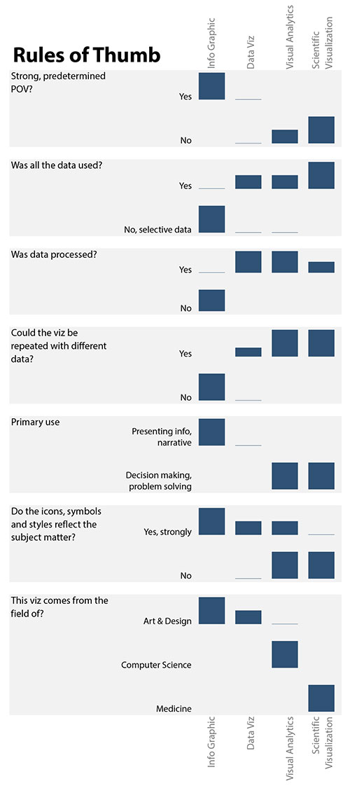
I’m pleased that it doesn’t look like your typical Excel Chart. In the process of making it, however, I discovered what I think is an inherent weakness in the tool. The sparkline is great for comparing values within any given row of data, but you can’t use it to compare values between rows. For example, if the values in one row were 1, 2, 3, 4 and the values in another row were 10, 20, 30, 40, the sparklines would be exactly the same. In other words, the highest bar in both rows would be the same height even though they represent very different magnitudes, and that is not inherently obvious. If anyone knows a workaround for this, I’m all ears.
From visualization to interaction
But maybe it’s time to think about data interaction rather than data visualization. Thanks to Enrico Bertini’s Fell in love with Data blog for planting that seed in my head. He wrote:
I must confess I am no longer satisfied with the word “visualization”. And I am even less satisfied by all the other paraphernalia people like to use: data visualization, interactive visualization, information visualization, visual analytics, infographics, etc.
All the terms that rely on the words ‘visualization’ or ‘graphics’ emphasize a one-way method of delivering meaning. But in this day and age, we don’t interact with either computers or content as though we were sitting back watching tv and having something delivered to us. Data interaction implies a different process and experience: one of probing and then re-probing a data set over time and discovering information for oneself.
We looked at Ben Fry’s Fortune 500 in class and I think it is a great example. It is interactive and it let’s you explore the data in different ways, refine your queries and come to your own multiple conclusions. It includes all the data rather than a selective set and it does not try to shove a message down your throat.
Next week: Visualization Types; Many Eyes workshop
DataViz in 6 Weeks is my blog about teaching Introduction to Visual Analytics at OCAD University in Toronto. Comments, follows and shares welcome.
Anne Stevens: I am a multidisciplinary designer working in data visualization, interaction design, innovation and critial design. I am particularly interested in non-screen based physical representations of data and tangible user interfaces.