Data Viz in 6 Weeks. Wk 5: Data
Data
Data Viz isn’t just about cool visualizations; it’s also about data. This week we tackled the subject of data: Big Data, Open Data, curating data, data wrangling tools, as well as a little bit of stats.
What is Big Data?
I’ve always found the term Big data a bit curious because of its similarity to Big Pharma, Big Oil, Big Sugar and Big Tobacco; all largely pejorative terms that refer more to the powerful super-giant corporations that dominate each industry than to the product being harvested or manufactured. Big Anything implies profit at any cost and money-no-object special interest lobbying power.
So, when big data was coined and popularized in the 1990s and the 2000s, was it a deliberate nod to those other Big industries? I’ve looked into a few histories of the term, but can’t find anything that addresses the question. Any thoughts?
- The Origins of ‘Big Data’: An Etymological Detective Story, New York Times
- A Very Short History of Big Data, Forbes Magazine
Definitions of big data typically focus on what makes the data (i.e. the product) unique rather than the corporations who have vested interests in it (despite our growing awareness of these corporations and security services). For example, Wikipedia describes big data as ”a blanket term for any collection of data sets so large and complex that it becomes difficult to process using on-hand database management tools or traditional data processing applications”.
In 2001, Gartner characterized Big Data as growing along 3 different axes — the 3 V’s — not just volume, but variety and velocity as well.
- Data volume: Yes, big data is big. We’ve all heard the stats about how more data has been collected in the last second than all of previous human history. (Okay, that’s not exactly true—yet; but it may be just a matter of time.)
- Variety: Big data comes in a wide range of forms: text, image, sound, social media, metadata, location data, transaction data or sensor data. Sources can be human or automated (i.e. things talking to things in the Internet of Things); formal or informal; structured or not. Originating from a range of sources using different units, terms, definitions, protocols, quality standards and languages, big data is messy.
- Velocity: Big data travels fast but is also very volatile. In social media, information can flow in nearly real time or suddenly go viral. As a result, data needs to be frequently updated or else become obsolete.
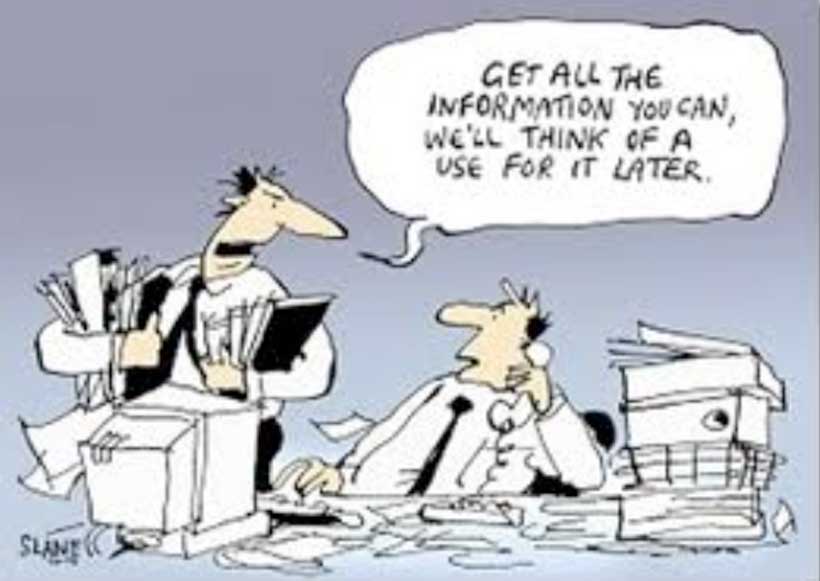
Big data – the new oil
When data becomes a commodity, then it stands to reason that the more data the better, right? Maybe not. In many cases, the challenge isn’t to make more data, but to figure out what to do with what we already have. In other words, the challenge is curation rather than creation. Curation is about finding meaning in data, storytelling and adding value to data. And, of course, this is data visualization’s mission.
Some common curation tasks involve:
- Consolidating data from different sources
- Tidying it up to make it internally consistent. For example, even if you are using two different files from the same city’s Open Data portal, you can be sure that no City bureaucrats spent any precious time making sure their department’s date formats, naming protocols or number of decimal places were consistent with those from some other department, just to make your job easier. You can expect to have to do that yourself.
- Structuring unstructured data
- Restructuring data to make it more useful for visualizations
- Editing out unnecessary data to reduce processing load on your visualization program
- Verifying accuracy of data from unfamiliar sources
- Updating and maintaing data
Maybe not the most glamourous side of data viz, but important none the less.
This week’s tools
In keeping with this week’s theme, we used the second half of the class to try our hands at a number of open source tools for wrangling and scraping data:
- XPath code in a GoogleDoc spreadsheet
- The Scrape Similar Chrome extension
- KimonoLabs, a very beta webservice for data scraping
- Google Refine, for tidying messy data
The verdict? Investing a little time to learn XPath code goes a long way, when combined with GoogleDocs and Scrape Similar. Here’s a couple of good tutorials:
- XPath: w3schools
- XPath and GoogleDocs: annielytics
Next week
Metaphor in data visualization
Processing and D3.js programming tools for custom designed data visualizations
DataViz in 6 Weeks is my blog about teaching Introduction to Visual Analytics at OCAD University in Toronto. Comments, follows and shares welcome. #DataVizInSixWeeks
Anne Stevens I am a multidisciplinary designer working in data visualization, interaction design, innovation and critical design. I am particularly interested in non-screen based physical representations of data and tangible user interfaces.