Tableau overFLOWs
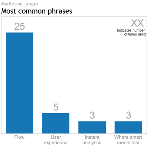
Tableau v9.0 virtual launch party overFLOWs with marketing jargon
Tableau hosted an east-coast/west-coast Virtual User Group launch party to introduce their newest version, v9.0: the Flow release, as they coined it.
__
First impression
At the risk of sounding shallow, I expected a bit more polish from Tableau. They are a worldwide leader in the BI market and they boast impressive revenue and growth numbers. But with too much blunt marketing jargon and filler the two hour production seemed a bit cheap.
I couldn’t resist counting the number of times (a) Flow, Where Smart Meets Fast, Instant Analytics and Fast Fast Fast were use, (b) improved user experience was referenced, and (c) one of the presenters repeated the mantra: “I’m so excited!!!”. Which begs the question: why wasn’t there more content for this invested and engaged Tableau user to focus on?
So just how many times was the word FLOW used in the just-less-than-two-hour event? Answer: 25. See the viz above.
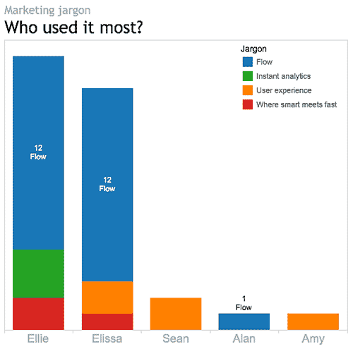
Which presenter used it the most? Answer: that depends. Ellie and Elissa each used it twelve times. So, based on the raw data, it’s a tie. However, normalizing the data reveals Elissa as the front runner, using Flow every 55 seconds on average. By comparison Ellie, who was on air much longer, only used it every 3 minutes and 50 seconds, on average. Congratulations Elissa.
__
Enough about the talking heads. Let’s get down to the new Tableau product itself. This is what v9.0 has to offer:
For the data geek
Lots and lots of geeky new stuff:
- • tools for interpeting, pivoting and tweeking Excel data. For example, Tableau 9.0 comes with a Split tool for splitting comma- or space- separated data into separate columns. This tool will eliminate the need to go back to Excel to take care of that clean up job before connecting to the data in Tableau.
- • the introduction of Level of Detail expressions (LODs), which Tableau describes as a very powerful new tool. What are LODs?, you ask. Good question. As Tableau describes it, there are many analysis questions that seem intuitive and easy to put in words, but difficult to actually execute in Tableau. For example, in my Tableau woes – Part 2 tutorial I described how you could use a Calculated Field to answer the question: how do Quebec Sales compare to National Sales? What made this simple enough question a challenge for Tableau prior to v9.0 is that it involved querying the data at two different levels of detail – the province and the country – at the same time. Before v9.0, answering these kinds of intuitive questions involved duplicate dimensions, sets, blends or table calculations, and felt a bit like workarounds. LODs give more control over how granular or aggregated the data is, regardless of the granularity or aggregation (i.e level of detail) of the actual visualization. They are supposed to make enquiry simpler, faster, more intuitive and more repeatable.
- • new data sources and/or improved connections: SAS, SPSS, R, Spark SQL, Amazon EMR, IBM Big Insights, Salesforce.com etc.
- • support for Regex expressions, if you are into that.
For the mapper
Improved usability (thank goodness!!!)
- • smoother, more Google-like pan and zoom
- • a new Geographic Search tool
- • lasso and radial selection tools that will feel more hands-on than conventional filter lists, sliders and dialogs that sit outside the actual viz. The selection tools should make for more on-the-fly map selection.
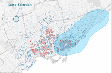
I didn’t hear anything about improved map granularity for non-US locations. However, Ellie’s map example – Edinburgh, Scotland – had postal-code/zip-code level detail, so I’m optimistic.
For the interface and usability person (and who isn’t?)
- • Those new lasso and radial selection tools will work on all visualizations, not just maps. Yay.
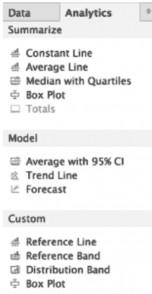
- • A second, Analytics, tab has been added to the existing Data menu on the left side of the UI (see image below). This Analytics menu will let you drag and drop multiple Trend Lines, Reference Lines etc. directly onto the viz, eliminating the need to go to pull down menus to do one thing at a time.
- • In general, v9.0 should offer more immediate feedback and analysis results while selecting, analysing and building Calculated Field expressions, for more on-the-fly exploration and iteration.
- • Type-in Pills give the analyst the option of clicking on a shelf and typing in a Measure or Dimension name, rather than dragging and dropping.
- • Faster query processing speeds, thanks to query caching, parallel queries and other mysterious under the hood improvements.
For the Tableau Public user
Apparently all the new v9.0 features will be available on Tableau Public, not just the paid versions (Server, Online and Desktop).
Tableau claims that they will be adding more profile and social features to TP so that people can use the platform more as a portfolio and blog. I hope they offer some control over who can see what. For example, I might want to publish my finished works to everyone, but hide all my drafts and preliminary versions. Or, I might want to share visualizations amongst a certain group of people – my Visual Analytics class, for example. Hopefully, that will be possible. Tableau didn’t provide this kind of detail, so it remains to be seen.
For the storyteller
Ellie mentioned formatting upgrades for Storypoints – not during her formal demo, but as more of a casual comment during her chit chat with Nate in the dying minutes of the production. She suggested these upgrades could be a sleeper hit of v9.0, but didn’t offer any additional details or images. Stay tuned.
For sales and marketing
A lot of cheese during the sales pitch part of the presentation:
- • Powerpoint slides of a competitive sailing athlete (sails/sales, geddit?) racing her heart out, but staying “in the flow”, at peak performance, one with her boat and the waves. Thus the marketing strategy is revealed.
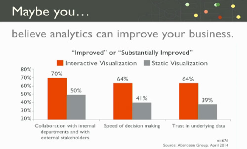
- • some very loosey-goosey bar charts to support Elissa’s notion that “maybe” “you believe” that “analytics can improve your business” and translate into improved sales (sails?). Her bar chart (below) actually addresses a different question altogether, namely, the relative value of interactive and static visualizations. For example, looking at the grey bars, only 41% of people believe that static visualizations improve the speed of decision making and, therefore, 59% of people don’t.
__
Background
I use Tableau Public and Google Refine (aka Open Refine) in my Introduction to Visual Analytics course so that the students can get up and running in a relatively short time generating multiple visualizations from real datasets. At this point in time we use Tableau Public v8.2 for Mac.
I have not personally beta tested v9.0. This blog is based solely on what I heard and saw during the Tableau Virtual User Group launch party. I look forward to using v9 after its full release and am sure that I will discover much more then. Stay tuned.
Oh, and one more thing: did I mention flow?
DataViz in 6 Weeks is my blog about teaching Introduction to Visual Analytics at OCAD University in Toronto. Comments, follows and shares welcome. #DataVizInSixWeeks
Anne Stevens
I am a multidisciplinary designer working in data visualization, interaction design and innovation. I am particularly interested in non-screen based physical representations of data and tangible user interfaces.