Data Viz in 6 weeks. Wk 4: Interaction design
Last week’s topic, Perception and Cognition, dealt with perceptual processing at the level of basic visual forms: shape, size, colour, value, texture, pattern etc. However, visual design and communication are much richer and more complex than that. They involve metaphor, wit, irony, surprise, narrative, interaction, animation and both 2D and 3D form. This week’s class, and the next, addressed these kind of design issues.
Interaction
William Playfair’s bar chart of Scottish imports and exports in 1780 was a static, black and white image intended for print. Needless to say, it had no layers, filters or information tool tips. Its bars could not be manipulated and its data was not live. It was not possible to either drill down into detail or aggregate 1780 Scottish exports with another country’s or another year’s.
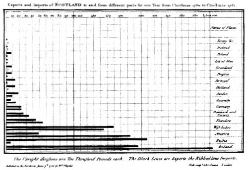
William Playfair. Scottish Exports, 1780.
As I wrote in Week One of Data Viz in 6 Weeks, data visualization today is more about interacting with data than simply representing it. Designing data visualizations, therefore, involves designing user interface and interaction as much as it involves designing the representation.
Traditional tools for data interaction include layers, filter boxes and query lists, amongst other things. They are a great start, but have some weaknesses from a usability standpoint:
- • layer and filter menus force your eye off the visualization. Sometimes query lists make you leave the visualization space entirely to make your selections.
- • as menu items are ticked on or off, the corresponding visualization changes can happen instantaneously, making them difficult to spot, especially if your eyes are still on the menu. This is made worse if the change is subtle or there are multiple views in a dashboard, making it impossible to look everywhere at once. The last thing you want is for your viewer to be checking and unchecking menu items repeatedly, just to try to spot the change in the visualization or the different dashboard windows.
By contrast, direct manipulation is a more hands-on approach to interacting with data. With direct manipulation you interact directly within the data visualization itself rather than via external or peripheral menus and filter lists.
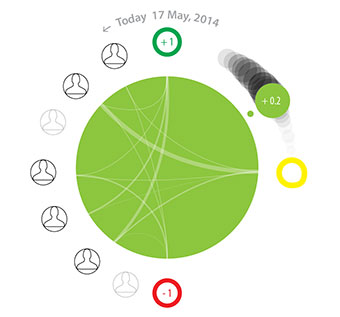
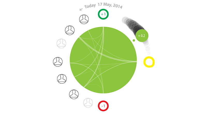
The Brava visualization, above, employs direct manipulation. The large green dot provides an overview of a patient’s condition on a green/yellow/red spectrum. A second smaller dot, the same colour as the first, provides redundant coding for users with colour blindness as well as a means of direct manipulation. First, its position between green at the top and red at the bottom corresponds to its position on the colour spectrum. Second, its number is mapped between +1.0 (green) and -1.0 (red) to reinforce the colour and provide more precision. Additionally, the small dot has a tail which fades into the background, providing context and trajectory information. Here’s where the direct manipulation comes in: the user can move the smaller dot to any point along the tail to go backwards and forwards in time and access the associated health information.
Animated transitions
Animated transitions also help the user understand changes in the data much better than instantaneous changes. Fathom Information Design’s (aka Ben Fry) Powering the Kitchen is a great example of how and why.
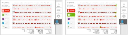
Click on Appliance View from the tabs on the right side of the screen. Then add the Range from the appliance menu on the left side and watch the energy consumption from the oven range, in green, be added to that of the fridge, in red. Being animated, it’s easy to spot, even if your eye has to move from one side of the visualization to the other.
It goes without saying that movement catches the eye. It is one of the strongest preattentive perceptual features mentioned in Week 3 of Data Viz in 6 Weeks.
Bill Buxton wrote that you need to think about designing the transistions between static states (i.e. views, web pages etc.) as you do about designing the static states themselves. The Powering the Kitchen is a great example of that principal in action.
Learning is a full body experience
Because you learn with your hands as much as your eyes and ears, this course is more than a lecture-based Data Viz ‘studies’ course. Each week, students also get their hands dirty using different open source data visualization programs. This week’s was Gephi, a network mapping tool.
Students also formed teams to played a design charrette card game. By drawing one card from each of three piles, teams randomly chose a Viz Type (eg. treemap, block histogram, small multiples etc.), a Design Feature (eg. metaphor, colour/hue, direct manipulation) and a Data Scenario (eg. pollution levels around Pearson Airport, spread of infectious diseases, Alice in Wonderland). Then they had twenty minutes to brainstorm and sketch as many data visualization ideas as possible that incorporated all three (or more). At the end of the charrette, they presented their ideas to the class to be torn to shreds (joking).
Next week
More Data viz design issues
Data scraping tools
DataViz in 6 Weeks is my blog about teaching Introduction to Visual Analytics at OCAD University in Toronto. Comments, follows and shares welcome. #DataVizInSixWeeks
Anne Stevens I am a multidisciplinary designer working in data visualization, interaction design, innovation and critical design. I am particularly interested in non-screen based physical representations of data and tangible user interfaces.