 I created this data viz course and have delivered it four or five times now. As you might imagine, I didn’t get everything right the first time (“no guff!” I hear the first cohort saying) and, as a result, the course evolved from one iteration to the next. I have learned a thing or two about teaching along the way. The students in Continuing Studies are already pretty highly motivated.]]> I created this data viz course and have delivered it four or five times now. As you might imagine, I didn’t get everything right the first time (“no guff!” I hear the first cohort saying) and, as a result, the course evolved from one iteration to the next.
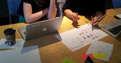
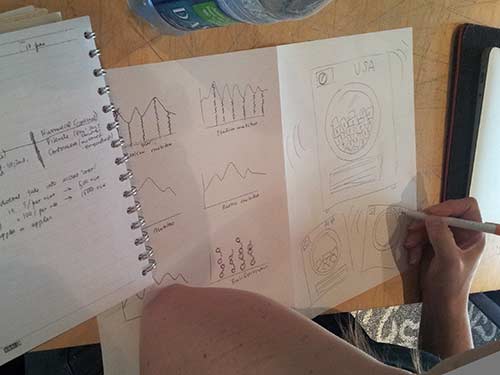
I have learned a thing or two about teaching along the way. The students in Continuing Studies are already pretty highly motivated self starters. Why else would they commit their Saturdays or Sundays to data viz school? Nevertheless, this time around I deliberately increased their deliverables and structured weekly assignments of one kind or another. Wow! Did they ever deliver. Mind blown : )
As an homage to @thisisindexed.com, I captured my biggest take-away from the class in a simple info graphic: the more you ask them to do, the more they deliver.
DataViz in 6 Weeks is my blog about teaching Introduction to Visual Analytics at OCAD University in Toronto. Comments, follows and shares welcome. #DataVizInSixWeeks
Anne Stevens
I am a multidisciplinary designer working in data visualization, interaction design and innovation. I am particularly interested in non-screen based physical representations of data and tangible user interfaces.
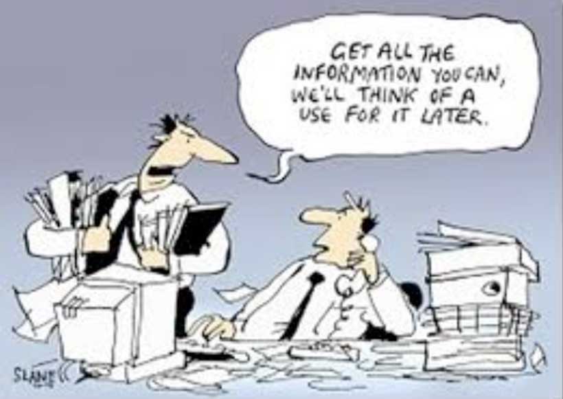
 The practice of visual analytics and data visualization involves a lot more than making compelling visuals and graphics. Typically, it also involves hours of grunt work to get good data and then make it useable by whatever program you have in mind. Possibly the most pragmatic class of the course, Week 5 is about the challenges of Big Data and some pragmatic solutions. What is Big Data Big Data is.]]> The practice of visual analytics and data visualization involves a lot more than making compelling visuals and graphics. Typically, it also involves hours of grunt work to get good data and then make it useable by whatever program you have in mind. Possibly the most pragmatic class of the course, Week 5 is about the challenges of Big Data and some pragmatic solutions.
What is Big Data
Big Data is commonly characterized by the 3 V’s: Volume, Variety, Velocity.
Challenges of Big Data
Big Data is messy and very informal
Echo Chamber effect
Volatility
Data curation process
Get some data
Clean it
Restructure it
Combine it
Explore it
Analyse and visualize it
Maintain it
Data cleaning and restructuring tools
Excel tools
Tableau Reshaper
Google Refine
Data Wrangler
Here’s the slides, in the new and improved format.
DataViz in 6 Weeks is my blog about teaching Introduction to Visual Analytics at OCAD University in Toronto. Comments, follows and shares welcome. #DataVizInSixWeeks
Anne Stevens I am a multidisciplinary designer working in data visualization, interaction design, innovation and critical design. I am particularly interested in non-screen based physical representations of data and tangible user interfaces.
]]> For many Tableau beginners, making high density, interactive visualizations can be a challenge. Tableau woes – Part 1 addressed this challenge with three strategies for combining data variables into a single display rather than plotting them in individual rows and columns (Tableau’s default mode, that makes direct comparison difficult to impossible): Measure Values Blending Axes Dual Axes This post will explain two more tools that can be used to add.]]> For many Tableau beginners, making high density, interactive visualizations can be a challenge.
Tableau woes – Part 1 addressed this challenge with three strategies for combining data variables into a single display rather than plotting them in individual rows and columns (Tableau’s default mode, that makes direct comparison difficult to impossible):
- Measure Values
- Blending Axes
- Dual Axes
This post will explain two more tools that can be used to add data density to a Tableau viz and give it a bit more interactivity.
- Create Calculated Field
- Hierarchy
As with the previous post, I’m using Tableau’s superstore sales dataset.

Where we left off in the previous post
Create Calculated Field
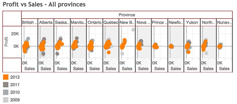
Starting where we left off in Tableau Woes – Part 1, what if you had created the viz above, but wanted to compare sales in one province, say Quebec, to national sales. If you tried to filter by province, Tableau would apply the filter all the Dimensions and Measures in the display and the end result would be a comparison of Quebec sales to Quebec sales, which is not useful.
The solution is to use Create Calculated Field. CCF is one of Tableau’s real strengths. It allows the user to create new Measures and Dimensions that were not in the original dataset, directly from inside Tableau and on the fly. With it, you can avoid having to back out of Tableau, revise the original Excel file, re-connect to Tableau and start all over again. Here’s an example:
- Again, starting where we left off in the previous blog post, go to the Analysis pull down menu and select Create Calculated Field.
- In the Calculated Field dialog box, give the CF a Name at the top, such as Quebec Sales.
- Construct a Formula in the box below. In this case, we need a classic If This Then That logic function to be applied to each row in the dataset that goes like this: if the province is Quebec, then use the Sales value, else use a value of zero. In Tableau syntax, this looks like so:
- IIF ( [Province] = ‘Quebec’, [Sales], 0)
- You could simply type the function into the Formula box, but it is better practice to double click on the actual Dimension, Measure and Function names in the lists below and let Tableau add the necessary brackets and get the exact spelling.
- After closing the CCF dialog, a new measure called Quebec Sales will appear in the Measures list, from where it can be used to build a visualization like any other Measure or Dimension. You can tell it is a CF because of the little asterisk added to the symbol to the left of the Dimension name.
- Remove Profits from the Rows shelf and move Quebec Sales there instead. Then right click on Quebec Sales and select Dual Axis. Finally, right click on the Quebec Sales axis and select Synchronize Axes. (See Tableau Woes – Part 1 for more detailed instructions re. these steps. ) Now the display shows Quebec sales in one colour and national sales in another, making comparison and analysis possible.
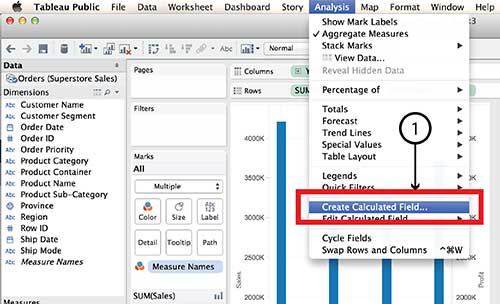


Tableau Parameters are another tool for controlling what is displayed. Parameters also make use of the Create Calculated Field function.
Hierarchy
The Hierarchy tool can also add interaction and dimensionality to a visualization, making it possible to drill down into detail or aggregate back up to bigger buckets. Here’s how it works:
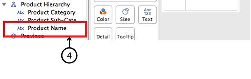
- On a new worksheet, drag Product Sub-Category on top of Product Category in the Dimensions menu.
- Give the Hierarchy a name, such as Product Hierarchy in the dialog box and click OK.
- A new Dimension called Product Hierarchy will be listed in the Dimensions menu with Product Category and Product Sub-category listed under it.
- To add Product Name simply drag it directly into the same Hierarchy.
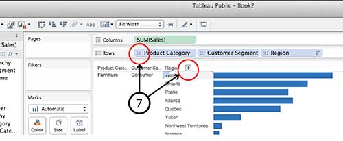
- Do the same with Customer Segment and Customer Name, and even Region and Province.
- Now the new Hierarchy pills can be dragged to the Row and Column shelves in the same way that any individual Dimension or Measure can be. For example, drag Product Hierarchy, Customer Hierarchy and Region Hierarchy to the Rows shelf and Sales to the Columns shelf and choose Horizontal Bar Graph type.
- You can drill down into any of the Hierarchy pills on the Row shelf by clicking the small Plus sign beside the pill name or the Plus symbol that appears when you hover over the Product Category, Customer Segment or Region axis lables in the visualization. Similarly, once you have drilled down a level from, say, Region to Province, you can click on the little Minus sign on the Region pill or the Minus sign on the Region axis.


It is worth noting that Hierarchy isn’t equally interactive for all viz types in dashboard view. A treemap, for example, doesn’t have any axes and I found it impossible to find a Plus or Minus sign to click. I imagine the same goes for a Bubble chart. If anyone has a solution for this problem, I’m all ears.
DataViz in 6 Weeks is my blog about teaching Introduction to Visual Analytics at OCAD University in Toronto. Comments, follows and shares welcome. #DataVizInSixWeeks
Anne Stevens I am a multidisciplinary designer working in data visualization, interaction design, innovation and critical design. I am particularly interested in non-screen based physical representations of data and tangible user interfaces.
]]> Naturally, Tableau Public’s Getting Started vidoes and tutorials make creating compelling visualizations look smooth and easy; as though you can simply download the program and hit the ground running. But from what I’ve seen in class (as well as my own experience), it ain’t necessaily so. Common frustration Once you connect to some data set and start placing Dimensions and Measures on Rows and Columns shelves, Tableau has a frustrating.]]> Naturally, Tableau Public’s Getting Started vidoes and tutorials make creating compelling visualizations look smooth and easy; as though you can simply download the program and hit the ground running. But from what I’ve seen in class (as well as my own experience), it ain’t necessaily so.
Common frustration
Once you connect to some data set and start placing Dimensions and Measures on Rows and Columns shelves, Tableau has a frustrating habit of spreading them out in individual rows and columns rather than layering them on top of each other. This creates at least three problems:
- • It is counter intuitive and makes it impossible to actually compare anything to anything else. And what are data analysis and visual analytics for, if not for comparing things?
- • The y-axis scale is different for each row, making direct comparison impossible.
- • Before long, the visualizations become unreadable because Tableau has to shrink all those rows and columns to fit on screen, as in the illustration at the top of this post.
For example, using Tableau’s superstore sales dataset, when Sales, Profit and Order quantity are dragged to the Rows shelf, the resulting line graphs are displayed in three rows, rather than all on the same graph with a common y-axis scale.

Possible solutions
In today’s class we covered a number of strategies for increasing the dimensionality of Tableau visualizations and avoiding the problem above.
Measure Values (what’s that mean and where did it come from?)
Use the Measure Values and Measure Names, two Calculated Fields that Tableau automatically generates when it connects to a data set. Think of Measure Values as being all the Measure variables grouped together.
- Instead of dragging individual Measures (i.e. variables) to the Rows shelf, drag Measure Values there.
- The Measure Values Card automatically opens, listing all the Measures.
- The visualization will look wierd until you drag the SUM(Number of Records) Measure out.
- Continue deleting any Measures you don’t want in the viz by dragging them to the side or right clicking on the Measure and selecting Remove (from the Measure Values card, not the original Measures list on the far left).
- Tableau automatically throws a Measure Names pill into the Marks Card. Think of Measure Names as being the names of all the Measures, grouped together. Drag it onto colour in order to create a colour legend.


Blending axes
Another way to do pretty much the same thing:
- Drag one Measure, such as Sales to the Rows Shelf and Order Date to the Columns Shelf.
- Instead of dragging other Measures to the Rows Shelf, drag them one at a time to the y-axis of the viz. Tableau automatically places Measure Values on the Rows Shelf and opens the Measure Values Card, creating the same end result as the example above.

Dual axes
A third way to combine variables is to create a Dual Axis viz. But this only works for a maximum of two variables.
- Drag Sales and Profit to the Rows Shelf, as before.
- Drag Order Date to the Columns Shelf, as before.
- Right click on the second pill on the Rows Shelf and choose Dual Axis from the menu. This creates a single viz with two line graphs. The Sales and Profit pills now look like they are joined together in the centre, indicating that they are Dual Axis.
- The problem is that the two y-axes are not calibrated the same. It is necessary to right click on the second y-axis and select Synchonize Axis.
- The appearance of each Measure (Sales and Profit) can be controlled from its own Marks Card. For example, selecting the SUM(Sales) Card will expand it. From there, you can select another graph type, such as Bars, from the menu.
- Drag Product Category to Colour to turn the Sales Bars into Stacked Bars.


Perception and cognition
The theory part of the class covered concepts of perception and cognition, and how they inform basic visualization design decisions. You can read about it here.
Here’s the Week Three – Perception & cognition slides.
DataViz in 6 Weeks is my blog about teaching Introduction to Visual Analytics at OCAD University in Toronto. Comments, follows and shares welcome. #DataVizInSixWeeks
Anne Stevens I am a multidisciplinary designer working in data visualization, interaction design, innovation and critical design. I am particularly interested in non-screen based physical representations of data and tangible user interfaces.
]]> Began the class with a game of Ripping Yarns. Working in small groups, the students’ challenge was to deconstruct a data visualization whose meaning wasn’t immediately obvious – i.e. that didn’t hand them an answer on a platter – based on the visual info, hints and clues provided. Then, to construct the best story possible about what the viz meant, keeping just this side of implausibility. The result? This clockwise.]]> Began the class with a game of Ripping Yarns. Working in small groups, the students’ challenge was to deconstruct a data visualization whose meaning wasn’t immediately obvious – i.e. that didn’t hand them an answer on a platter – based on the visual info, hints and clues provided. Then, to construct the best story possible about what the viz meant, keeping just this side of implausibility.
The result? This clockwise visualization, above, represents Battlestar Galactica expenditures before and after the invasion by the Cylons (?)*
Not surprisingly, the author’s intended meaning was different: a comparison of US departmental budgets relative media coverage in 2009. It had nothing to do with flows of either money or time. Can’t blame students for reading either relationship into it the viz, though.
This lesson led right into Week Two’s subject matter: a survey of visualization types and a discussion of their strengths, weaknesses, implications and data-suitability.
Here’s the Week Two slides.
* If I didn’t capture the BG storyline and references accurately, the students can correct me or elaborate, as they see fit.
#DataVizInSixWeeks is my blog about teaching Introduction to Visual Analytics at OCAD University in Toronto. Comments, follows and shares welcome.
Anne Stevens I am a multidisciplinary designer working in data visualization, interaction design, innovation and critical design. I am particularly interested in non-screen based physical representations of data and tangible user interfaces.
]]> Just launched version 2 of DataViz in 6 Weeks, a blog about teaching the Introduction to Visual Analytics course at OCAD University in Toronto. First class, fall term, was disrupted by brand new classroom projector technology that worked until it didn’t, and a fire alarm evacuation that kept us huddled under an awning across the street to keep out of the rain. An hour later, we schlepped back up the.]]> Just launched version 2 of DataViz in 6 Weeks, a blog about teaching the Introduction to Visual Analytics course at OCAD University in Toronto.
First class, fall term, was disrupted by brand new classroom projector technology that worked until it didn’t, and a fire alarm evacuation that kept us huddled under an awning across the street to keep out of the rain. An hour later, we schlepped back up the stairs to the top floor. Computer restarted and, surprise, it still couldn’t connect to the projector. Kudos to the class for being good sports and gathering around my laptop for a small screen presentation about putting data visualization in context. In the half light classroom, it felt a bit like telling stories around a glowing camp fire.
- Historical Context: the emergence of statistical graphics in the 18th c, the ‘Golden Age’ in the 19th c, the dark ages and then a kind of renaissance and explosion in the 20th.
- Disciplinary Context: Not all visualizations are created equal. What, then, is the difference between infoViz, dataViz, visual analytics, data analytics and scientific/medical visualization? And what about non-screen based stuff like data sculpture and physical viz?
Thanks to Michael Friendly’s The Golden Age of Statistical Graphics for a great survey of the Golden Age of statistical graphics, and his Milestones of data viz website.
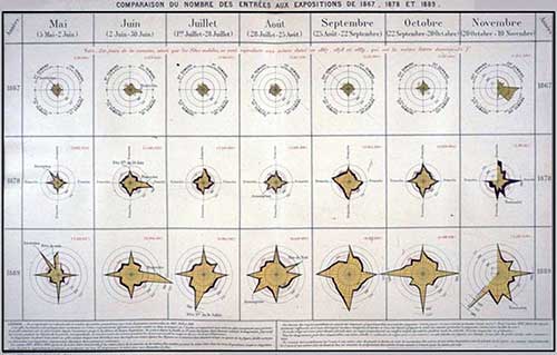
Two way star radial
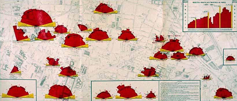
Polar radial viz of theatre audiences in Paris
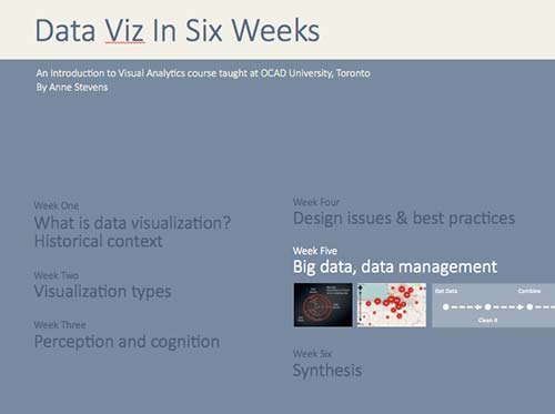
Here’s the Week One slides.
DataViz in 6 Weeks is my blog about teaching Introduction to Visual Analytics at OCAD University in Toronto. Comments, follows and shares welcome. #DataVizInSixWeeks
Anne Stevens I am a multidisciplinary designer working in data visualization, interaction design, innovation and critical design. I am particularly interested in non-screen based physical representations of data and tangible user interfaces.
]]> It seems to me that cartography is a lot more comfortable with metaphor (maps as metaphors; the metaphorical use of maps) than either data viz or visual analytics are. Data Viz and metaphor So what does data visualization have to say about metaphor? Edward Tufte, with his less-is-more, no-nonsense approach to numbers, statistics and data visualization, dismisses the metaphor as a cutesy and gratuitous device and a sign of ”loose”.]]> It seems to me that cartography is a lot more comfortable with metaphor (maps as metaphors; the metaphorical use of maps) than either data viz or visual analytics are.
Data Viz and metaphor
So what does data visualization have to say about metaphor?
Edward Tufte, with his less-is-more, no-nonsense approach to numbers, statistics and data visualization, dismisses the metaphor as a cutesy and gratuitous device and a sign of ”loose” thinking:
- Largely descriptive metaphors … don’t contribute much to the substance at hand. Such metaphors are inevitably dequantified, turning data into vague, cute shapes. — Edward Tufte
Fernanda B. Viégas and Martin Wattenberg describe metaphors as mere surface treatment:
- First, the (data) artworks must be based on actual data, rather than the metaphors or surface appearance of visualization. — Viegas and Wattenberg
I agree with Tufte that sports announcers and politicians have been known to abuse metaphors (we can’t all be so eloquent). Equally, some information designers have been known to play fast and loose with data, often disguising the facts with one form of distracting surface treatment or another, including visual metaphors. In either case, the fault lies with the speaker or the designer – not with the metaphor, so let’s not throw the metaphorical baby out with the bath water. In data viz, the role of metaphor deserves a deeper look.
Cartography and metaphor
Maps, like metaphors, are simple things that help us understand bigger and more complex things (such as the earth or the New World). Marshall McLuhan said that all media are metaphors in that they translate one thing (raw experience, data, the earth) into another form (speech, visualization, a map). But, he said, no medium is a neutral carrier of content. What one hides, another reveals. World maps flatten curved space, distorting one dimension to preserve another; maps necessarily conceal as much as they reveal. After all, a 1:1 scale map of the world would be useless. In these respects, maps and data visualizations are no different.
But more than that, we think spatially – even about non-spatial concepts (more on this below). So extending spatial and map-related metaphors to information in other domains comes naturally to us.
Metaphor and cognition
Metaphorical thinking is fundamental to cognition. According to Metaphor Theory, in the course of normal early childhood development, we internalize basic spatial metaphorical concepts such as:
- • up and down: people who are active are upright; things that are resting, sleeping, sick or dead are flat
- • big and little: babies and kittens are little. Parents, old people, big brothers and full grown cats are big – ‘cus they’re older
- • inside and outside: being inside your home, blankie, parents’ hug is safe and warm; being outside or far away is not
Subsequently, according to metaphor theory, as language skills develop, we acquire more complex conceptual concepts but they are all built on simpler metaphors. Metaphors, then, are the building blocks (another metaphor) of language and meaning.
So it is with our visual languages, including data viz. Complex visualizations evolve from simpler precedents and rely on the viewer’s familiarity with what came before. We expect our older brother to be bigger and taller than us. Similarly, we associate bigger values with bigger shapes and higher positions on a bar graph. That’s why the following visualization is so sneaky. It reverses the y-axis convention to mislead the viewer into thinking the crime rate has fallen since 2005.
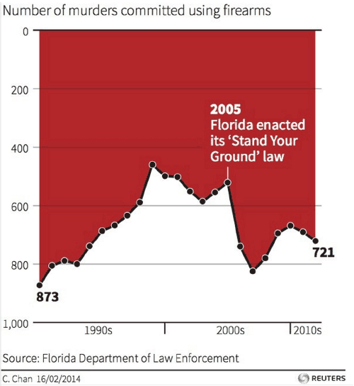
Number of murders committed using firearms: reverses y-axis convention, while using dripping blood metaphor for gory effect
In my Week 3 post, I described how our brains evolved ways to make perception highly efficient while minimizing the load on our visual working memory—so that our heads did not have to be the size of beach balls to handle all that visual processing. As I said then, I’m no psychologist, but it seems to me that we similarly rely on metaphor as a light weight carrier of meaning to reduce the overall cognitive load on our brains.
Four more reasons to pay attention to metaphor
In the interests of space and time, here, briefly, are four more reasons to study metaphor in data visualization:
- Data Viz is a visual language and like all our languages, it is richer and more meaningful thanks to the use and presence of metaphor.
Data Blocks
- Thinking metaphorically, a designer can approach an old subject in a new way. For example, the Data Blocks project came about because I asked: what if people could play with data like playing with building blocks, or what if people could strategize about data the way they gathered around the war room table in World War II movies.

- Familiar metaphors can be used to play with the viewers’ expectation and create surprise meaning.
Modern Landform Series. Westward Spread of H5Ni (avian flu). Kim Baranowski. The trappings and conventions of a childhood scene conceal serious subject matter
- Challenging metaphors can engage viewers by making them use their imagination and problem-solving skills to make the connection necessary to complete the concept.
So are metaphors only acceptable in infoViz and graphic design? Is there no place for them in dataViz and visual analytics? You know where I stand. Please chime in.
This week’s tools
Over the course of six weeks, we have used a range of data visualization tools, starting with the more ubiquitous (Excel), and progressing through a number of more or less user-friendly and more or less open source tools (Many Eyes, Tableau, Gephi, Scrape Similar). Today we demonstrated two open source tools at the more code-savvy end of the spectrum: Processing and D3.js. Both programs let you parse data and design original visualizations entirely from scratch, thus providing more freedom than some of the pre-packaged tools.
Design charrette
As in Week 4 we played the design charrette card game, this time adding one additional category: data type (ordinal, nominal, in/formal, un/structured, qualitative, quantitative etc.).
DataViz in 6 Weeks is my blog about teaching Introduction to Visual Analytics at OCAD University in Toronto. Comments, follows and shares welcome. #DataVizInSixWeeks
Anne Stevens I am a multidisciplinary designer working in data visualization, interaction design, innovation and critical design. I am particularly interested in non-screen based physical representations of data and tangible user interfaces.
]]> Data Data Viz isn’t just about cool visualizations; it’s also about data. This week we tackled the subject of data: Big Data, Open Data, curating data, data wrangling tools, as well as a little bit of stats. What is Big Data? I’ve always found the term Big data a bit curious because of its similarity to Big Pharma, Big Oil, Big Sugar and Big Tobacco; all largely pejorative terms that.]]> Data
Data Viz isn’t just about cool visualizations; it’s also about data. This week we tackled the subject of data: Big Data, Open Data, curating data, data wrangling tools, as well as a little bit of stats.
What is Big Data?
I’ve always found the term Big data a bit curious because of its similarity to Big Pharma, Big Oil, Big Sugar and Big Tobacco; all largely pejorative terms that refer more to the powerful super-giant corporations that dominate each industry than to the product being harvested or manufactured. Big Anything implies profit at any cost and money-no-object special interest lobbying power.
So, when big data was coined and popularized in the 1990s and the 2000s, was it a deliberate nod to those other Big industries? I’ve looked into a few histories of the term, but can’t find anything that addresses the question. Any thoughts?
- The Origins of ‘Big Data’: An Etymological Detective Story, New York Times
- A Very Short History of Big Data, Forbes Magazine
Definitions of big data typically focus on what makes the data (i.e. the product) unique rather than the corporations who have vested interests in it (despite our growing awareness of these corporations and security services). For example, Wikipedia describes big data as ”a blanket term for any collection of data sets so large and complex that it becomes difficult to process using on-hand database management tools or traditional data processing applications”.
In 2001, Gartner characterized Big Data as growing along 3 different axes — the 3 V’s — not just volume, but variety and velocity as well.
- Data volume: Yes, big data is big. We’ve all heard the stats about how more data has been collected in the last second than all of previous human history. (Okay, that’s not exactly true—yet; but it may be just a matter of time.)
- Variety: Big data comes in a wide range of forms: text, image, sound, social media, metadata, location data, transaction data or sensor data. Sources can be human or automated (i.e. things talking to things in the Internet of Things); formal or informal; structured or not. Originating from a range of sources using different units, terms, definitions, protocols, quality standards and languages, big data is messy.
- Velocity: Big data travels fast but is also very volatile. In social media, information can flow in nearly real time or suddenly go viral. As a result, data needs to be frequently updated or else become obsolete.
Big data – the new oil
When data becomes a commodity, then it stands to reason that the more data the better, right? Maybe not. In many cases, the challenge isn’t to make more data, but to figure out what to do with what we already have. In other words, the challenge is curation rather than creation. Curation is about finding meaning in data, storytelling and adding value to data. And, of course, this is data visualization’s mission.
Some common curation tasks involve:
- Consolidating data from different sources
- Tidying it up to make it internally consistent. For example, even if you are using two different files from the same city’s Open Data portal, you can be sure that no City bureaucrats spent any precious time making sure their department’s date formats, naming protocols or number of decimal places were consistent with those from some other department, just to make your job easier. You can expect to have to do that yourself.
- Structuring unstructured data
- Restructuring data to make it more useful for visualizations
- Editing out unnecessary data to reduce processing load on your visualization program
- Verifying accuracy of data from unfamiliar sources
- Updating and maintaing data
Maybe not the most glamourous side of data viz, but important none the less.
This week’s tools
In keeping with this week’s theme, we used the second half of the class to try our hands at a number of open source tools for wrangling and scraping data:
- XPath code in a GoogleDoc spreadsheet
- The Scrape Similar Chrome extension
- KimonoLabs, a very beta webservice for data scraping
- Google Refine, for tidying messy data
The verdict? Investing a little time to learn XPath code goes a long way, when combined with GoogleDocs and Scrape Similar. Here’s a couple of good tutorials:
- XPath: w3schools
- XPath and GoogleDocs: annielytics
Next week
Metaphor in data visualization
Processing and D3.js programming tools for custom designed data visualizations
DataViz in 6 Weeks is my blog about teaching Introduction to Visual Analytics at OCAD University in Toronto. Comments, follows and shares welcome. #DataVizInSixWeeks
Anne Stevens I am a multidisciplinary designer working in data visualization, interaction design, innovation and critical design. I am particularly interested in non-screen based physical representations of data and tangible user interfaces.
]]> Last week’s topic, Perception and Cognition, dealt with perceptual processing at the level of basic visual forms: shape, size, colour, value, texture, pattern etc. However, visual design and communication are much richer and more complex than that. They involve metaphor, wit, irony, surprise, narrative, interaction, animation and both 2D and 3D form. This week’s class, and the next, addressed these kind of design issues. Interaction William Playfair’s bar chart of.]]> Last week’s topic, Perception and Cognition, dealt with perceptual processing at the level of basic visual forms: shape, size, colour, value, texture, pattern etc. However, visual design and communication are much richer and more complex than that. They involve metaphor, wit, irony, surprise, narrative, interaction, animation and both 2D and 3D form. This week’s class, and the next, addressed these kind of design issues.
Interaction
William Playfair’s bar chart of Scottish imports and exports in 1780 was a static, black and white image intended for print. Needless to say, it had no layers, filters or information tool tips. Its bars could not be manipulated and its data was not live. It was not possible to either drill down into detail or aggregate 1780 Scottish exports with another country’s or another year’s.
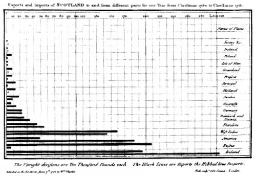
William Playfair. Scottish Exports, 1780.
As I wrote in Week One of Data Viz in 6 Weeks, data visualization today is more about interacting with data than simply representing it. Designing data visualizations, therefore, involves designing user interface and interaction as much as it involves designing the representation.
Traditional tools for data interaction include layers, filter boxes and query lists, amongst other things. They are a great start, but have some weaknesses from a usability standpoint:
- • layer and filter menus force your eye off the visualization. Sometimes query lists make you leave the visualization space entirely to make your selections.
- • as menu items are ticked on or off, the corresponding visualization changes can happen instantaneously, making them difficult to spot, especially if your eyes are still on the menu. This is made worse if the change is subtle or there are multiple views in a dashboard, making it impossible to look everywhere at once. The last thing you want is for your viewer to be checking and unchecking menu items repeatedly, just to try to spot the change in the visualization or the different dashboard windows.
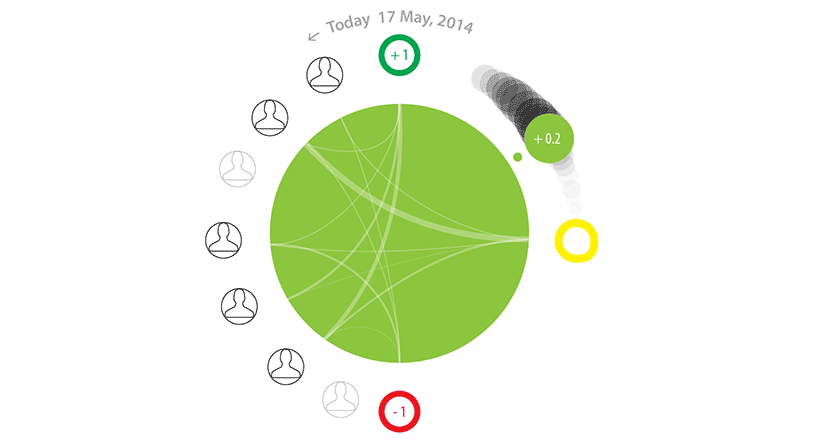
By contrast, direct manipulation is a more hands-on approach to interacting with data. With direct manipulation you interact directly within the data visualization itself rather than via external or peripheral menus and filter lists.
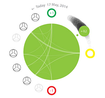
The Brava visualization, above, employs direct manipulation. The large green dot provides an overview of a patient’s condition on a green/yellow/red spectrum. A second smaller dot, the same colour as the first, provides redundant coding for users with colour blindness as well as a means of direct manipulation. First, its position between green at the top and red at the bottom corresponds to its position on the colour spectrum. Second, its number is mapped between +1.0 (green) and -1.0 (red) to reinforce the colour and provide more precision. Additionally, the small dot has a tail which fades into the background, providing context and trajectory information. Here’s where the direct manipulation comes in: the user can move the smaller dot to any point along the tail to go backwards and forwards in time and access the associated health information.
Animated transitions
Animated transitions also help the user understand changes in the data much better than instantaneous changes. Fathom Information Design’s (aka Ben Fry) Powering the Kitchen is a great example of how and why.
Click on Appliance View from the tabs on the right side of the screen. Then add the Range from the appliance menu on the left side and watch the energy consumption from the oven range, in green, be added to that of the fridge, in red. Being animated, it’s easy to spot, even if your eye has to move from one side of the visualization to the other.
It goes without saying that movement catches the eye. It is one of the strongest preattentive perceptual features mentioned in Week 3 of Data Viz in 6 Weeks.
Bill Buxton wrote that you need to think about designing the transistions between static states (i.e. views, web pages etc.) as you do about designing the static states themselves. The Powering the Kitchen is a great example of that principal in action.
Learning is a full body experience
Because you learn with your hands as much as your eyes and ears, this course is more than a lecture-based Data Viz ‘studies’ course. Each week, students also get their hands dirty using different open source data visualization programs. This week’s was Gephi, a network mapping tool.
Students also formed teams to played a design charrette card game. By drawing one card from each of three piles, teams randomly chose a Viz Type (eg. treemap, block histogram, small multiples etc.), a Design Feature (eg. metaphor, colour/hue, direct manipulation) and a Data Scenario (eg. pollution levels around Pearson Airport, spread of infectious diseases, Alice in Wonderland). Then they had twenty minutes to brainstorm and sketch as many data visualization ideas as possible that incorporated all three (or more). At the end of the charrette, they presented their ideas to the class to be torn to shreds (joking).
Next week
More Data viz design issues
Data scraping tools
DataViz in 6 Weeks is my blog about teaching Introduction to Visual Analytics at OCAD University in Toronto. Comments, follows and shares welcome. #DataVizInSixWeeks
Anne Stevens I am a multidisciplinary designer working in data visualization, interaction design, innovation and critical design. I am particularly interested in non-screen based physical representations of data and tangible user interfaces.
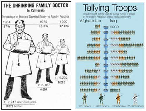
]]> The Good, The Bad and the Ugly This week’s icebreaker was The Good, The Bad and the Ugly. Working in groups, students picked apart sometimes strong but mostly weak InfoViz examples, such as: The Shrinking Family Doctor, that uses one symbol to represent three different variables and represents the closest in time as being the furthest away in perspective. Tallying Troups, that maps quantity to colour. Pie charts whose segments.]]> The Good, The Bad and the Ugly
This week’s icebreaker was The Good, The Bad and the Ugly. Working in groups, students picked apart sometimes strong but mostly weak InfoViz examples, such as:
-
The Shrinking Family Doctor, that uses one symbol to represent three different variables and represents the closest in time as being the furthest away in perspective.
Tallying Troups, that maps quantity to colour.
Pie charts whose segments add up to more than 100%.
The unnecessary use of 3D or geographic base map information.
Perception and cognition – why bother?
- • If the intent of data visualization is to find patterns in data, communicate meaning, tell stories, augment cognition, complement perception, aid memory and help with decision making – all things that require our eyes and our brains – then it is useful to have a grasp of some basic principles of perception and cognition and be able to work with them, not against them.
- • In the process of designing an information visualization masterpiece, it is easy to become overly familiar with our own work the longer we work on it. We lose sight of the design’s weaknesses and over estimate its strengths. Concepts of perception and cognition give us objective tools to analyse our own work and improve the odds that the meaning being encoded in the visualization will actually be communicated and received as intended.
- • Computers are extremely good at some processing tasks: rapid number crunching, extreme precision, storing and recalling large volumes of data. The human brain is very good at others: lateral thinking, pattern recognition, creativity and working with fuzzy data. A good data visualization combines the processing power of both computer and human, leveraging the strengths of each complementarily.
I’m no pschologist
Three university degrees under my belt and somehow I’ve never taken Psych 101. Nevertheless, here’s what I’ve cobbled together about perception and cognition from various sources:
- • Myth: perception is a bottom-up process whereby information comes in through our senses and is then processed by the brain.
- • Myth: we are passive receivers of information about the outside world.
- • Myths: our eyes are like camera lenses and images on our retina are like photographs that capture everything within our field of vision, equally well.
- • Myth: our awareness of the outside world is continuous and seamless.
- • Reality: our brains have evolved a number of ways to function extremely efficiently. Our eyes and brains give us the sensation of seamless awareness of the external world despite functioning more like a just-in-time delivery system. If the brain hadn’t evolved this way, it would have to be the size of a beach ball to be able to continuously process all that sensory data and stimulation – not to mention taking care of everything else that it has to.
- • Reality: different parts of our brains work differently. Our primitive brain is fast and automatic. It does not rationalize; it reacts. It is very efficient, requiring little working memory, even to multitask. This is why we can drive stick shift, operating clutch, gas pedal, turn indicators and steering wheel at the same time, all the while holding a conversation and ignoring the radio in the background. By contrast, processing in the brain’s frontal lobes is much slower. It can involve logic, reflection, empathy, deliberate goal-setting and reading, but requires more working memory and is more single-task oriented than the automatic processing of the primitive brain.
- • Reality: perception and cognition are two-way streets, combining both bottom-up (incoming sensory data) and top-down (biases, past experience, assumptions) processing. Top-down processing is what Marshall McLuhan was referring to when he said, “I wouldn’t have seen it if I hadn’t believed it.”
- • Reality: not all perception is created equal. Preattentive perception is different than attentive perception.
Preattentive perception
It is often said that the human brain is a pattern recognition machine. I think of it more like a pattern addict. It just can’t stop finding patterns in things; can’t get enough of them. It does so before you can even think about it because it is part of the brain’s rapid and automatic primitive processing.
When I say: find the red circle in the diagram below, you’ve probably already seen it before you finished reading this sentence. That’s preattentive perception.
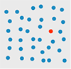
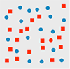
But when I say: find the red circle in the diagram below, you have to consciously search for it. That’s attentive perception. It takes more visual working memory, time and conscious effort. It involves more cognitive load.
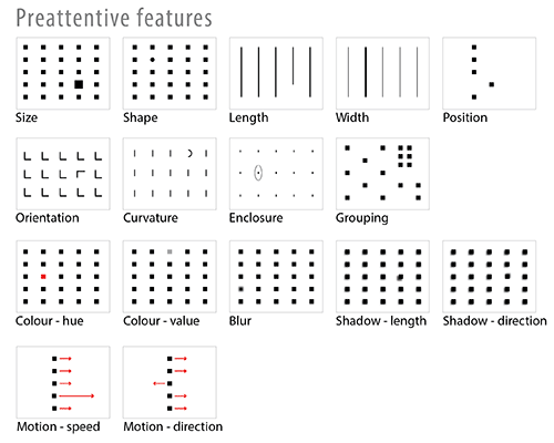
Preattentive features
Designers can take advantage of preattentive visual featues to communicate effectively and efficiently. Not all preattentive features, however, are created equal. Some have more impact than others.
Gestalt psychology
Gestalt psychology also sheds light on how our brains process visual information and construct objects out of the sea of sensory data. According to the Gestalt Law of Similarity, for example, we tend to group similar objects into larger wholes. It is easier for the brain to keep track of one large group than umpteen smaller objects. Other Gestalt Laws include Closure, Proximity, Symmetry, Continuity, Common Fate and Figure/Ground.
Paul Butler’s Visualizing Friendship (at the top of this post) is a great example of the preattentive perception and the Gestalt Laws of Closure and Figure/Ground applied to data visualization. We see a map of the world, even though the data provided is less than complete.

Paul Butler. “Visualizing Friendship”. Facebooks friends worldwide.
Jacques Bertin’s visual variables
In visualization design, a chart with one dimension of data is pretty easy. A multi-dimensional data visualization with different dimensions mapped to different visual features is trickier. To be succesful, it has to avoid interference and noise from preattentive features and Gestalt phenomena. This is where Jacques Bertin comes in.
Bertin’s 1967 Semiology of Graphics is a comprehensive theory of visual variables and the strengths and weaknesses of human perception applied to the graphic coding of map data. Equally relevant to data viz today, it is another example of the debt data viz owes to cartography.
Which brings me back to the examples from The Good, The Bad and The Ugly above:
- • The Shrinking Family Doctor uses one visual variable (size) to represent three different data variables, which is not possible.
- • Tallying Troops maps quantity to colour. It is hard to read because we don’t perceive different colours as bigger or smaller than each other. As a result, the viz requires a lot of hard mental work to understand the data. First, you have to count symbols, then refer to the legend and multiply by magnitude associated with a given colour, then remember that total as you repeat for each row.
Part 2, Tools: Tableau Public
The second half of each class is dedicated to hands-on work with different open source data viz tools. This week’s tool was Tableau Public
. In the time available, we only scratched the surface but the class found it pretty impressive.
Pros:
- • User-friendly
- • more designerly than Many Eyes
- • Dashboards
- • It embeds easily in a blog or website, preserving interactivity without the annoying Java warnings that plagued Many Eyes
- • Automatically generates latitude and longitude for place names
- • Additional measures (i.e. variables) that weren’t in the original dataset can be generated inside Tableau. I.e. it is not necesssary to back out of Tableau, to go back to the original dataset, revise, re-save and re-import it.
Cons:
- • One BIG shortcoming: why oh why is there still no version of Tableau for Mac? Hello!!
- • Also, like Many Eyes, nothing you do in Tableau Public is private – but, heh, that’s what you get for free, right.
Next week
Data viz design best practices
DataViz in 6 Weeks is my blog about teaching Introduction to Visual Analytics at OCAD University in Toronto. Comments, follows and shares welcome. #DataVizInSixWeeks
Anne Stevens I am a multidisciplinary designer working in data visualization, interaction design, innovation and critical design. I am particularly interested in non-screen based physical representations of data and tangible user interfaces.
]]>