 In visual analytics, data interaction can be as important data visualization. This tutorial is about adding interactivity to Tableau visualizations, specifically using Filters and Parameters. Filters Filters, you guessed it, let you filter data. In Tableau, they can be either static or interactive. An example of a static filter would be a condition that was set in worksheet mode to display a certain subset of the total data (eg. only.]]> In visual analytics, data interaction can be as important data visualization. This tutorial is about adding interactivity to Tableau visualizations, specifically using Filters and Parameters.
Filters
Filters, you guessed it, let you filter data. In Tableau, they can be either static or interactive. An example of a static filter would be a condition that was set in worksheet mode to display a certain subset of the total data (eg. only sales for certain provinces, or certain product categories). Static filters can be revised in the worksheet by going back to the original filter dialog, but can’t be changed in dashboard mode or from Tableau Public. In other words, they are not interactive by default. You can make them interactive, however, by choosing Show Quick Filter to add a filter list to the worksheet and dashboard.
Parameters
Parameters are commonly used to create additional types of interactive filters, but they are not, in themselves, filters. Rather, they are variables. As such, they aren’t really useful on their own; they have to be part of something else, such as an equation, a filter, a reference line, a calculated field, or what Tableau calls parameter controls (sliders, selection menus and type-in fields).
Like filters, parameters can be either static or interactive. An example of a static parameter would be a fixed sales target that is used in a bar graph to colour sales numbers that meet the target one colour, and those that don’t, another. An example of an interactive parameter would be a parameter control slider on the dashboard that lets the user adjust the sales target up or down and see the resulting colour change in the visualization.
As an interaction designer, I think of sliders, selection menus and type-in fields in terms of interaction. Tableau, on the other hand, is more concerned with the underlying math, formulas and analysis. As a result, the workflow in Tableau for creating interactivity starts with the parameters and calculated field formulas first, and adds the interactive feature to the UI last. Secondly, interactive features are called “Parameter Controls”, suggesting that you are interacting with the underlying formula more so than the visualization itself.
Personally, I find Tableau’s workflow is a bit counter intuitive. Here’s how I would do it: add an Interactions Card to the standard worksheet UI. Populate the card with icons for sliders, selection menus, radio buttons, toggle switches, zoom tools, selection tools, reference lines etc. This way, the user can simply drag an interaction icon to a visualization, or drag a measure or dimension to the interaction icon first; and then establish the parameters of the tool second. I feel like this drag and drop approach would be intuitive and still consistent with Tableau’s other workflows. Anyway, that’s my two cents’, for what it’s worth.)
Tutorial
The following examples illustrate different ways to use Filters and Parameters. Once again, I’m using the SuperstoreSales data found here
. Open a new worksheet tab for the first two examples because we’ll come back to them in the second half of the tutorial.
Filters
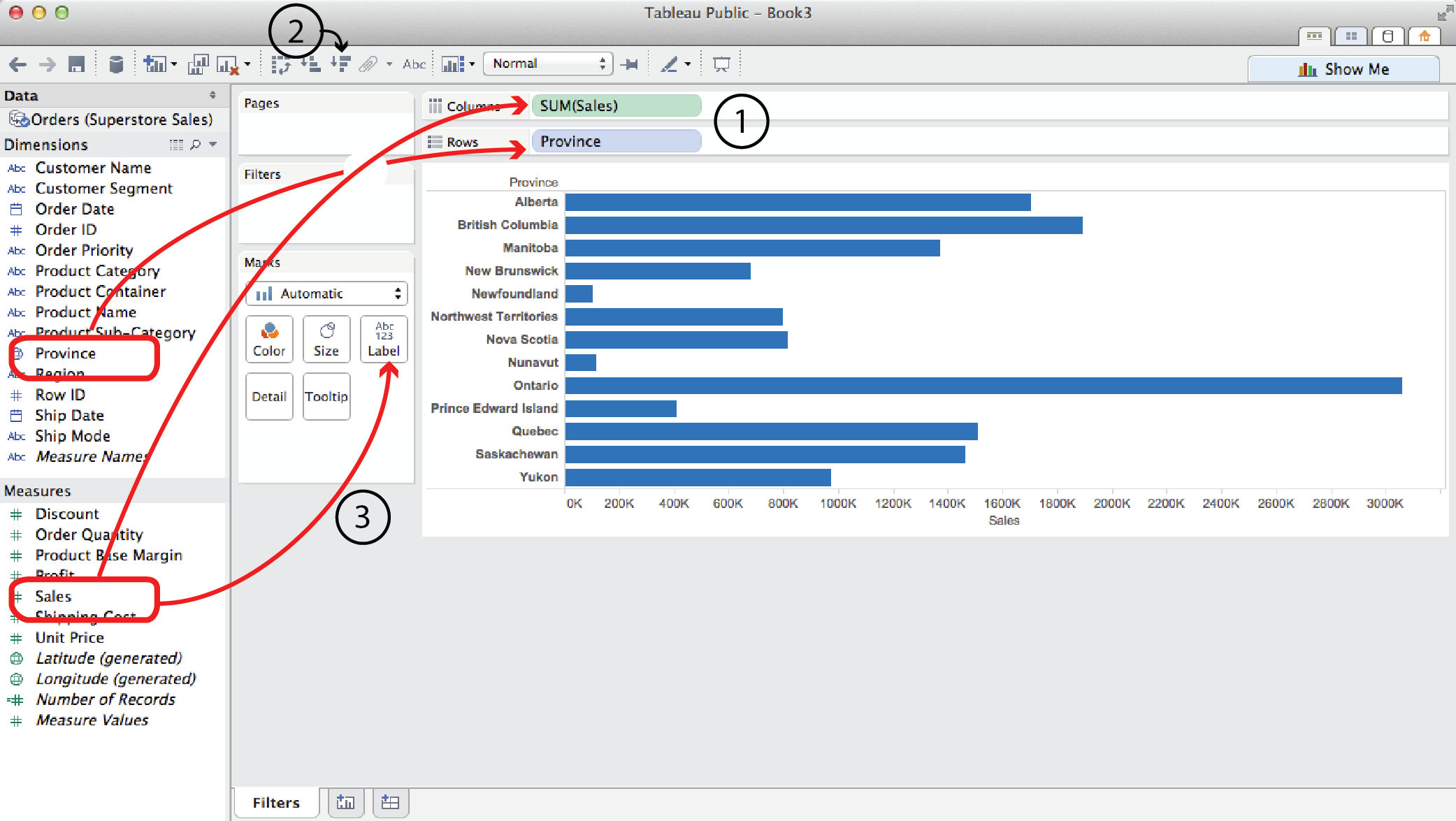
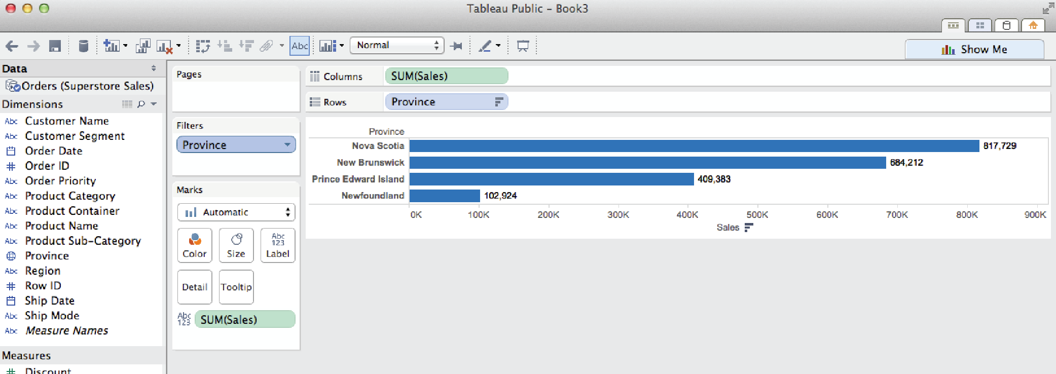
Probably the most familiar and straightforward filter type is the simple filter.
- Say you wanted to look at Sales by Province. You would drag Sales to the Columns shelf and Province to the Rows shelf.
- To sort them biggest to smallest, click on a Quick Sort button.
- To add Sales labels to the bars, drag Sales from the Measures list (not the Columns shelf) to Label in the Marks card.
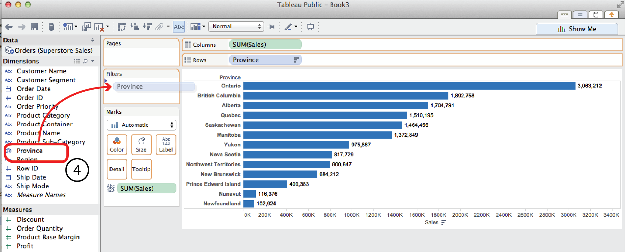
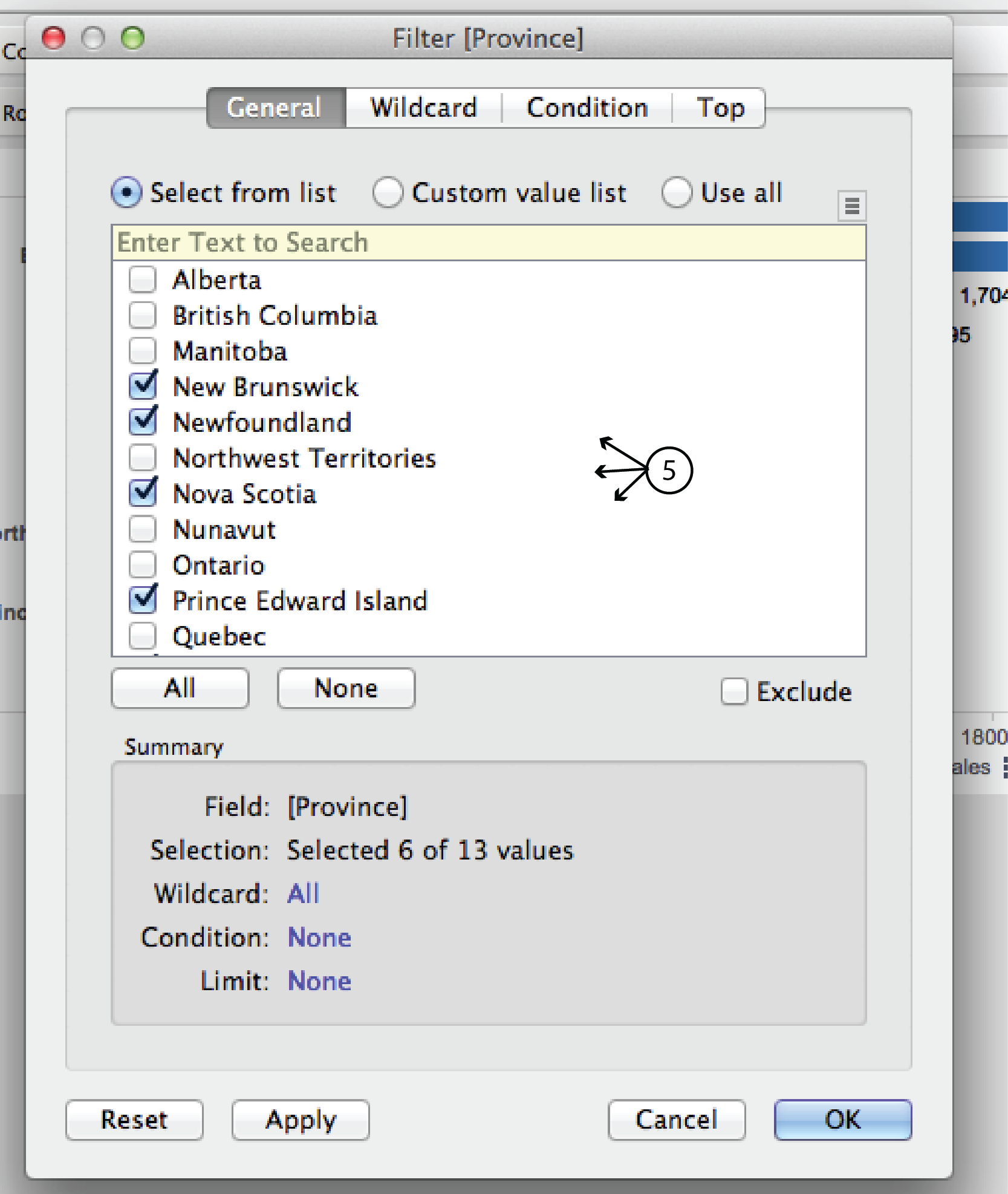
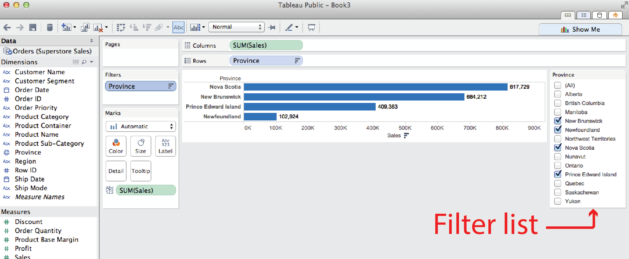
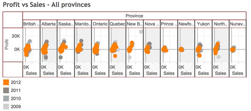
- Now if you wanted to filter the results to only show the Maritime Provinces, you could drag Province from the Dimensions menu to the Filters card to open the Filters dialog.
- In the General tab of the dialog, uncheck the non Maritime provinces and click OK. The result is just the four Maritime provinces. Pretty straight forward.
Filter by top (or bottom)
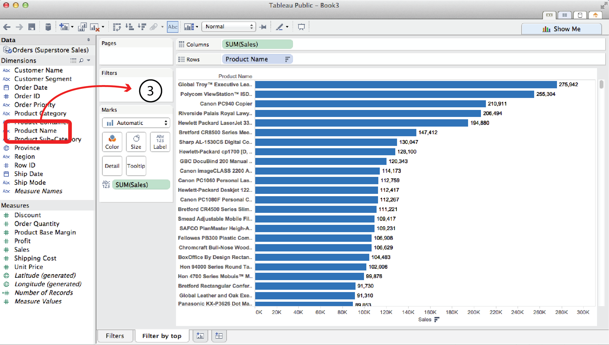
Open a new worksheet tab. Say you wanted to look at Sales for every individual product the Superstore sells.
- You could drag Sales to the Columns shelf and Product Name to the Rows shelf. This would produce a horizontal bar chart with over a thousand bars, which is pretty unwieldy.
- Clicking the Sort Descending button and dragging Sales to the Label Card, as in the previous example, helps clarify things but, nevertheless, the chart is pretty long and unweildy.
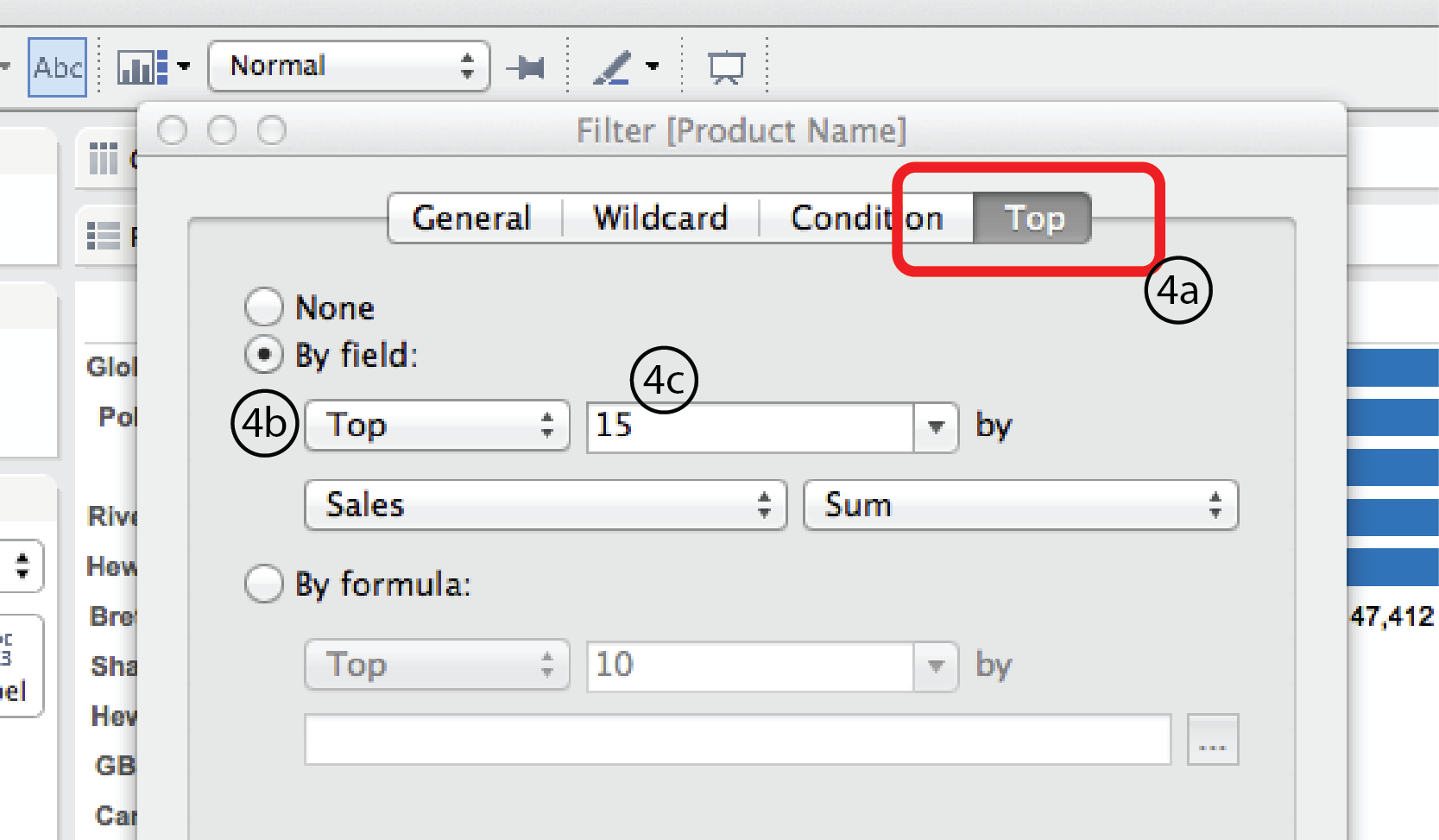
- Often in visual analytics, you are most interested in what is happening at the extreme conditions, moreso than the middle. This is where Filter by Top (or Bottom) comes in handy. It might be useful to just look at the top (or bottom) 15 sellers. To do so, Drag Product Name from the Dimensions menu to the Filters card. Again, this opens the Filter dialog.
- Choose the Top tab at the top of the dialog. Select the By field radio button. Select Top or Bottom from the menu below it. Then enter 15 in the field to the right. For this example, we’ll leave Sales and Sum in the row below as is. But obviously, you could choose any other Measure (Profit, Discount, Shipping Date etc.) or measure type (average, minimum, median etc.) that you were interested in. Finally, click OK at the bottom.
Filter by top and condition
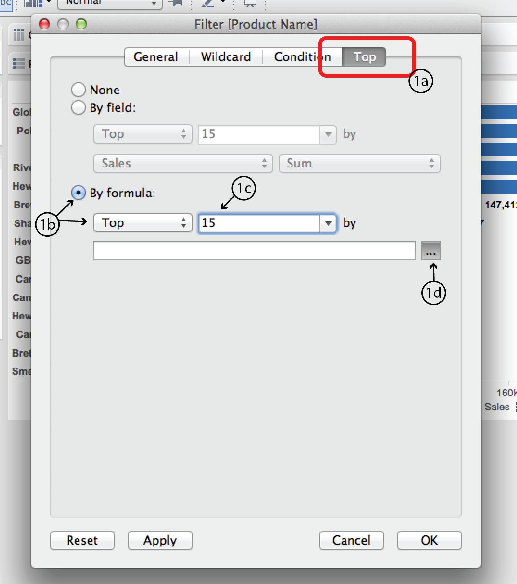
In a slightly more complex scenario, what if you wanted to look at the top 15 sellers in the Technology Product Category?
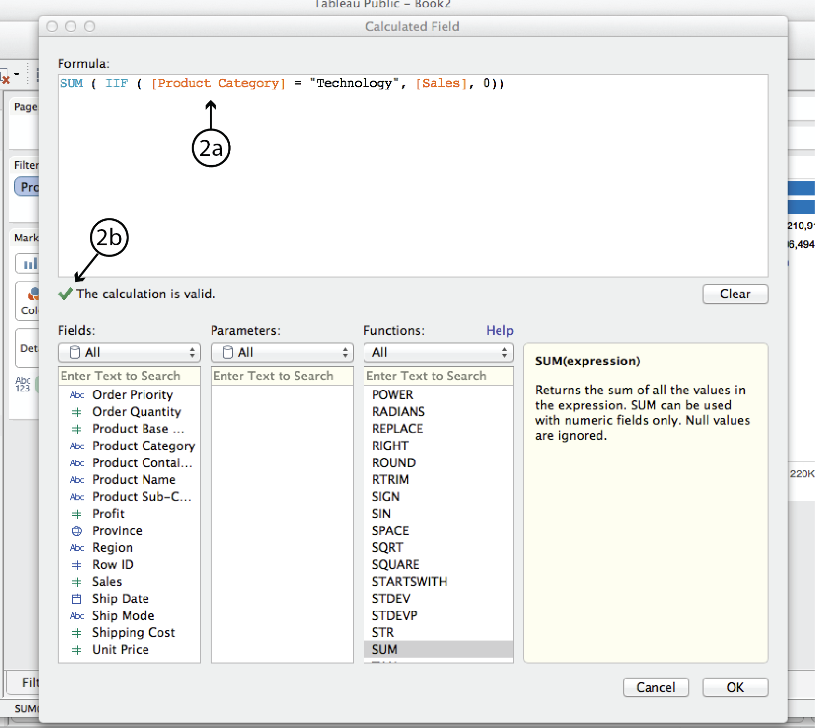
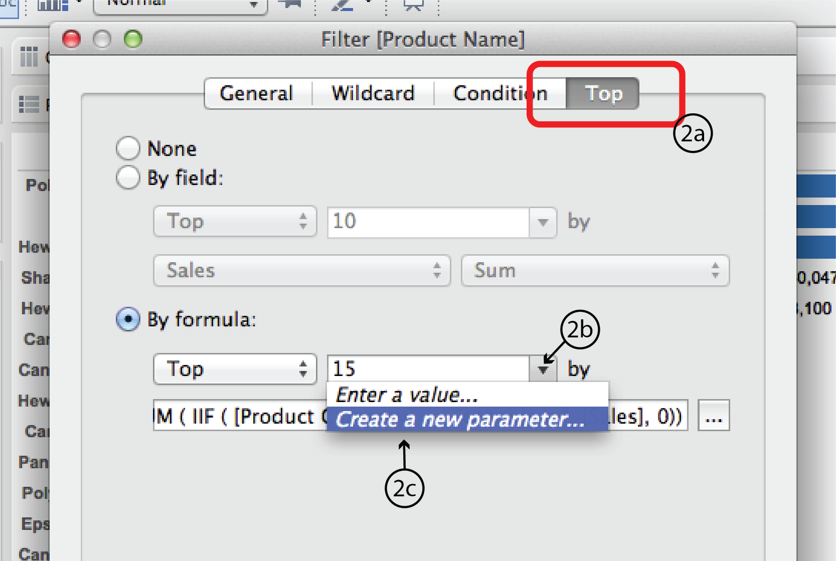
- Using the same worksheet as previously, right click on the Product Name filter and choose Filter to open the Filter dialog once again. As you did last time, open the Top tab. This time, select the By formula radio button. Choose Top from the Top/Bottom menu list below and enter 15 into the space to the right. If you are really good with Tableau Calculated Field syntax, you could enter a formula directly into the space below. The rest of us will click on the “…” button to the right to open the Calculated Field dialog.
- Enter tthe following formula in the space at the top. (Hint: double clicking on the Dimension and Measure names in the Fields menu simplifies typing in the different types of brackets.):
SUM( IIF ( [Product Category] = “Technology”, [Sales], 0 ))In plain english, this formula means: for each product order (i.e. row in the dataset), IF the product category is Technology, THEN add the Sales amount; if not, add zero. Tableau will confirm that your syntax is correct with a green check mark or tell you there’s something wrong with a red X. Assuming the syntax is correct, click Apply, then OK at the bottom of the CF dialog. Then click OK again at the bottom of the Filter dialog.
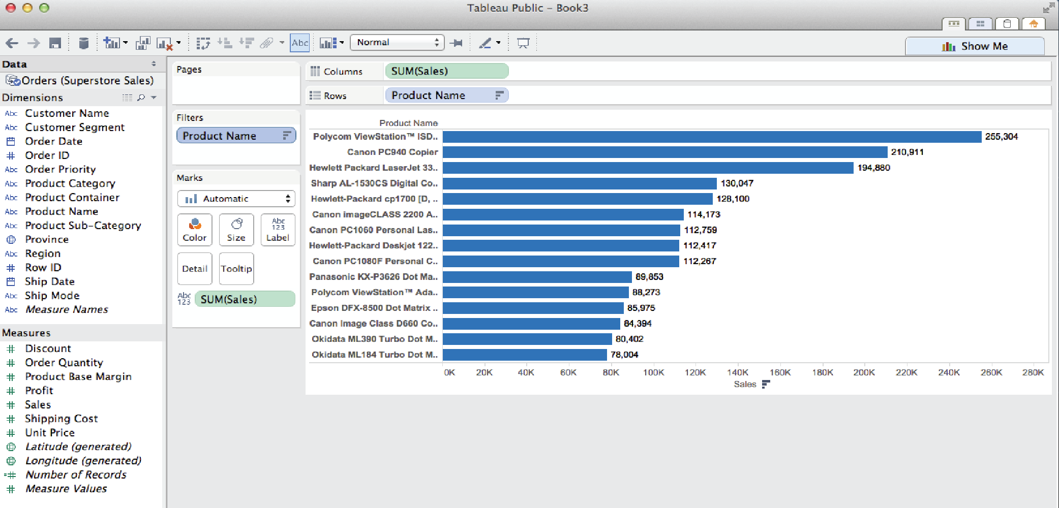
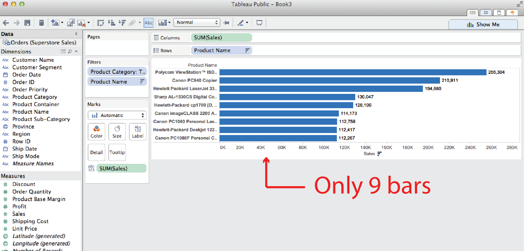
- Note: you might think that you could do the same thing more easily by filtering by Product Category first so that only Technology is displayed, and then using a second Filter by Top filter to display the top 15 sellers. But this method yields different results, as you can see below. It returns only nine products, even though we filtered for the top 15. The reason for this is that Tableau interprets two filters such as these to mean: display those products that are top 15 sellers AND in the technology product category. In other words, some of the other top sellers were in other categories and, therefore, were not displayed.
Parameters
The examples so far have used static filters (i.e. fixed, under the hood). They can be revised in a worksheet by reopening the Filters dialog and revising the filter, but they can not be adjusted or interacted with in a dashboard. The following examples illustrate how Parameters can be used to make them more interactive.
Add an interactive filter list
It doesn’t actually take a Parameter to make a filter list interactive. All you have to do is right click on the filter name in the Filters card and select Show Quick Filter. Tableau will add an interactive filter list to the worksheet.
Add a slider control
Using the Filter by top example, say you want to replace the fixed number of products to display (15) with a slider that lets user control how many top (or bottom) selling products to display. To do this you need to revise the original Product Name Filter from a fixed number (15) to a variable using a Parameter.
- Right click on the Product Name filter and choose Filter to open the filter dialog.
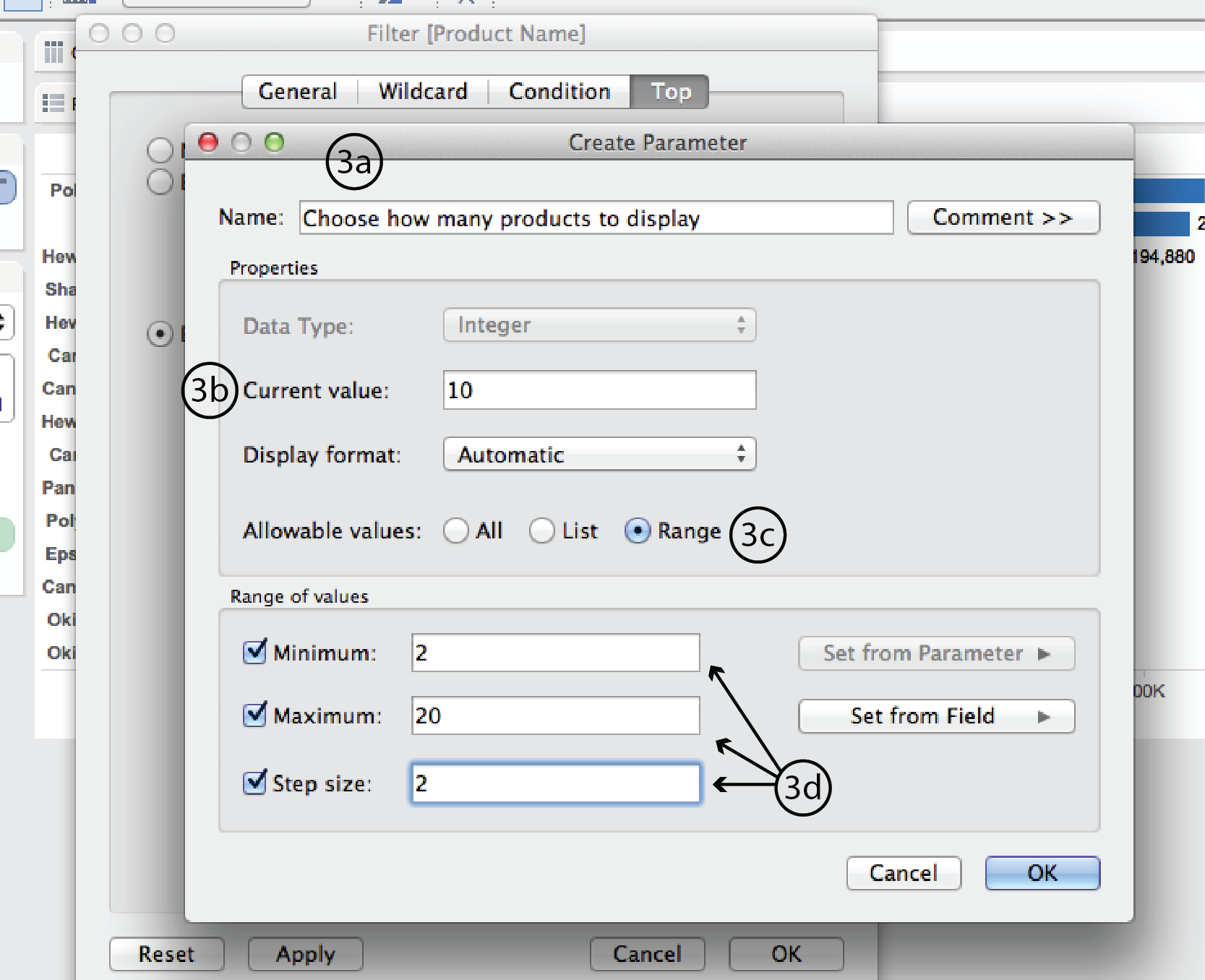
- Choose the Top tab and click on the little triangle to the right of the number 15 type-in field to expand the list of options. Select Create a New Parameter to open the Create Parameter dialog.
- In the Create Parameter dialog, enter a name such as “Choose how many products to display” at the top. Change Current value to 10. This will be the new default. Beside Allowable values, choose Range. Under Range of values, choose a minimum of 2, a maximum of 20 and a step size of 2. Then click Okay, and Okay again in the Filter dialog.
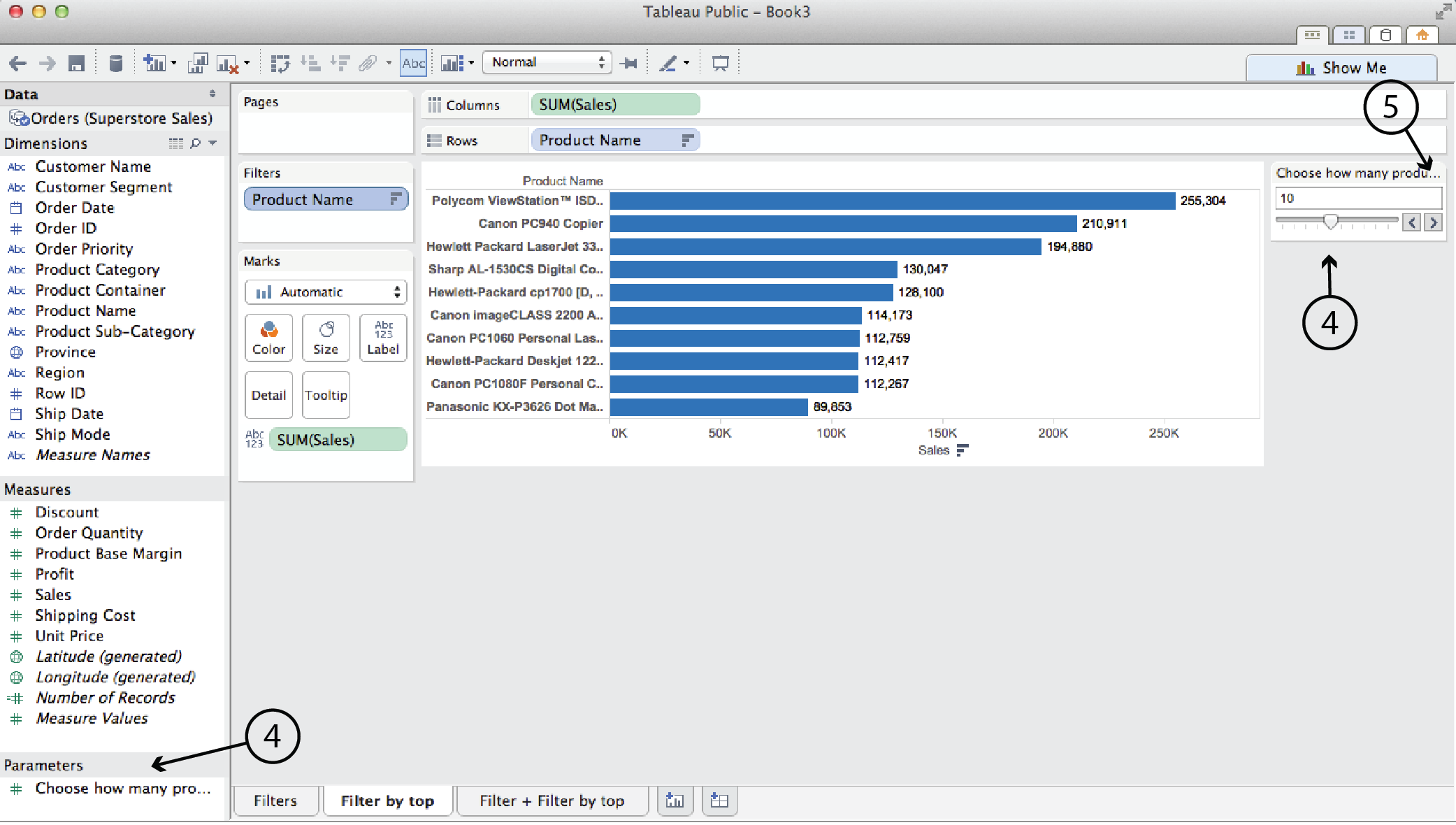
- In this case, Tableau automatically adds the slider into the worksheet. (It won’t always, though.) It also lists the Parameter in the left hand menu pane.
- You can click on the triangle in the top right corner of the parameter card to edit the title, parameter, slider etc.
Add a Reference line
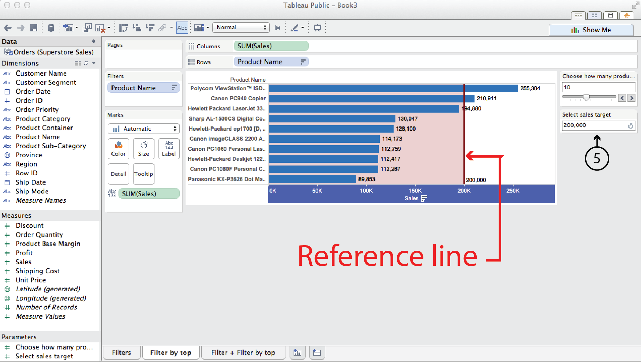
Use the same Filter by top technology sales example again. This time, say you wanted to add a Reference line that showed a sales target, and you wanted to make that reference line adjustable by the user.
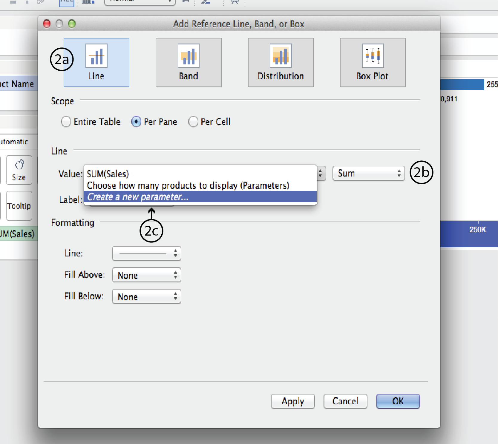
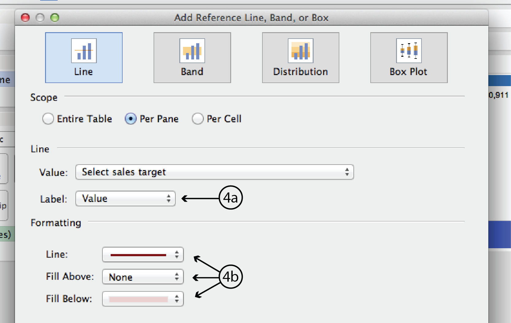
- Right click on the horizontal axis and select Add Reference Line, Band or Box. This opens the ARLBorB dialog.
- In the ARLBorB dialog, choose Line type at the very top, if it isn’t already. Choose Sum rather than Average for the data type. Right click on the up/down arrows to the right of the Value field to expand the menu. Select Create a New Parameter to open the Create Paramete dialog.
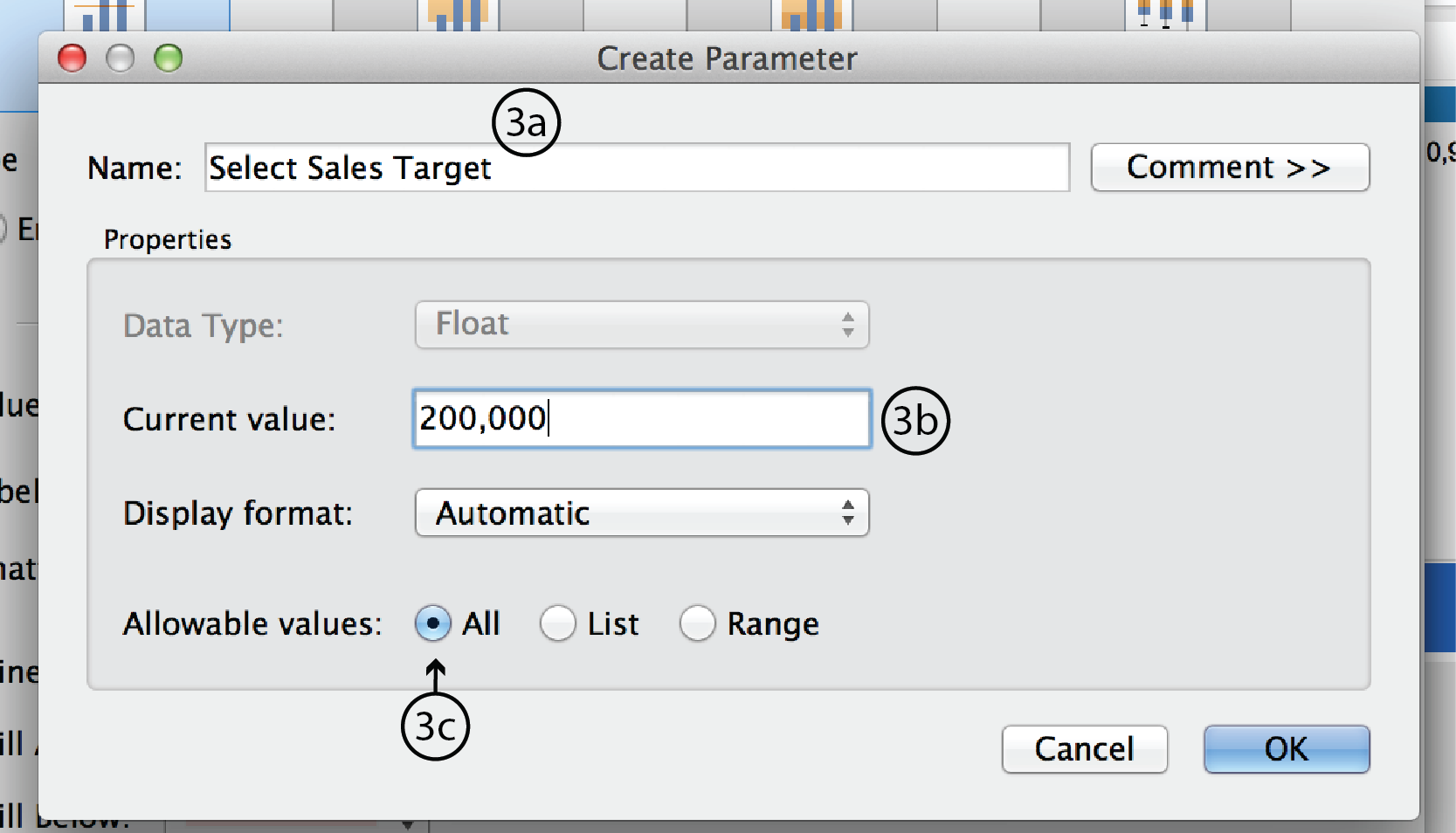
- In the Parameter dialog, enter a name such as Select Sales Target. Make Current value 200,000; this will be the default. Leave Display format as Automatic and Allowable values as All. Click OK to close the dialog.
- Back in the ARLBorB dialog, change Label to Value. This refers to the reference line’s label in the visualization. Under Formatting, change Line colour and Fill as you see fit. When you are ready hit Apply, then OK, or just OK.
- Again, Tableau automatically adds a Parameter Control to the worksheet. This time, it is a type-in field and it can’t be changed to a slider.

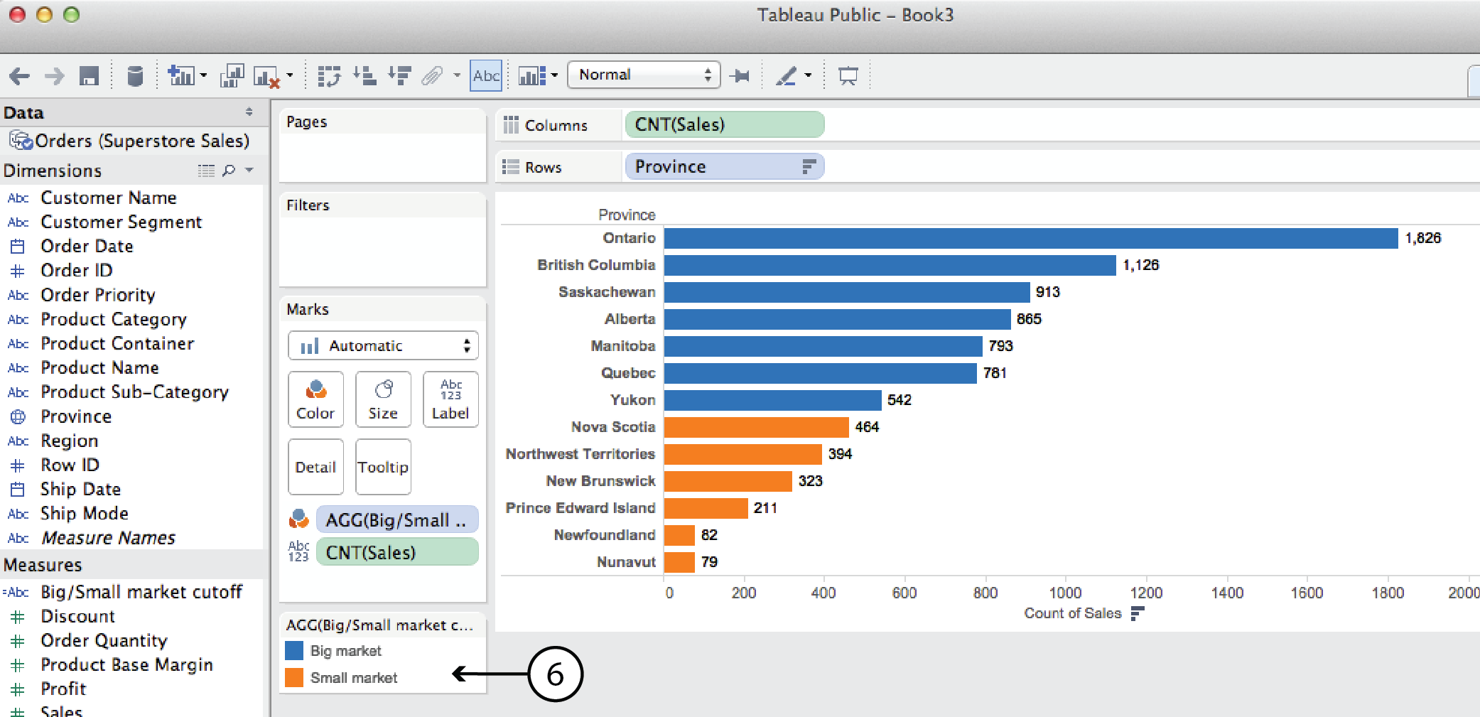
Parameter + CF (Big market/small market cutoff example)
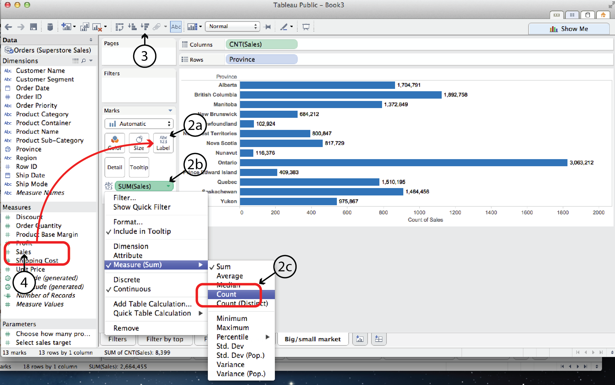
A parameter can also be used in a calculated field. For example, say you wanted to look at Sales by Province and categorize the provincial markets as either big or small depending on the number of sales. Since the big market/small market designation is not part of the original dataset, we have to use a Calculated Field to create it. In this case, lets look at the number of sales orders, as opposed to either tthe order quantity (i.e. 50 pens or 10 desks) or the sales value (i.e. dollar value).
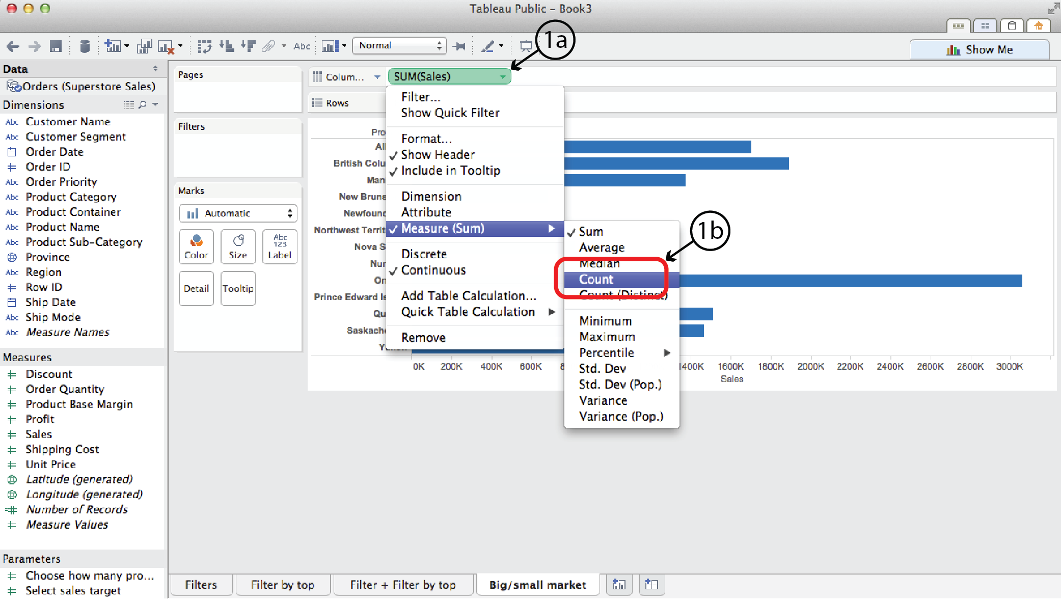
- Open a new worksheet and drag Province to the Rows shelf and Sales to the Columns shelf. Right click on Sales and select Measure to change the measure from Sum to Count, in order to count the number of sales rather than the sales value.
- Then, to add a label to the viz for the number of sales, drag Sales from the Measures list to Label on the Marks Card. As in step #1, right click on the Sales pill on the Marks card and select Measure to change the measure from Sum to Count.
- Select Sort Descending to sort the bars.
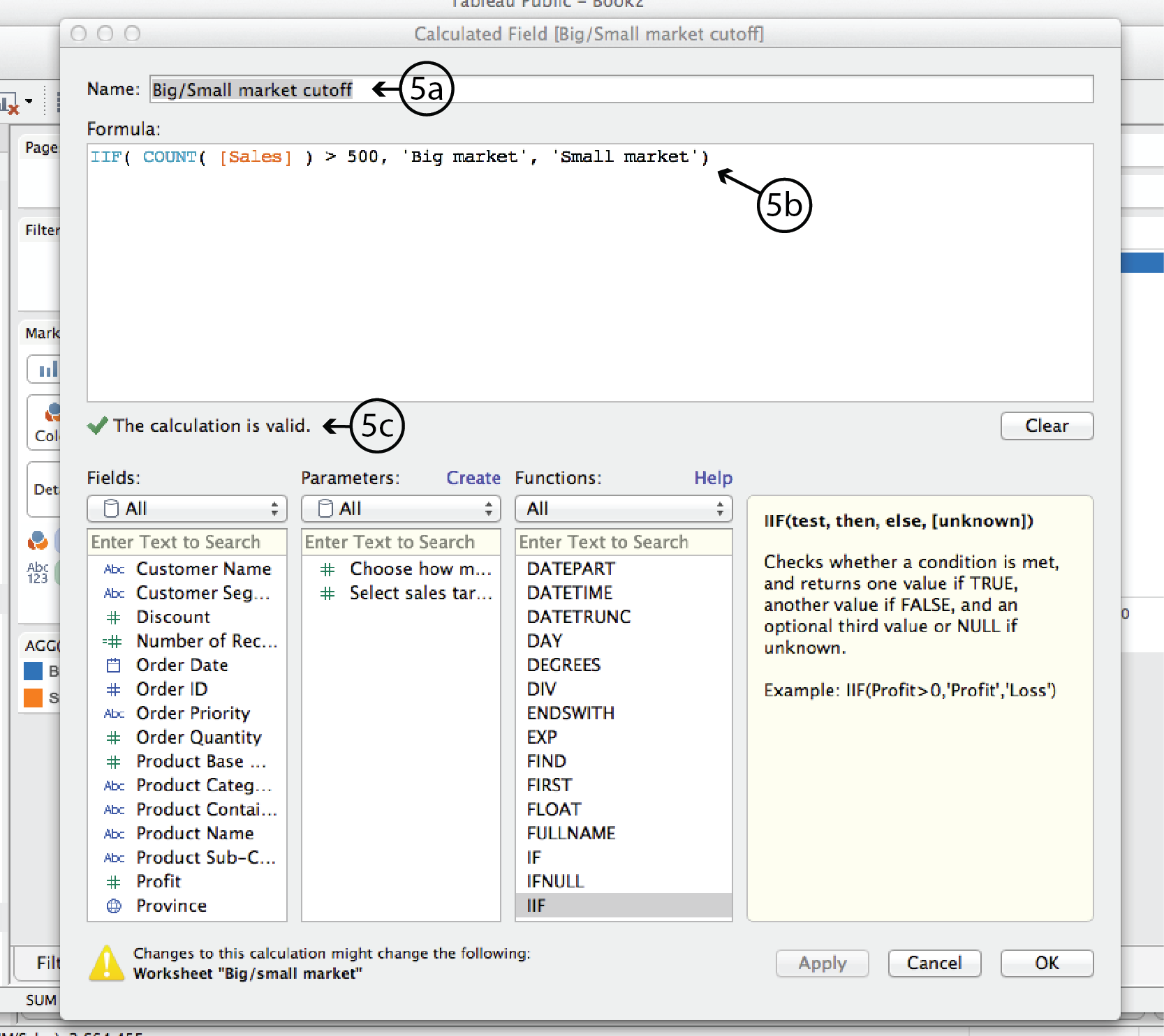
- First we’ll create a static big market/small market cutoff. Right click on Sales in the Measures list and select Creat Calculated Field, or select Create Calculated Field from the Analysis menu. Either way, the Calculated Field dialog opens.
- In the CF dialog, add a Name at the top, such as Big/Small market cutoff. In the Formula window add the following formula:
IIF( COUNT( [Sales] ) > 500, ‘Big market’, ‘Small market’ )In plain english, this formula says is: IF the count (i.e. the number) of Sales is greater than 500, THEN it is a Big market, otherwise it is a Small market.
Tableau will verify that the formula syntax is correct with a green checkmark below the Formula window. Then click OK to close the dialog.
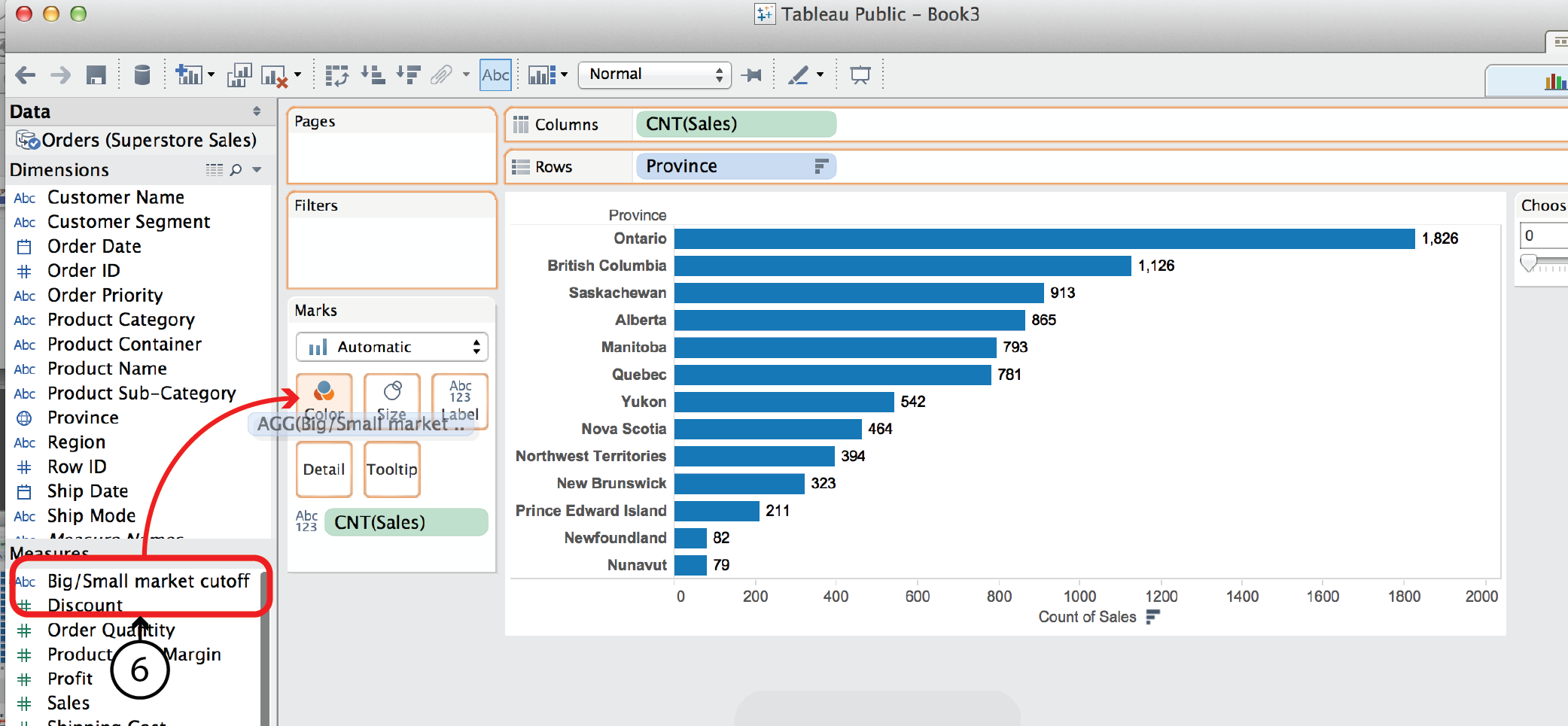
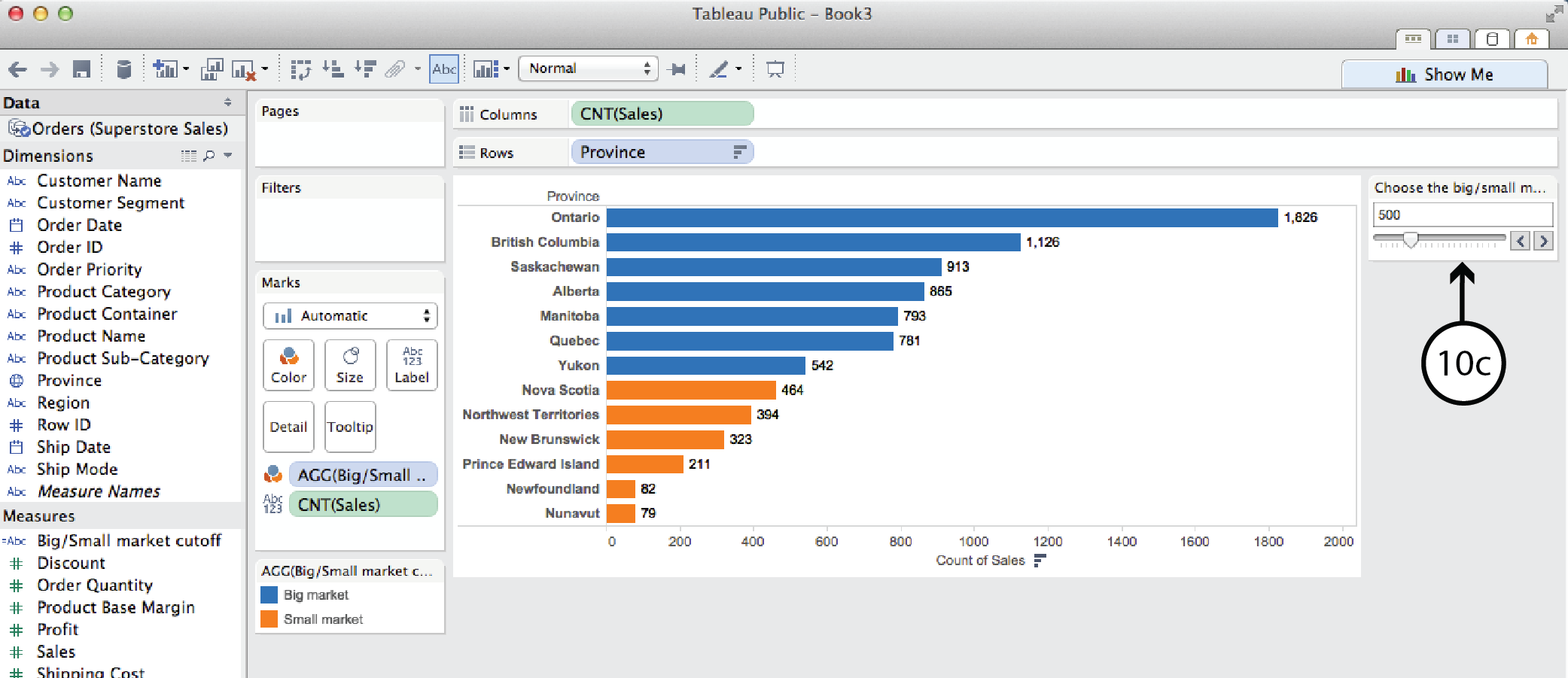
- The newly created Calculated Field is now listed at the top of the Measures list on the left. The small asterisk to the left of the name indicates that it is a CF. Now you can drag it ¬from there to Color on the Marks Card. Tableau will colour code the bar chart according to whether the province is a big or small market and add a colour legend.
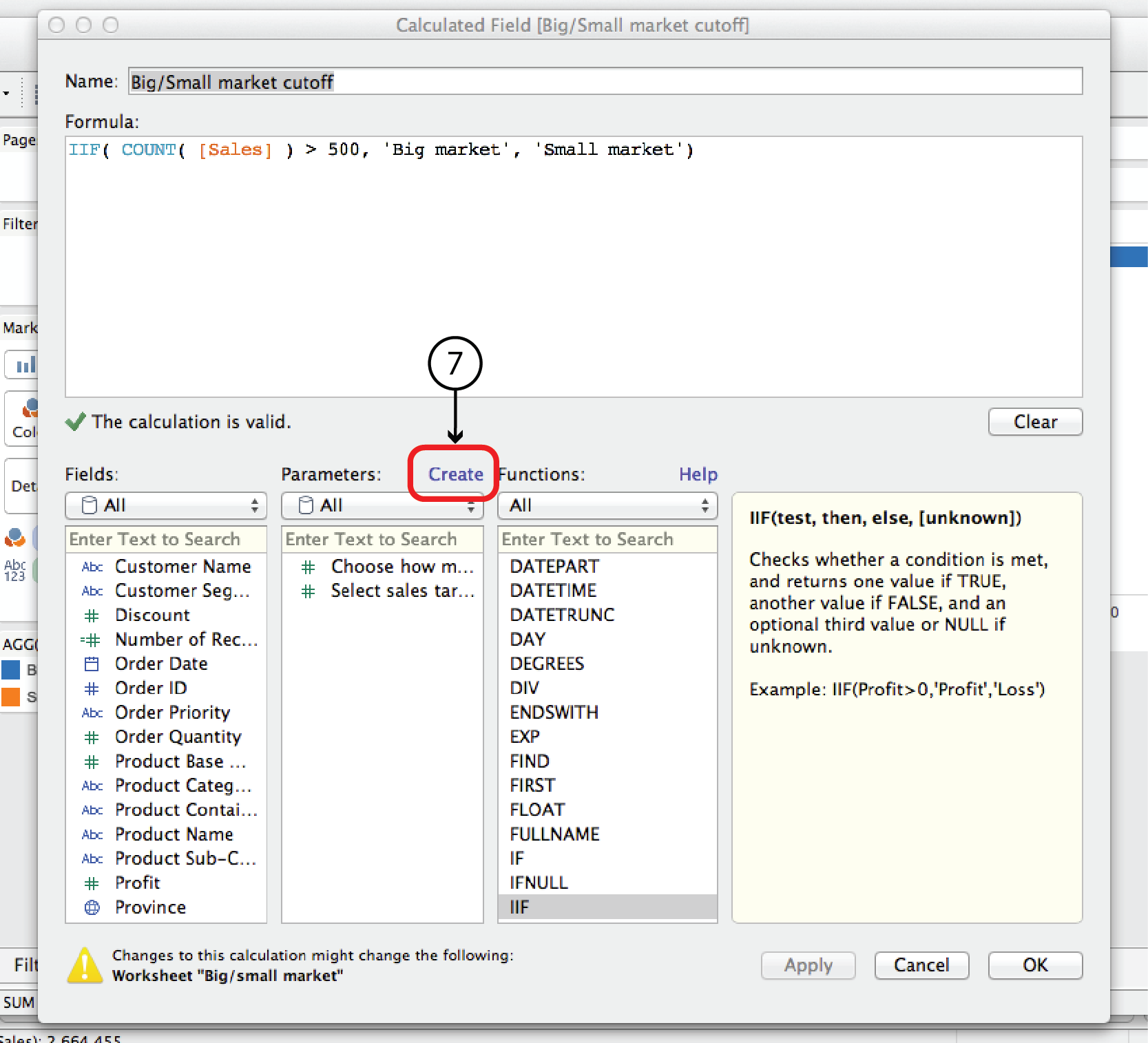
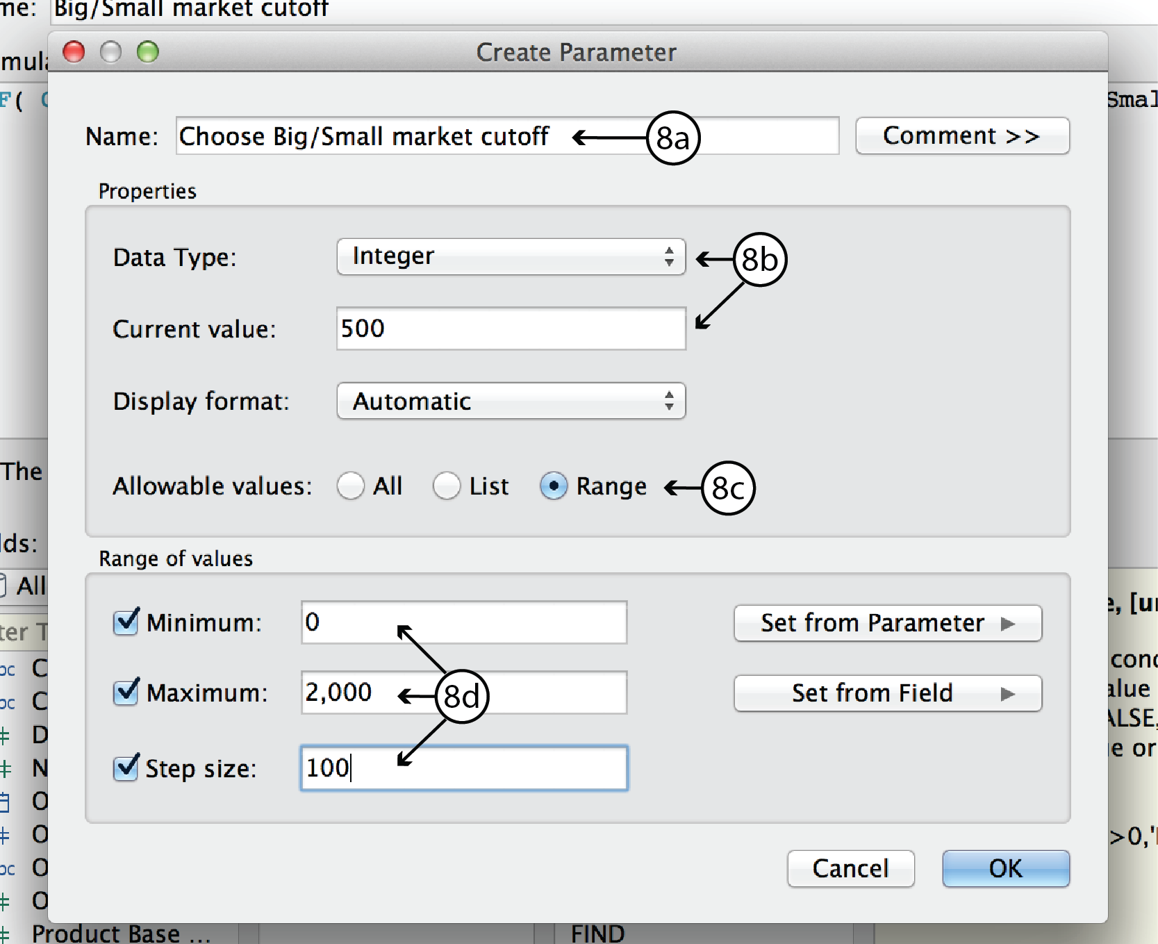
- In order to make the Big/Small market cutoff interactive, you have to first replace the number 500 in the CF with a parameter, and then add the parameter control to the worksheet. To do that, right click on the Big/Small market cuttoff CF in the Measures list and select Edit to open the CF dialog. At the top of the Parameters list, click Create to open the Create Parameter dialog.
- In the Create Parameter dialog, enter a name such as Choose Big/Small market cutoff. For Data Type, choose Integer. For Current Value, choose 500 or any other default value you want. Leave Display format as Automatic. For allowable values, choose Range. Since we know that the range of sales orders goes from roughly 0 to 2000, select Minimum and enter 0, select Maximum and enter 2000, and select Step Size and enter 100. Click Okay to return to the CF dialog.
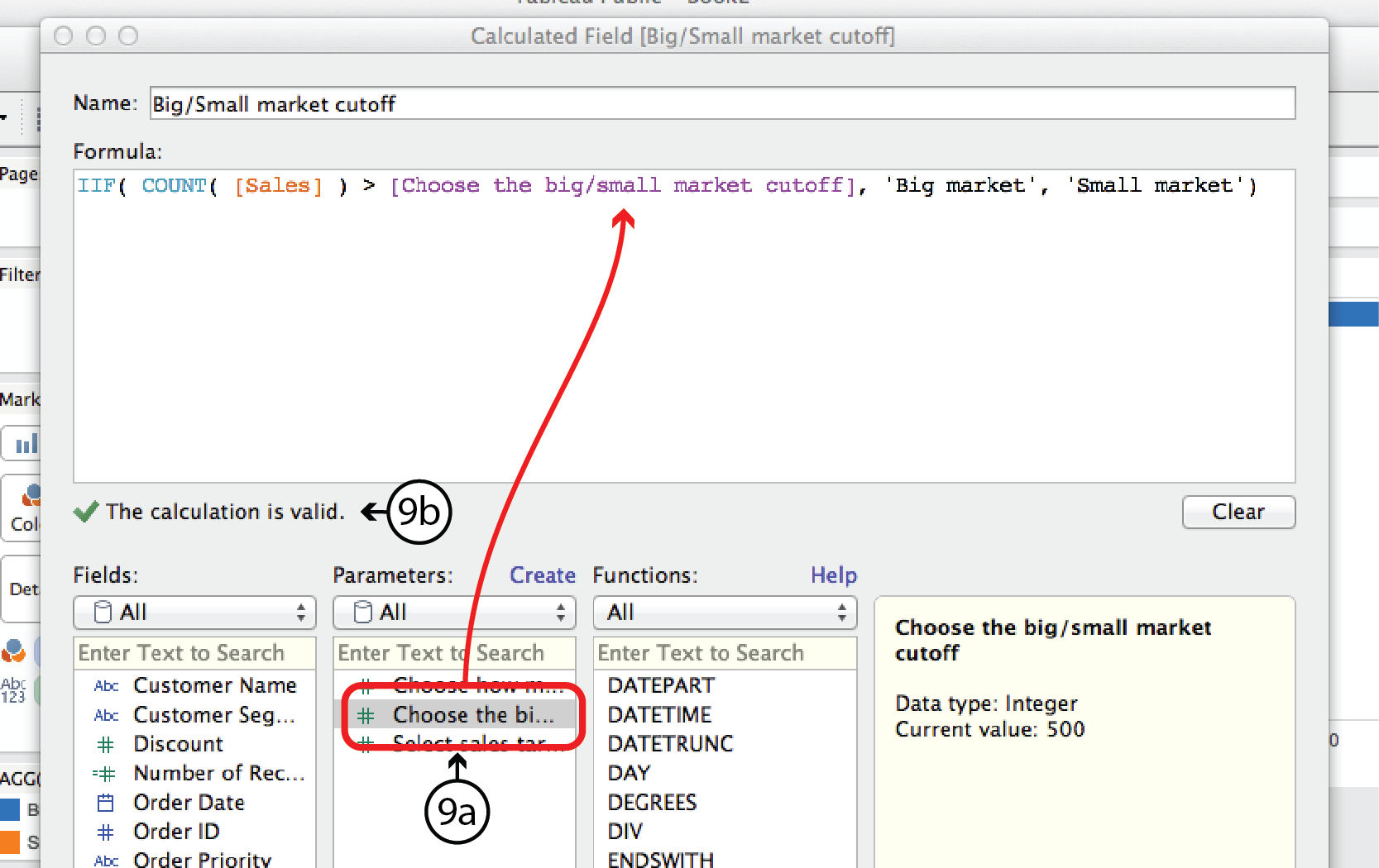
- In the CF dialog, you should see the new parameter listed in the Parameters list. Now you can replace the number 500 in the Formula with the parameter by highlighting 500 and then double clicking on the new Parameter. If all goes well, Tableau will confirm that the formula syntax is correct with another green checkmark. If so, click OK.
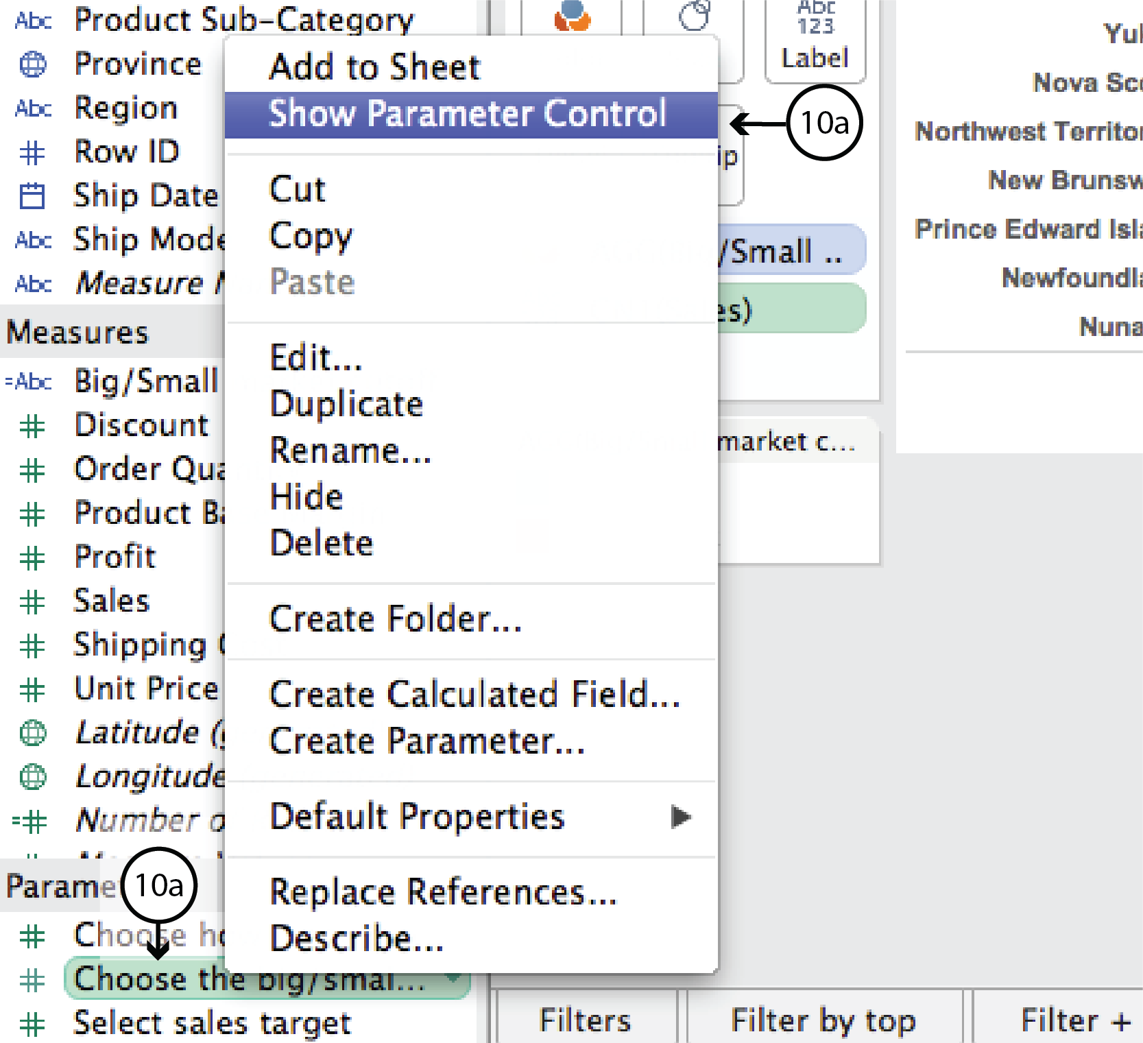
- The new Parameter is listed in the Parameters menu on the bottom left of the worksheet. This time, though, Tableau did not automatically add it to the worksheet. To add it, right click on the Parameter in the menu and select Show Parameter Control. This brings a combination Type-in and Slider Parameter control onto the worksheet that lets the user control where the big market/small market cutoff is.
DataViz in 6 Weeks is my blog about teaching Introduction to Visual Analytics at OCAD University in Toronto. Comments, follows and shares welcome. #DataVizInSixWeeks
Anne Stevens
I am a multidisciplinary designer working in data visualization, interaction design and innovation. I am particularly interested in non-screen based physical representations of data and tangible user interfaces.
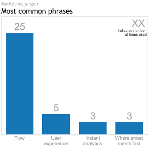 Tableau v9.0 virtual launch party overFLOWs with marketing jargon Tableau hosted an east-coast/west-coast Virtual User Group launch party to introduce their newest version, v9.0: the Flow release, as they coined it. __ First impression At the risk of sounding shallow, I expected a bit more polish from Tableau. They are a worldwide leader in the BI market and they boast impressive revenue and growth numbers. But with too much blunt.]]> Tableau v9.0 virtual launch party overFLOWs with marketing jargon
Tableau hosted an east-coast/west-coast Virtual User Group launch party to introduce their newest version, v9.0: the Flow release, as they coined it.
__
First impression
At the risk of sounding shallow, I expected a bit more polish from Tableau. They are a worldwide leader in the BI market and they boast impressive revenue and growth numbers. But with too much blunt marketing jargon and filler the two hour production seemed a bit cheap.
I couldn’t resist counting the number of times (a) Flow, Where Smart Meets Fast, Instant Analytics and Fast Fast Fast were use, (b) improved user experience was referenced, and (c) one of the presenters repeated the mantra: “I’m so excited!!!”. Which begs the question: why wasn’t there more content for this invested and engaged Tableau user to focus on?
So just how many times was the word FLOW used in the just-less-than-two-hour event? Answer: 25. See the viz above.
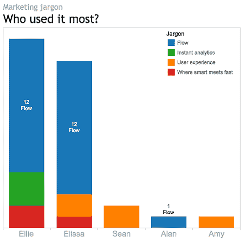
Which presenter used it the most? Answer: that depends. Ellie and Elissa each used it twelve times. So, based on the raw data, it’s a tie. However, normalizing the data reveals Elissa as the front runner, using Flow every 55 seconds on average. By comparison Ellie, who was on air much longer, only used it every 3 minutes and 50 seconds, on average. Congratulations Elissa.
__
Enough about the talking heads. Let’s get down to the new Tableau product itself. This is what v9.0 has to offer:
For the data geek
Lots and lots of geeky new stuff:
- • tools for interpeting, pivoting and tweeking Excel data. For example, Tableau 9.0 comes with a Split tool for splitting comma- or space- separated data into separate columns. This tool will eliminate the need to go back to Excel to take care of that clean up job before connecting to the data in Tableau.
- • the introduction of Level of Detail expressions (LODs), which Tableau describes as a very powerful new tool. What are LODs?, you ask. Good question. As Tableau describes it, there are many analysis questions that seem intuitive and easy to put in words, but difficult to actually execute in Tableau. For example, in my Tableau woes – Part 2 tutorial I described how you could use a Calculated Field to answer the question: how do Quebec Sales compare to National Sales? What made this simple enough question a challenge for Tableau prior to v9.0 is that it involved querying the data at two different levels of detail – the province and the country – at the same time. Before v9.0, answering these kinds of intuitive questions involved duplicate dimensions, sets, blends or table calculations, and felt a bit like workarounds. LODs give more control over how granular or aggregated the data is, regardless of the granularity or aggregation (i.e level of detail) of the actual visualization. They are supposed to make enquiry simpler, faster, more intuitive and more repeatable.
- • new data sources and/or improved connections: SAS, SPSS, R, Spark SQL, Amazon EMR, IBM Big Insights, Salesforce.com etc.
- • support for Regex expressions, if you are into that.
For the mapper
Improved usability (thank goodness!!!)
- • smoother, more Google-like pan and zoom
- • a new Geographic Search tool
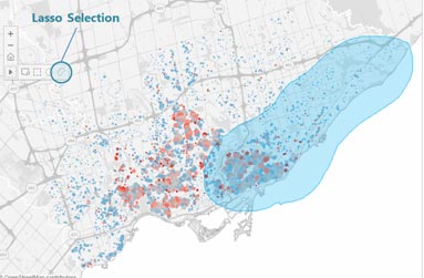
- • lasso and radial selection tools that will feel more hands-on than conventional filter lists, sliders and dialogs that sit outside the actual viz. The selection tools should make for more on-the-fly map selection.
I didn’t hear anything about improved map granularity for non-US locations. However, Ellie’s map example – Edinburgh, Scotland – had postal-code/zip-code level detail, so I’m optimistic.
For the interface and usability person (and who isn’t?)
- • Those new lasso and radial selection tools will work on all visualizations, not just maps. Yay.
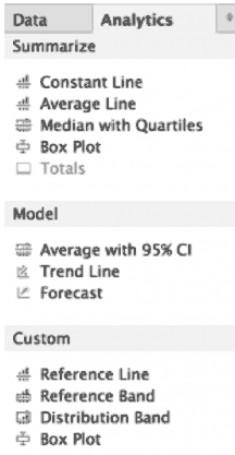
- • A second, Analytics, tab has been added to the existing Data menu on the left side of the UI (see image below). This Analytics menu will let you drag and drop multiple Trend Lines, Reference Lines etc. directly onto the viz, eliminating the need to go to pull down menus to do one thing at a time.
- • In general, v9.0 should offer more immediate feedback and analysis results while selecting, analysing and building Calculated Field expressions, for more on-the-fly exploration and iteration.
- • Type-in Pills give the analyst the option of clicking on a shelf and typing in a Measure or Dimension name, rather than dragging and dropping.
- • Faster query processing speeds, thanks to query caching, parallel queries and other mysterious under the hood improvements.
For the Tableau Public user
Apparently all the new v9.0 features will be available on Tableau Public, not just the paid versions (Server, Online and Desktop).
Tableau claims that they will be adding more profile and social features to TP so that people can use the platform more as a portfolio and blog. I hope they offer some control over who can see what. For example, I might want to publish my finished works to everyone, but hide all my drafts and preliminary versions. Or, I might want to share visualizations amongst a certain group of people – my Visual Analytics class, for example. Hopefully, that will be possible. Tableau didn’t provide this kind of detail, so it remains to be seen.
For the storyteller
Ellie mentioned formatting upgrades for Storypoints – not during her formal demo, but as more of a casual comment during her chit chat with Nate in the dying minutes of the production. She suggested these upgrades could be a sleeper hit of v9.0, but didn’t offer any additional details or images. Stay tuned.
For sales and marketing
A lot of cheese during the sales pitch part of the presentation:
- • Powerpoint slides of a competitive sailing athlete (sails/sales, geddit?) racing her heart out, but staying “in the flow”, at peak performance, one with her boat and the waves. Thus the marketing strategy is revealed.
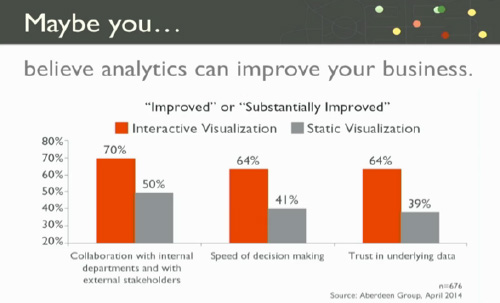
- • some very loosey-goosey bar charts to support Elissa’s notion that “maybe” “you believe” that “analytics can improve your business” and translate into improved sales (sails?). Her bar chart (below) actually addresses a different question altogether, namely, the relative value of interactive and static visualizations. For example, looking at the grey bars, only 41% of people believe that static visualizations improve the speed of decision making and, therefore, 59% of people don’t.
__
Background
I use Tableau Public and Google Refine (aka Open Refine) in my Introduction to Visual Analytics course so that the students can get up and running in a relatively short time generating multiple visualizations from real datasets. At this point in time we use Tableau Public v8.2 for Mac.
I have not personally beta tested v9.0. This blog is based solely on what I heard and saw during the Tableau Virtual User Group launch party. I look forward to using v9 after its full release and am sure that I will discover much more then. Stay tuned.
Oh, and one more thing: did I mention flow?
DataViz in 6 Weeks is my blog about teaching Introduction to Visual Analytics at OCAD University in Toronto. Comments, follows and shares welcome. #DataVizInSixWeeks
Anne Stevens
I am a multidisciplinary designer working in data visualization, interaction design and innovation. I am particularly interested in non-screen based physical representations of data and tangible user interfaces.
 For many Tableau beginners, making high density, interactive visualizations can be a challenge. Tableau woes – Part 1 addressed this challenge with three strategies for combining data variables into a single display rather than plotting them in individual rows and columns (Tableau’s default mode, that makes direct comparison difficult to impossible): Measure Values Blending Axes Dual Axes This post will explain two more tools that can be used to add.]]> For many Tableau beginners, making high density, interactive visualizations can be a challenge.
Tableau woes – Part 1 addressed this challenge with three strategies for combining data variables into a single display rather than plotting them in individual rows and columns (Tableau’s default mode, that makes direct comparison difficult to impossible):
- Measure Values
- Blending Axes
- Dual Axes
This post will explain two more tools that can be used to add data density to a Tableau viz and give it a bit more interactivity.
- Create Calculated Field
- Hierarchy
As with the previous post, I’m using Tableau’s superstore sales dataset.

Where we left off in the previous post
Create Calculated Field
Starting where we left off in Tableau Woes – Part 1, what if you had created the viz above, but wanted to compare sales in one province, say Quebec, to national sales. If you tried to filter by province, Tableau would apply the filter all the Dimensions and Measures in the display and the end result would be a comparison of Quebec sales to Quebec sales, which is not useful.
The solution is to use Create Calculated Field. CCF is one of Tableau’s real strengths. It allows the user to create new Measures and Dimensions that were not in the original dataset, directly from inside Tableau and on the fly. With it, you can avoid having to back out of Tableau, revise the original Excel file, re-connect to Tableau and start all over again. Here’s an example:
- Again, starting where we left off in the previous blog post, go to the Analysis pull down menu and select Create Calculated Field.
- In the Calculated Field dialog box, give the CF a Name at the top, such as Quebec Sales.
- Construct a Formula in the box below. In this case, we need a classic If This Then That logic function to be applied to each row in the dataset that goes like this: if the province is Quebec, then use the Sales value, else use a value of zero. In Tableau syntax, this looks like so:
- IIF ( [Province] = ‘Quebec’, [Sales], 0)
- You could simply type the function into the Formula box, but it is better practice to double click on the actual Dimension, Measure and Function names in the lists below and let Tableau add the necessary brackets and get the exact spelling.
- After closing the CCF dialog, a new measure called Quebec Sales will appear in the Measures list, from where it can be used to build a visualization like any other Measure or Dimension. You can tell it is a CF because of the little asterisk added to the symbol to the left of the Dimension name.
- Remove Profits from the Rows shelf and move Quebec Sales there instead. Then right click on Quebec Sales and select Dual Axis. Finally, right click on the Quebec Sales axis and select Synchronize Axes. (See Tableau Woes – Part 1 for more detailed instructions re. these steps. ) Now the display shows Quebec sales in one colour and national sales in another, making comparison and analysis possible.
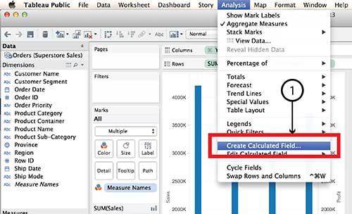


Tableau Parameters are another tool for controlling what is displayed. Parameters also make use of the Create Calculated Field function.
Hierarchy
The Hierarchy tool can also add interaction and dimensionality to a visualization, making it possible to drill down into detail or aggregate back up to bigger buckets. Here’s how it works:
- On a new worksheet, drag Product Sub-Category on top of Product Category in the Dimensions menu.
- Give the Hierarchy a name, such as Product Hierarchy in the dialog box and click OK.
- A new Dimension called Product Hierarchy will be listed in the Dimensions menu with Product Category and Product Sub-category listed under it.
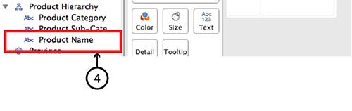
- To add Product Name simply drag it directly into the same Hierarchy.
- Do the same with Customer Segment and Customer Name, and even Region and Province.
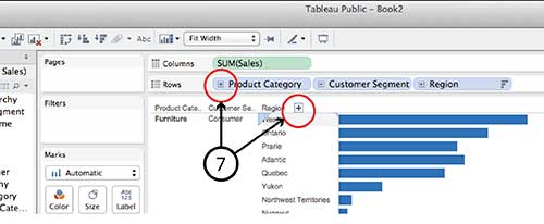
- Now the new Hierarchy pills can be dragged to the Row and Column shelves in the same way that any individual Dimension or Measure can be. For example, drag Product Hierarchy, Customer Hierarchy and Region Hierarchy to the Rows shelf and Sales to the Columns shelf and choose Horizontal Bar Graph type.
- You can drill down into any of the Hierarchy pills on the Row shelf by clicking the small Plus sign beside the pill name or the Plus symbol that appears when you hover over the Product Category, Customer Segment or Region axis lables in the visualization. Similarly, once you have drilled down a level from, say, Region to Province, you can click on the little Minus sign on the Region pill or the Minus sign on the Region axis.


It is worth noting that Hierarchy isn’t equally interactive for all viz types in dashboard view. A treemap, for example, doesn’t have any axes and I found it impossible to find a Plus or Minus sign to click. I imagine the same goes for a Bubble chart. If anyone has a solution for this problem, I’m all ears.
DataViz in 6 Weeks is my blog about teaching Introduction to Visual Analytics at OCAD University in Toronto. Comments, follows and shares welcome. #DataVizInSixWeeks
Anne Stevens I am a multidisciplinary designer working in data visualization, interaction design, innovation and critical design. I am particularly interested in non-screen based physical representations of data and tangible user interfaces.
]]> Naturally, Tableau Public’s Getting Started vidoes and tutorials make creating compelling visualizations look smooth and easy; as though you can simply download the program and hit the ground running. But from what I’ve seen in class (as well as my own experience), it ain’t necessaily so. Common frustration Once you connect to some data set and start placing Dimensions and Measures on Rows and Columns shelves, Tableau has a frustrating.]]> Naturally, Tableau Public’s Getting Started vidoes and tutorials make creating compelling visualizations look smooth and easy; as though you can simply download the program and hit the ground running. But from what I’ve seen in class (as well as my own experience), it ain’t necessaily so.
Common frustration
Once you connect to some data set and start placing Dimensions and Measures on Rows and Columns shelves, Tableau has a frustrating habit of spreading them out in individual rows and columns rather than layering them on top of each other. This creates at least three problems:
- • It is counter intuitive and makes it impossible to actually compare anything to anything else. And what are data analysis and visual analytics for, if not for comparing things?
- • The y-axis scale is different for each row, making direct comparison impossible.
- • Before long, the visualizations become unreadable because Tableau has to shrink all those rows and columns to fit on screen, as in the illustration at the top of this post.
For example, using Tableau’s superstore sales dataset, when Sales, Profit and Order quantity are dragged to the Rows shelf, the resulting line graphs are displayed in three rows, rather than all on the same graph with a common y-axis scale.

Possible solutions
In today’s class we covered a number of strategies for increasing the dimensionality of Tableau visualizations and avoiding the problem above.
Measure Values (what’s that mean and where did it come from?)
Use the Measure Values and Measure Names, two Calculated Fields that Tableau automatically generates when it connects to a data set. Think of Measure Values as being all the Measure variables grouped together.
- Instead of dragging individual Measures (i.e. variables) to the Rows shelf, drag Measure Values there.
- The Measure Values Card automatically opens, listing all the Measures.
- The visualization will look wierd until you drag the SUM(Number of Records) Measure out.
- Continue deleting any Measures you don’t want in the viz by dragging them to the side or right clicking on the Measure and selecting Remove (from the Measure Values card, not the original Measures list on the far left).
- Tableau automatically throws a Measure Names pill into the Marks Card. Think of Measure Names as being the names of all the Measures, grouped together. Drag it onto colour in order to create a colour legend.


Blending axes
Another way to do pretty much the same thing:
- Drag one Measure, such as Sales to the Rows Shelf and Order Date to the Columns Shelf.
- Instead of dragging other Measures to the Rows Shelf, drag them one at a time to the y-axis of the viz. Tableau automatically places Measure Values on the Rows Shelf and opens the Measure Values Card, creating the same end result as the example above.

Dual axes
A third way to combine variables is to create a Dual Axis viz. But this only works for a maximum of two variables.
- Drag Sales and Profit to the Rows Shelf, as before.
- Drag Order Date to the Columns Shelf, as before.
- Right click on the second pill on the Rows Shelf and choose Dual Axis from the menu. This creates a single viz with two line graphs. The Sales and Profit pills now look like they are joined together in the centre, indicating that they are Dual Axis.
- The problem is that the two y-axes are not calibrated the same. It is necessary to right click on the second y-axis and select Synchonize Axis.
- The appearance of each Measure (Sales and Profit) can be controlled from its own Marks Card. For example, selecting the SUM(Sales) Card will expand it. From there, you can select another graph type, such as Bars, from the menu.
- Drag Product Category to Colour to turn the Sales Bars into Stacked Bars.


Perception and cognition
The theory part of the class covered concepts of perception and cognition, and how they inform basic visualization design decisions. You can read about it here.
Here’s the Week Three – Perception & cognition slides.
DataViz in 6 Weeks is my blog about teaching Introduction to Visual Analytics at OCAD University in Toronto. Comments, follows and shares welcome. #DataVizInSixWeeks
Anne Stevens I am a multidisciplinary designer working in data visualization, interaction design, innovation and critical design. I am particularly interested in non-screen based physical representations of data and tangible user interfaces.
]]>