 Naturally, Tableau Public’s Getting Started vidoes and tutorials make creating compelling visualizations look smooth and easy; as though you can simply download the program and hit the ground running. But from what I’ve seen in class (as well as my own experience), it ain’t necessaily so. Common frustration Once you connect to some data set and start placing Dimensions and Measures on Rows and Columns shelves, Tableau has a frustrating.]]> Naturally, Tableau Public’s Getting Started vidoes and tutorials make creating compelling visualizations look smooth and easy; as though you can simply download the program and hit the ground running. But from what I’ve seen in class (as well as my own experience), it ain’t necessaily so.
Common frustration
Once you connect to some data set and start placing Dimensions and Measures on Rows and Columns shelves, Tableau has a frustrating habit of spreading them out in individual rows and columns rather than layering them on top of each other. This creates at least three problems:
- • It is counter intuitive and makes it impossible to actually compare anything to anything else. And what are data analysis and visual analytics for, if not for comparing things?
- • The y-axis scale is different for each row, making direct comparison impossible.
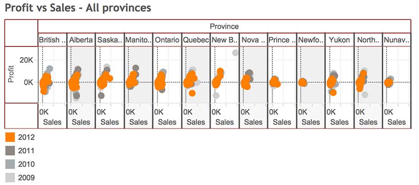
- • Before long, the visualizations become unreadable because Tableau has to shrink all those rows and columns to fit on screen, as in the illustration at the top of this post.
For example, using Tableau’s superstore sales dataset, when Sales, Profit and Order quantity are dragged to the Rows shelf, the resulting line graphs are displayed in three rows, rather than all on the same graph with a common y-axis scale.

Possible solutions
In today’s class we covered a number of strategies for increasing the dimensionality of Tableau visualizations and avoiding the problem above.
Measure Values (what’s that mean and where did it come from?)
Use the Measure Values and Measure Names, two Calculated Fields that Tableau automatically generates when it connects to a data set. Think of Measure Values as being all the Measure variables grouped together.
- Instead of dragging individual Measures (i.e. variables) to the Rows shelf, drag Measure Values there.
- The Measure Values Card automatically opens, listing all the Measures.
- The visualization will look wierd until you drag the SUM(Number of Records) Measure out.
- Continue deleting any Measures you don’t want in the viz by dragging them to the side or right clicking on the Measure and selecting Remove (from the Measure Values card, not the original Measures list on the far left).
- Tableau automatically throws a Measure Names pill into the Marks Card. Think of Measure Names as being the names of all the Measures, grouped together. Drag it onto colour in order to create a colour legend.


Blending axes
Another way to do pretty much the same thing:
- Drag one Measure, such as Sales to the Rows Shelf and Order Date to the Columns Shelf.
- Instead of dragging other Measures to the Rows Shelf, drag them one at a time to the y-axis of the viz. Tableau automatically places Measure Values on the Rows Shelf and opens the Measure Values Card, creating the same end result as the example above.

Dual axes
A third way to combine variables is to create a Dual Axis viz. But this only works for a maximum of two variables.
- Drag Sales and Profit to the Rows Shelf, as before.
- Drag Order Date to the Columns Shelf, as before.
- Right click on the second pill on the Rows Shelf and choose Dual Axis from the menu. This creates a single viz with two line graphs. The Sales and Profit pills now look like they are joined together in the centre, indicating that they are Dual Axis.
- The problem is that the two y-axes are not calibrated the same. It is necessary to right click on the second y-axis and select Synchonize Axis.
- The appearance of each Measure (Sales and Profit) can be controlled from its own Marks Card. For example, selecting the SUM(Sales) Card will expand it. From there, you can select another graph type, such as Bars, from the menu.
- Drag Product Category to Colour to turn the Sales Bars into Stacked Bars.


Perception and cognition
The theory part of the class covered concepts of perception and cognition, and how they inform basic visualization design decisions. You can read about it here.
Here’s the Week Three – Perception & cognition slides.
DataViz in 6 Weeks is my blog about teaching Introduction to Visual Analytics at OCAD University in Toronto. Comments, follows and shares welcome. #DataVizInSixWeeks
Anne Stevens I am a multidisciplinary designer working in data visualization, interaction design, innovation and critical design. I am particularly interested in non-screen based physical representations of data and tangible user interfaces.
]]>