Tableau tutorial #2: Hierarchy, Calculated Fields

For many Tableau beginners, making high density, interactive visualizations can be a challenge.
Tableau woes – Part 1 addressed this challenge with three strategies for combining data variables into a single display rather than plotting them in individual rows and columns (Tableau’s default mode, that makes direct comparison difficult to impossible):
- Measure Values
- Blending Axes
- Dual Axes
This post will explain two more tools that can be used to add data density to a Tableau viz and give it a bit more interactivity.
- Create Calculated Field
- Hierarchy
As with the previous post, I’m using Tableau’s superstore sales dataset.

Where we left off in the previous post
Create Calculated Field
Starting where we left off in Tableau Woes – Part 1, what if you had created the viz above, but wanted to compare sales in one province, say Quebec, to national sales. If you tried to filter by province, Tableau would apply the filter all the Dimensions and Measures in the display and the end result would be a comparison of Quebec sales to Quebec sales, which is not useful.
The solution is to use Create Calculated Field. CCF is one of Tableau’s real strengths. It allows the user to create new Measures and Dimensions that were not in the original dataset, directly from inside Tableau and on the fly. With it, you can avoid having to back out of Tableau, revise the original Excel file, re-connect to Tableau and start all over again. Here’s an example:
- Again, starting where we left off in the previous blog post, go to the Analysis pull down menu and select Create Calculated Field.
- In the Calculated Field dialog box, give the CF a Name at the top, such as Quebec Sales.
- Construct a Formula in the box below. In this case, we need a classic If This Then That logic function to be applied to each row in the dataset that goes like this: if the province is Quebec, then use the Sales value, else use a value of zero. In Tableau syntax, this looks like so:
- IIF ( [Province] = ‘Quebec’, [Sales], 0)
- You could simply type the function into the Formula box, but it is better practice to double click on the actual Dimension, Measure and Function names in the lists below and let Tableau add the necessary brackets and get the exact spelling.
- After closing the CCF dialog, a new measure called Quebec Sales will appear in the Measures list, from where it can be used to build a visualization like any other Measure or Dimension. You can tell it is a CF because of the little asterisk added to the symbol to the left of the Dimension name.
- Remove Profits from the Rows shelf and move Quebec Sales there instead. Then right click on Quebec Sales and select Dual Axis. Finally, right click on the Quebec Sales axis and select Synchronize Axes. (See Tableau Woes – Part 1 for more detailed instructions re. these steps. ) Now the display shows Quebec sales in one colour and national sales in another, making comparison and analysis possible.
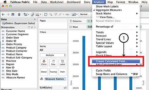


Tableau Parameters are another tool for controlling what is displayed. Parameters also make use of the Create Calculated Field function.
Hierarchy
The Hierarchy tool can also add interaction and dimensionality to a visualization, making it possible to drill down into detail or aggregate back up to bigger buckets. Here’s how it works:
- On a new worksheet, drag Product Sub-Category on top of Product Category in the Dimensions menu.
- Give the Hierarchy a name, such as Product Hierarchy in the dialog box and click OK.
- A new Dimension called Product Hierarchy will be listed in the Dimensions menu with Product Category and Product Sub-category listed under it.
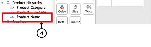
- To add Product Name simply drag it directly into the same Hierarchy.
- Do the same with Customer Segment and Customer Name, and even Region and Province.
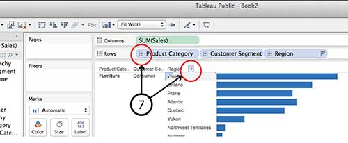
- Now the new Hierarchy pills can be dragged to the Row and Column shelves in the same way that any individual Dimension or Measure can be. For example, drag Product Hierarchy, Customer Hierarchy and Region Hierarchy to the Rows shelf and Sales to the Columns shelf and choose Horizontal Bar Graph type.
- You can drill down into any of the Hierarchy pills on the Row shelf by clicking the small Plus sign beside the pill name or the Plus symbol that appears when you hover over the Product Category, Customer Segment or Region axis lables in the visualization. Similarly, once you have drilled down a level from, say, Region to Province, you can click on the little Minus sign on the Region pill or the Minus sign on the Region axis.


It is worth noting that Hierarchy isn’t equally interactive for all viz types in dashboard view. A treemap, for example, doesn’t have any axes and I found it impossible to find a Plus or Minus sign to click. I imagine the same goes for a Bubble chart. If anyone has a solution for this problem, I’m all ears.
DataViz in 6 Weeks is my blog about teaching Introduction to Visual Analytics at OCAD University in Toronto. Comments, follows and shares welcome. #DataVizInSixWeeks
Anne Stevens I am a multidisciplinary designer working in data visualization, interaction design, innovation and critical design. I am particularly interested in non-screen based physical representations of data and tangible user interfaces.