Tableau tutorial #3 – filters and parameters
In visual analytics, data interaction can be as important data visualization. This tutorial is about adding interactivity to Tableau visualizations, specifically using Filters and Parameters.
Filters
Filters, you guessed it, let you filter data. In Tableau, they can be either static or interactive. An example of a static filter would be a condition that was set in worksheet mode to display a certain subset of the total data (eg. only sales for certain provinces, or certain product categories). Static filters can be revised in the worksheet by going back to the original filter dialog, but can’t be changed in dashboard mode or from Tableau Public. In other words, they are not interactive by default. You can make them interactive, however, by choosing Show Quick Filter to add a filter list to the worksheet and dashboard.
Parameters
Parameters are commonly used to create additional types of interactive filters, but they are not, in themselves, filters. Rather, they are variables. As such, they aren’t really useful on their own; they have to be part of something else, such as an equation, a filter, a reference line, a calculated field, or what Tableau calls parameter controls (sliders, selection menus and type-in fields).
Like filters, parameters can be either static or interactive. An example of a static parameter would be a fixed sales target that is used in a bar graph to colour sales numbers that meet the target one colour, and those that don’t, another. An example of an interactive parameter would be a parameter control slider on the dashboard that lets the user adjust the sales target up or down and see the resulting colour change in the visualization.
As an interaction designer, I think of sliders, selection menus and type-in fields in terms of interaction. Tableau, on the other hand, is more concerned with the underlying math, formulas and analysis. As a result, the workflow in Tableau for creating interactivity starts with the parameters and calculated field formulas first, and adds the interactive feature to the UI last. Secondly, interactive features are called “Parameter Controls”, suggesting that you are interacting with the underlying formula more so than the visualization itself.
Personally, I find Tableau’s workflow is a bit counter intuitive. Here’s how I would do it: add an Interactions Card to the standard worksheet UI. Populate the card with icons for sliders, selection menus, radio buttons, toggle switches, zoom tools, selection tools, reference lines etc. This way, the user can simply drag an interaction icon to a visualization, or drag a measure or dimension to the interaction icon first; and then establish the parameters of the tool second. I feel like this drag and drop approach would be intuitive and still consistent with Tableau’s other workflows. Anyway, that’s my two cents’, for what it’s worth.)
Tutorial
The following examples illustrate different ways to use Filters and Parameters. Once again, I’m using the SuperstoreSales data found here
. Open a new worksheet tab for the first two examples because we’ll come back to them in the second half of the tutorial.
Filters
Probably the most familiar and straightforward filter type is the simple filter.
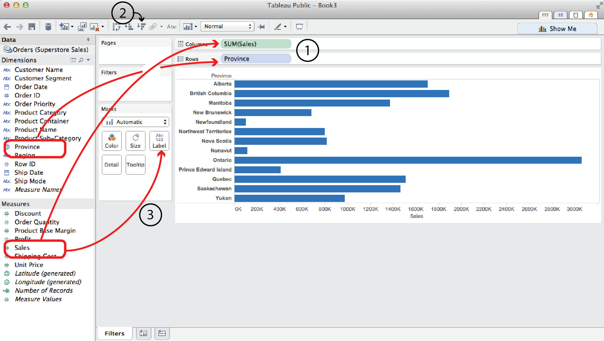
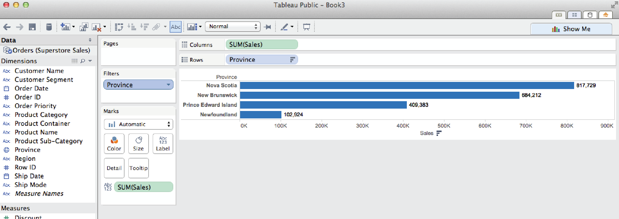
- Say you wanted to look at Sales by Province. You would drag Sales to the Columns shelf and Province to the Rows shelf.
- To sort them biggest to smallest, click on a Quick Sort button.
- To add Sales labels to the bars, drag Sales from the Measures list (not the Columns shelf) to Label in the Marks card.
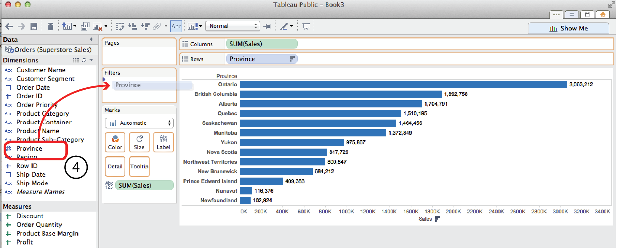
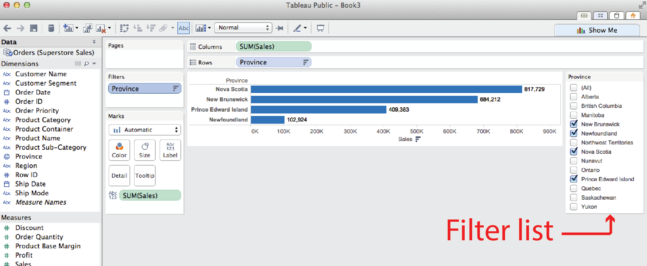
- Now if you wanted to filter the results to only show the Maritime Provinces, you could drag Province from the Dimensions menu to the Filters card to open the Filters dialog.
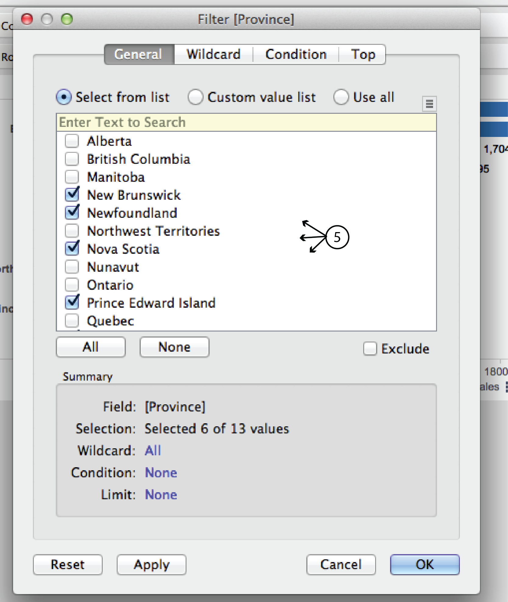
- In the General tab of the dialog, uncheck the non Maritime provinces and click OK. The result is just the four Maritime provinces. Pretty straight forward.
Filter by top (or bottom)
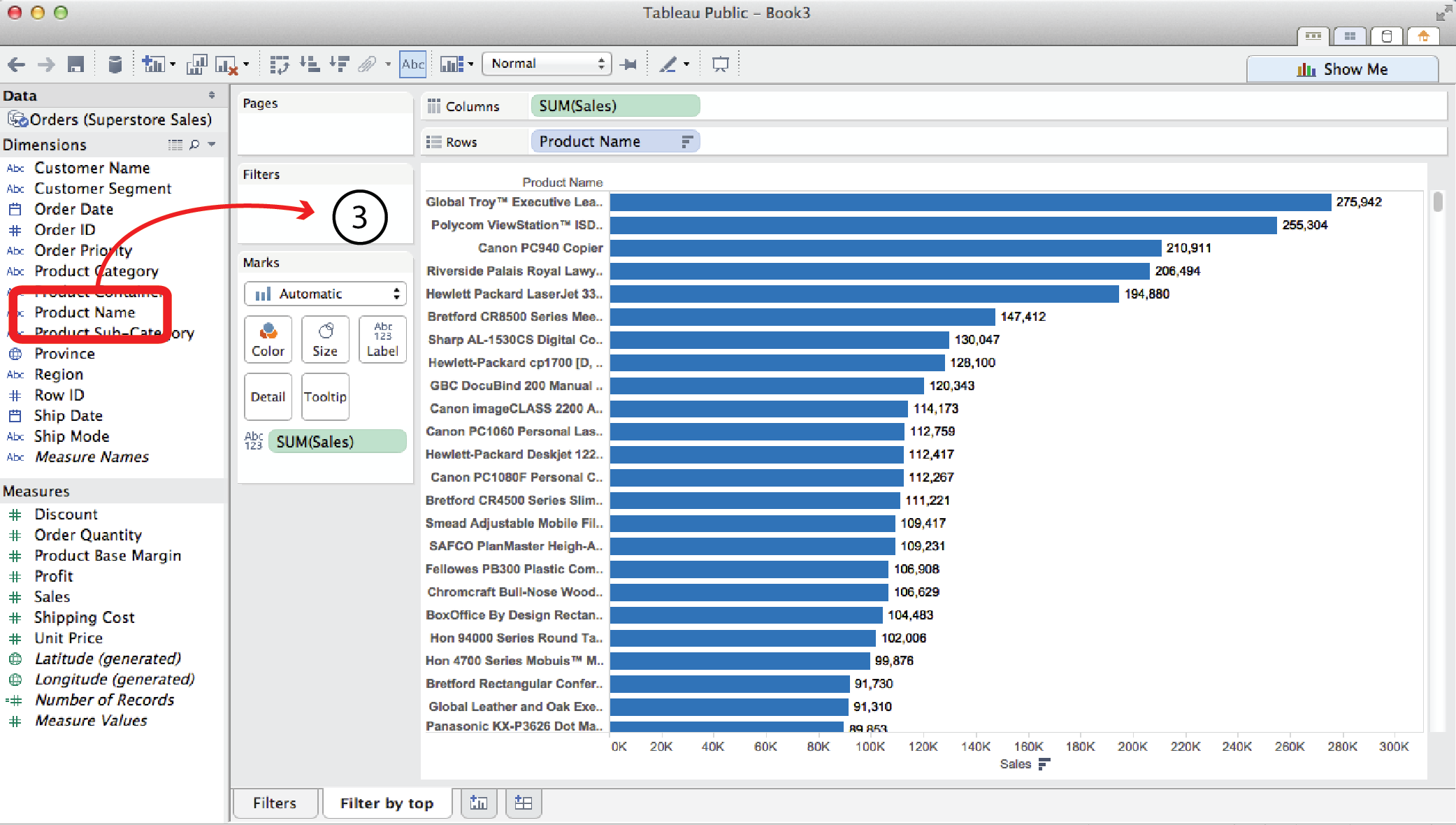
Open a new worksheet tab. Say you wanted to look at Sales for every individual product the Superstore sells.
- You could drag Sales to the Columns shelf and Product Name to the Rows shelf. This would produce a horizontal bar chart with over a thousand bars, which is pretty unwieldy.
- Clicking the Sort Descending button and dragging Sales to the Label Card, as in the previous example, helps clarify things but, nevertheless, the chart is pretty long and unweildy.
- Often in visual analytics, you are most interested in what is happening at the extreme conditions, moreso than the middle. This is where Filter by Top (or Bottom) comes in handy. It might be useful to just look at the top (or bottom) 15 sellers. To do so, Drag Product Name from the Dimensions menu to the Filters card. Again, this opens the Filter dialog.
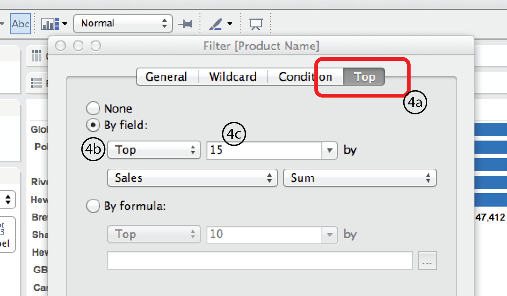
- Choose the Top tab at the top of the dialog. Select the By field radio button. Select Top or Bottom from the menu below it. Then enter 15 in the field to the right. For this example, we’ll leave Sales and Sum in the row below as is. But obviously, you could choose any other Measure (Profit, Discount, Shipping Date etc.) or measure type (average, minimum, median etc.) that you were interested in. Finally, click OK at the bottom.
Filter by top and condition
In a slightly more complex scenario, what if you wanted to look at the top 15 sellers in the Technology Product Category?
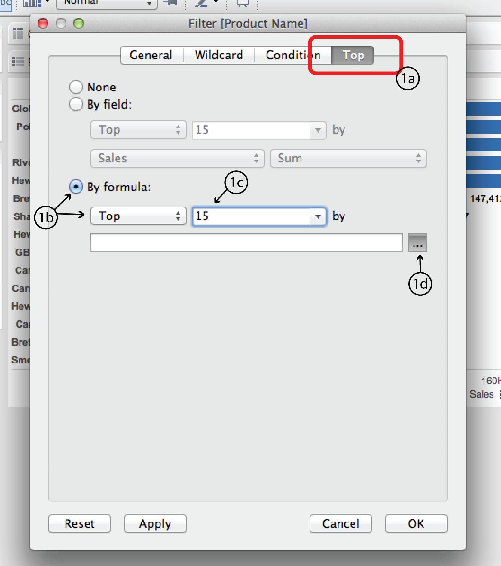
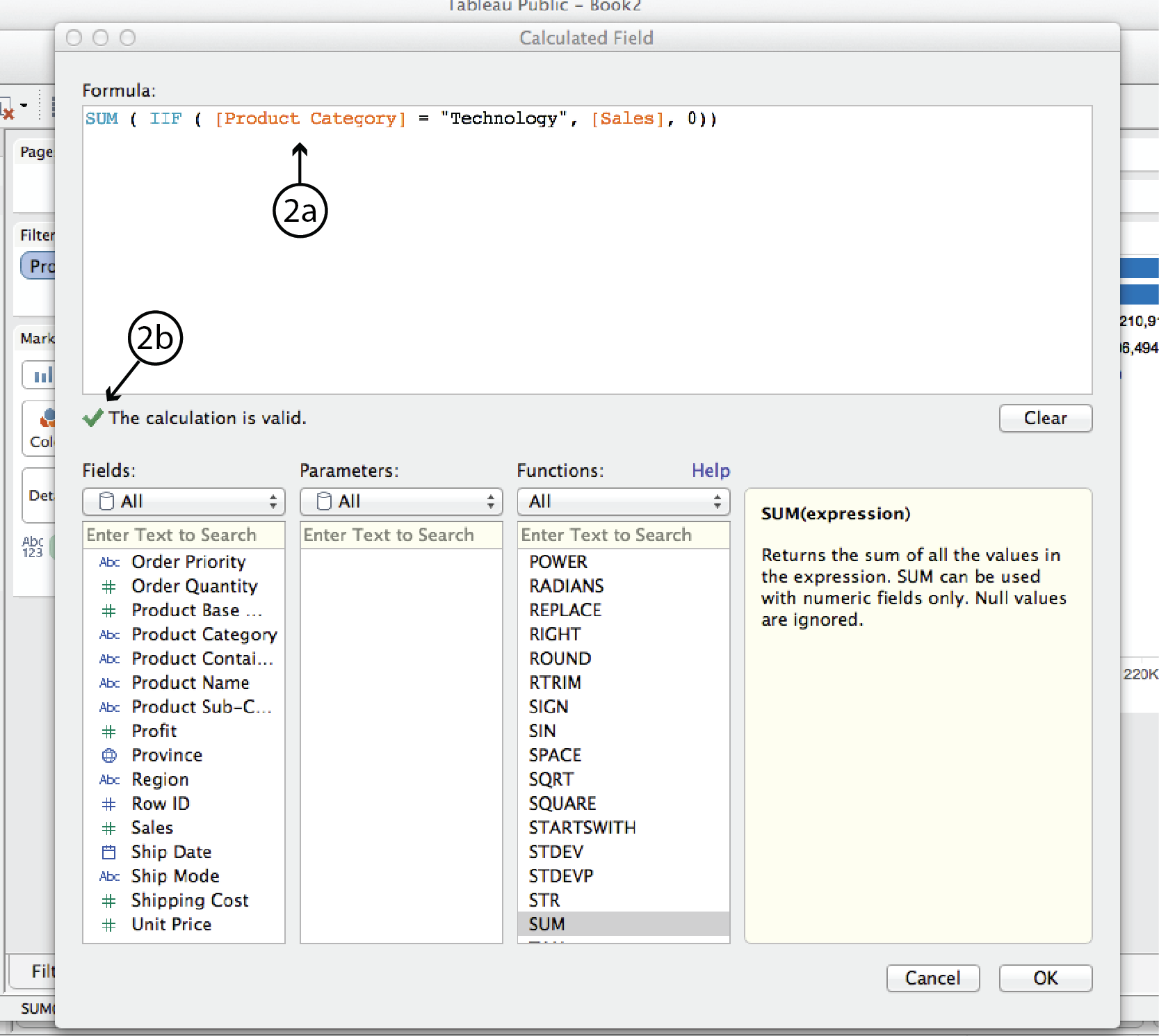
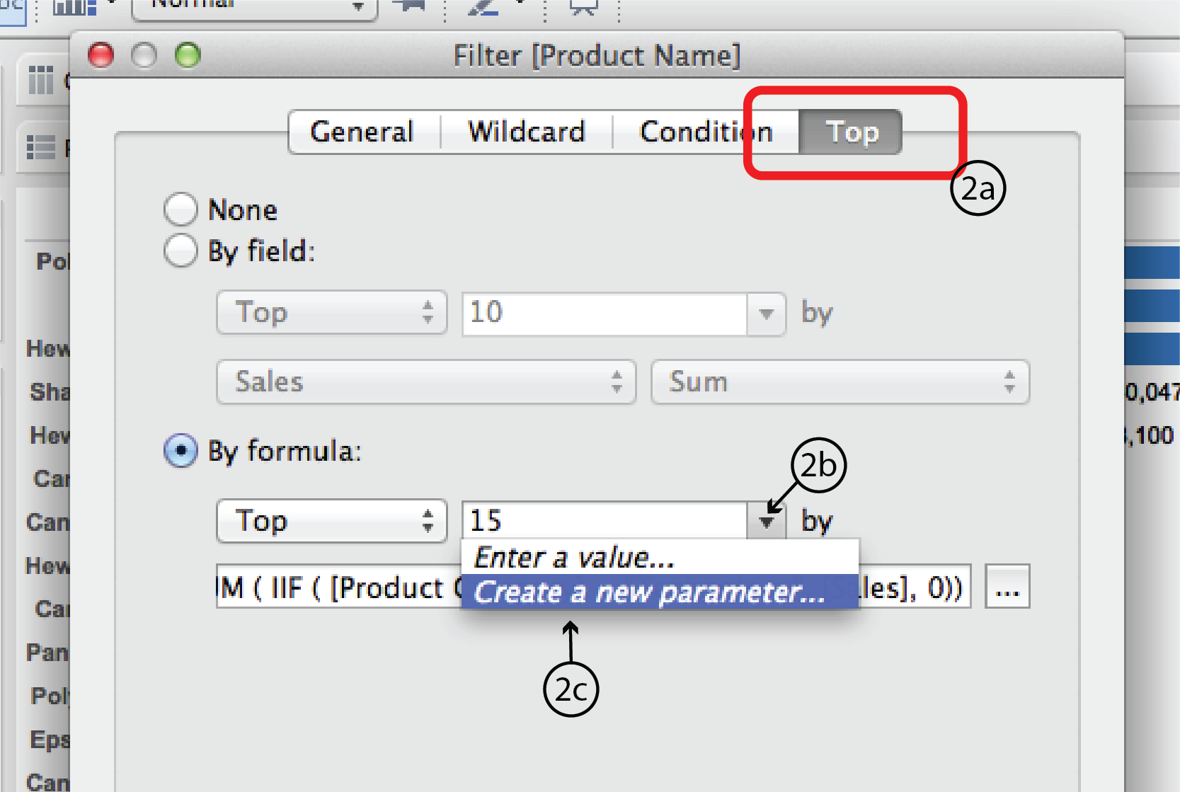
- Using the same worksheet as previously, right click on the Product Name filter and choose Filter to open the Filter dialog once again. As you did last time, open the Top tab. This time, select the By formula radio button. Choose Top from the Top/Bottom menu list below and enter 15 into the space to the right. If you are really good with Tableau Calculated Field syntax, you could enter a formula directly into the space below. The rest of us will click on the “…” button to the right to open the Calculated Field dialog.
- Enter tthe following formula in the space at the top. (Hint: double clicking on the Dimension and Measure names in the Fields menu simplifies typing in the different types of brackets.):
SUM( IIF ( [Product Category] = “Technology”, [Sales], 0 ))In plain english, this formula means: for each product order (i.e. row in the dataset), IF the product category is Technology, THEN add the Sales amount; if not, add zero. Tableau will confirm that your syntax is correct with a green check mark or tell you there’s something wrong with a red X. Assuming the syntax is correct, click Apply, then OK at the bottom of the CF dialog. Then click OK again at the bottom of the Filter dialog.
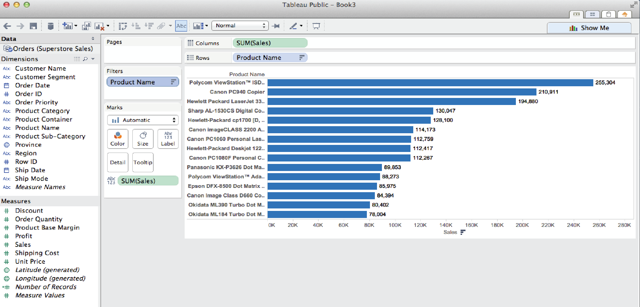
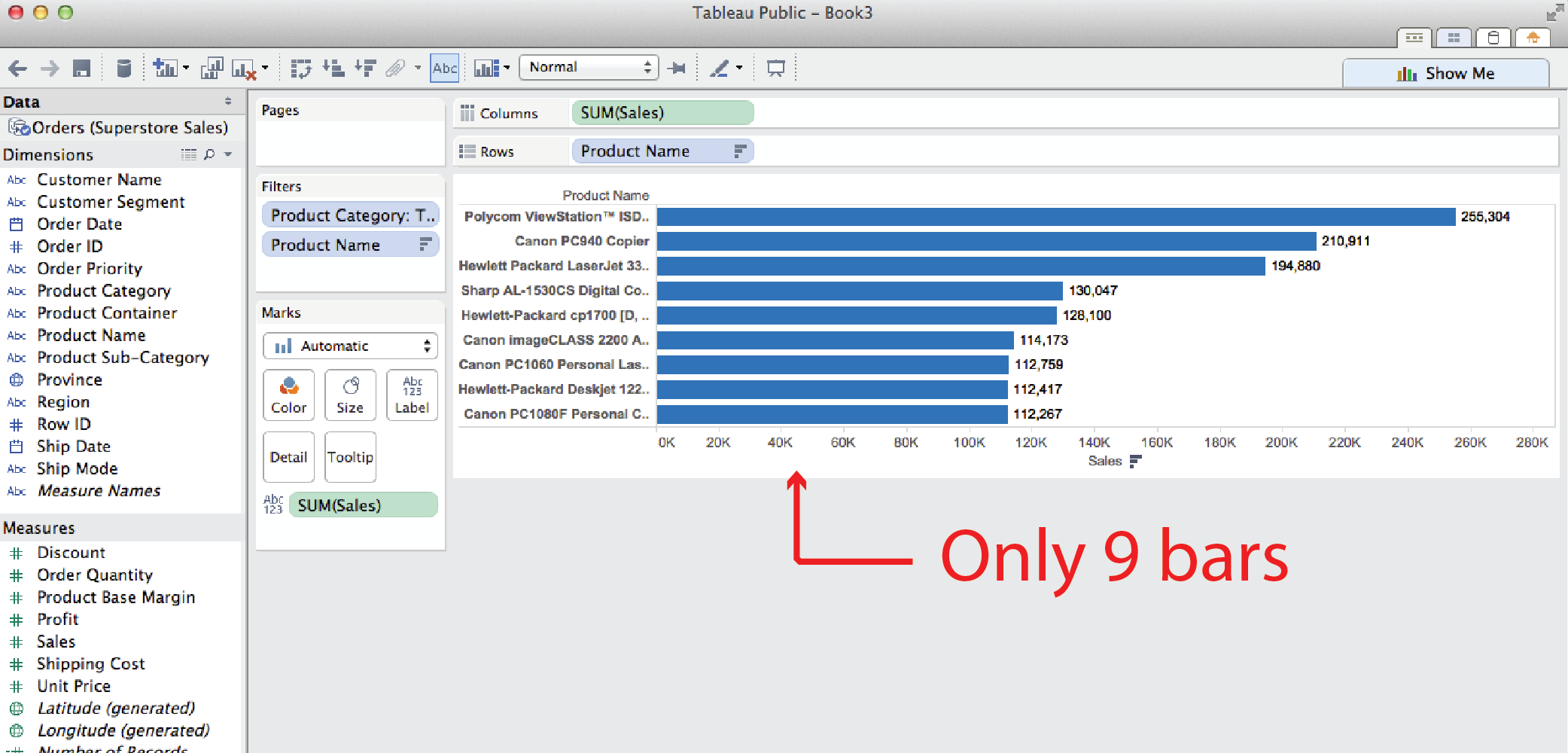
- Note: you might think that you could do the same thing more easily by filtering by Product Category first so that only Technology is displayed, and then using a second Filter by Top filter to display the top 15 sellers. But this method yields different results, as you can see below. It returns only nine products, even though we filtered for the top 15. The reason for this is that Tableau interprets two filters such as these to mean: display those products that are top 15 sellers AND in the technology product category. In other words, some of the other top sellers were in other categories and, therefore, were not displayed.
Parameters
The examples so far have used static filters (i.e. fixed, under the hood). They can be revised in a worksheet by reopening the Filters dialog and revising the filter, but they can not be adjusted or interacted with in a dashboard. The following examples illustrate how Parameters can be used to make them more interactive.
Add an interactive filter list
It doesn’t actually take a Parameter to make a filter list interactive. All you have to do is right click on the filter name in the Filters card and select Show Quick Filter. Tableau will add an interactive filter list to the worksheet.
Add a slider control
Using the Filter by top example, say you want to replace the fixed number of products to display (15) with a slider that lets user control how many top (or bottom) selling products to display. To do this you need to revise the original Product Name Filter from a fixed number (15) to a variable using a Parameter.
- Right click on the Product Name filter and choose Filter to open the filter dialog.
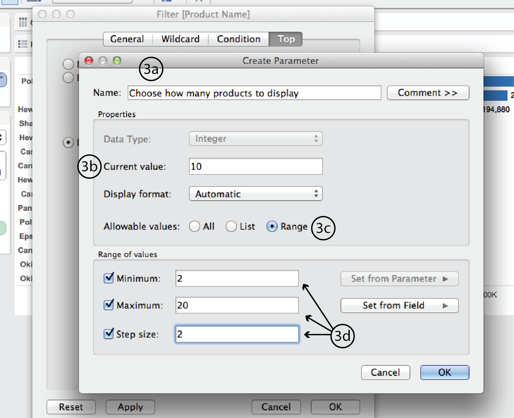
- Choose the Top tab and click on the little triangle to the right of the number 15 type-in field to expand the list of options. Select Create a New Parameter to open the Create Parameter dialog.
- In the Create Parameter dialog, enter a name such as “Choose how many products to display” at the top. Change Current value to 10. This will be the new default. Beside Allowable values, choose Range. Under Range of values, choose a minimum of 2, a maximum of 20 and a step size of 2. Then click Okay, and Okay again in the Filter dialog.
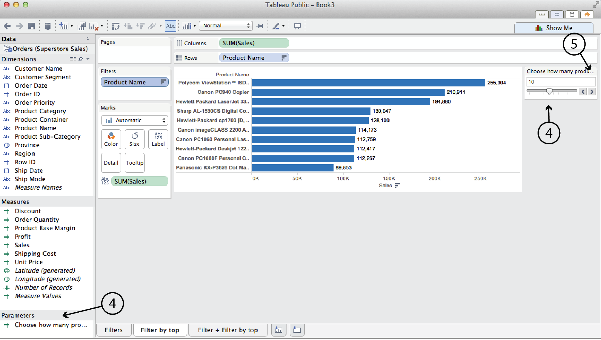
- In this case, Tableau automatically adds the slider into the worksheet. (It won’t always, though.) It also lists the Parameter in the left hand menu pane.
- You can click on the triangle in the top right corner of the parameter card to edit the title, parameter, slider etc.
Add a Reference line
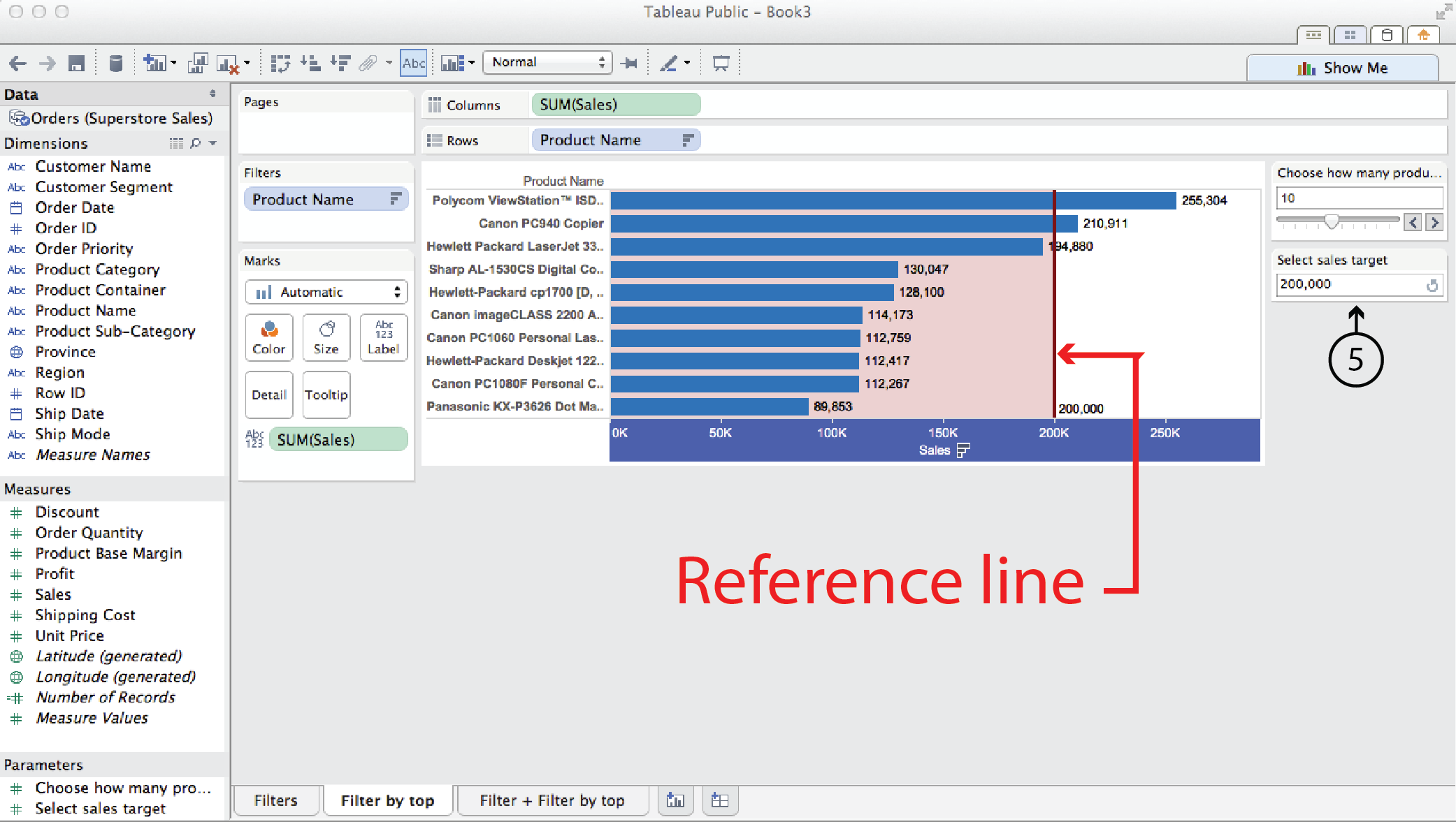
Use the same Filter by top technology sales example again. This time, say you wanted to add a Reference line that showed a sales target, and you wanted to make that reference line adjustable by the user.
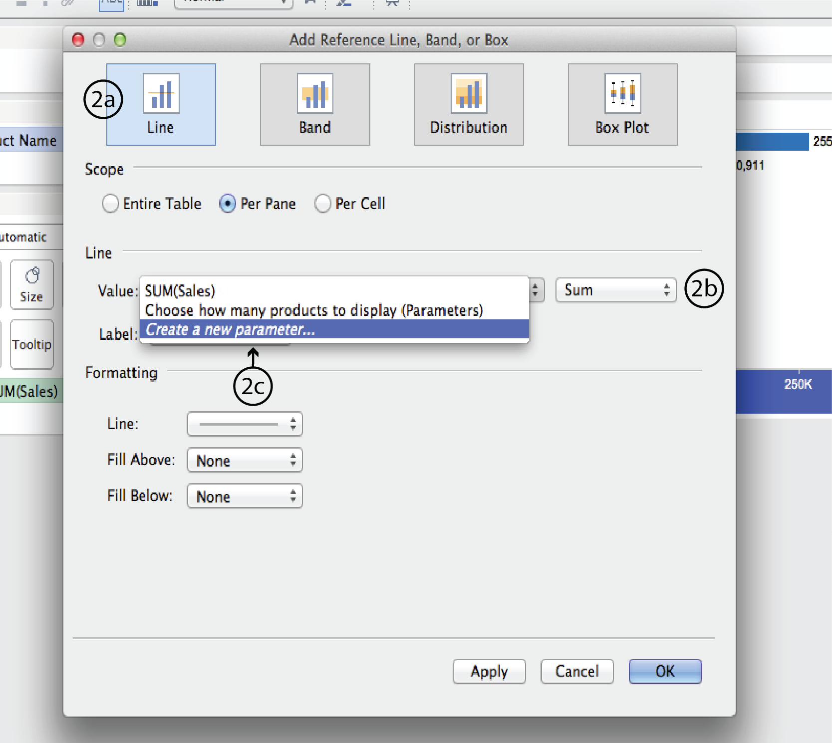
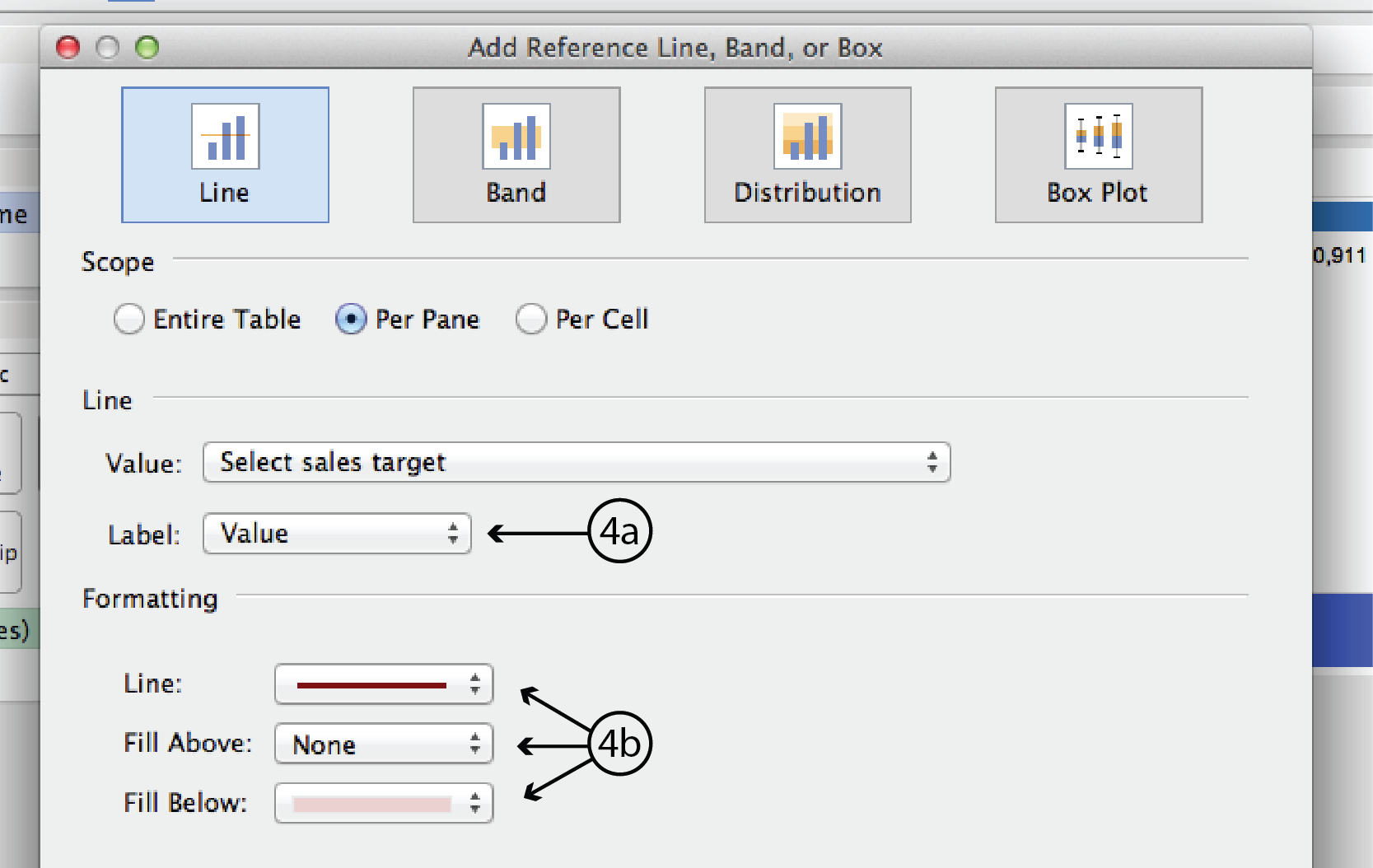
- Right click on the horizontal axis and select Add Reference Line, Band or Box. This opens the ARLBorB dialog.
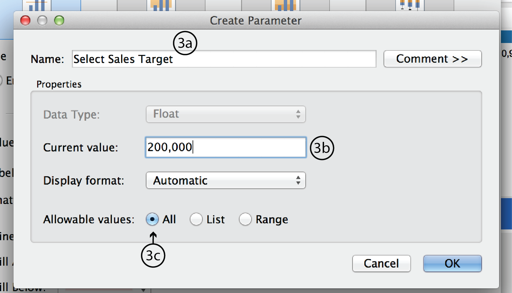
- In the ARLBorB dialog, choose Line type at the very top, if it isn’t already. Choose Sum rather than Average for the data type. Right click on the up/down arrows to the right of the Value field to expand the menu. Select Create a New Parameter to open the Create Paramete dialog.
- In the Parameter dialog, enter a name such as Select Sales Target. Make Current value 200,000; this will be the default. Leave Display format as Automatic and Allowable values as All. Click OK to close the dialog.
- Back in the ARLBorB dialog, change Label to Value. This refers to the reference line’s label in the visualization. Under Formatting, change Line colour and Fill as you see fit. When you are ready hit Apply, then OK, or just OK.
- Again, Tableau automatically adds a Parameter Control to the worksheet. This time, it is a type-in field and it can’t be changed to a slider.

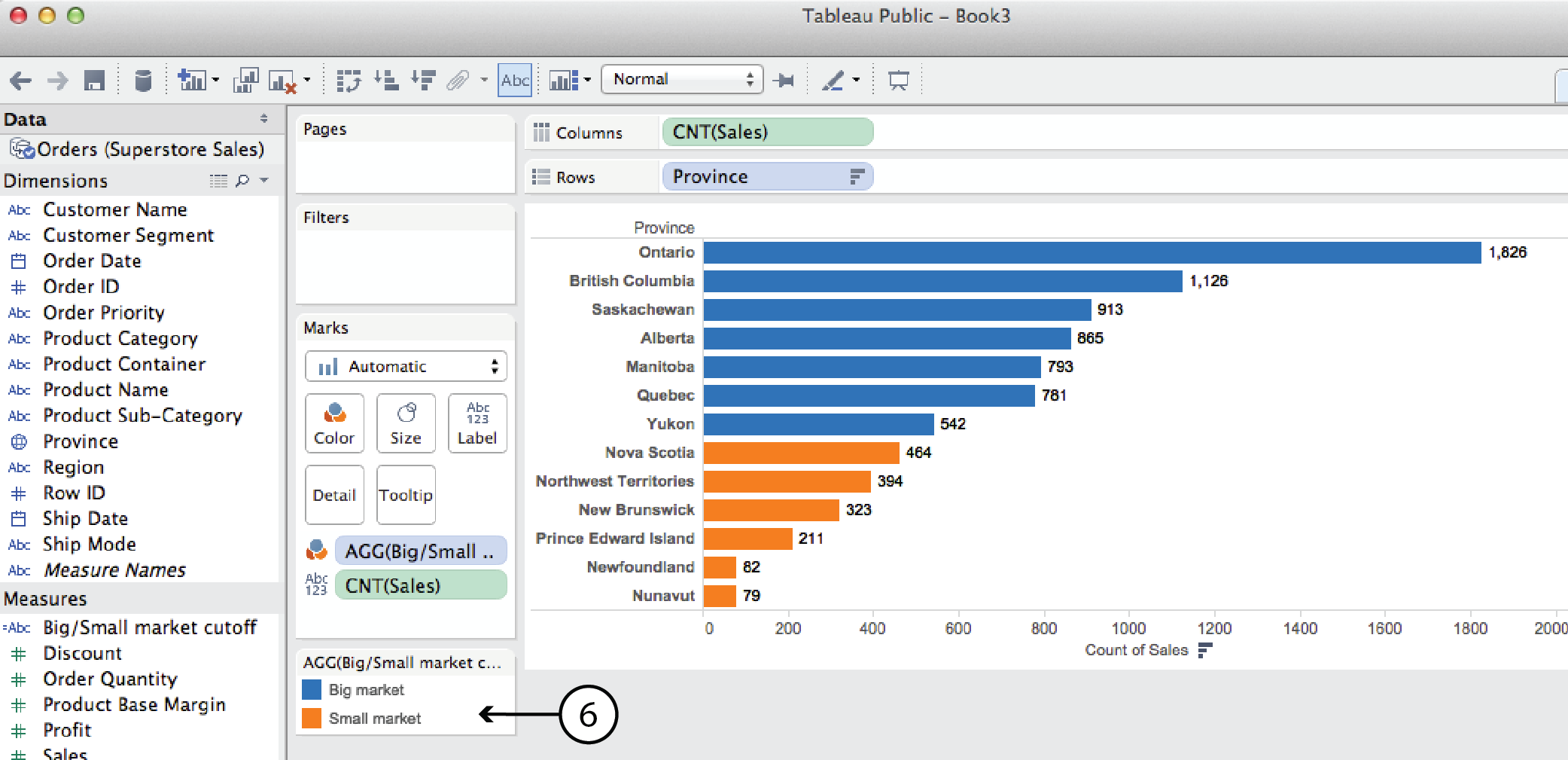
Parameter + CF (Big market/small market cutoff example)
A parameter can also be used in a calculated field. For example, say you wanted to look at Sales by Province and categorize the provincial markets as either big or small depending on the number of sales. Since the big market/small market designation is not part of the original dataset, we have to use a Calculated Field to create it. In this case, lets look at the number of sales orders, as opposed to either tthe order quantity (i.e. 50 pens or 10 desks) or the sales value (i.e. dollar value).
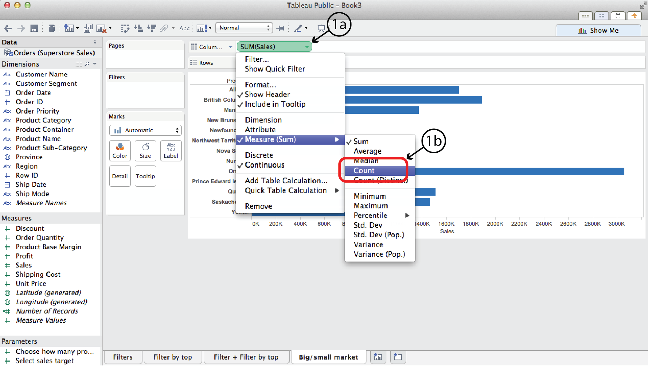
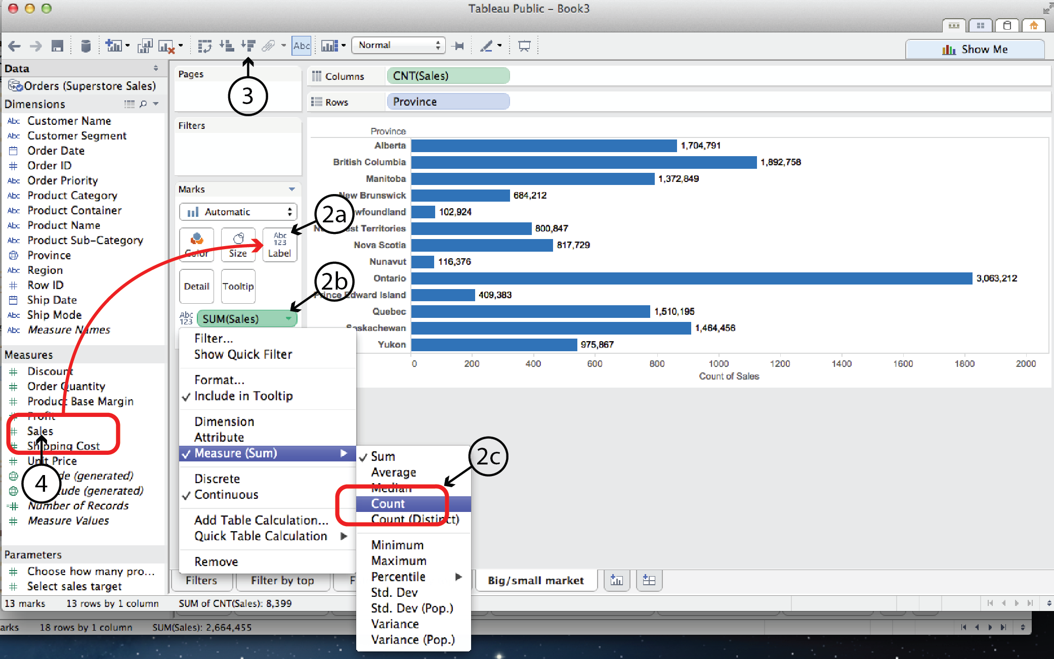
- Open a new worksheet and drag Province to the Rows shelf and Sales to the Columns shelf. Right click on Sales and select Measure to change the measure from Sum to Count, in order to count the number of sales rather than the sales value.
- Then, to add a label to the viz for the number of sales, drag Sales from the Measures list to Label on the Marks Card. As in step #1, right click on the Sales pill on the Marks card and select Measure to change the measure from Sum to Count.
- Select Sort Descending to sort the bars.
- First we’ll create a static big market/small market cutoff. Right click on Sales in the Measures list and select Creat Calculated Field, or select Create Calculated Field from the Analysis menu. Either way, the Calculated Field dialog opens.
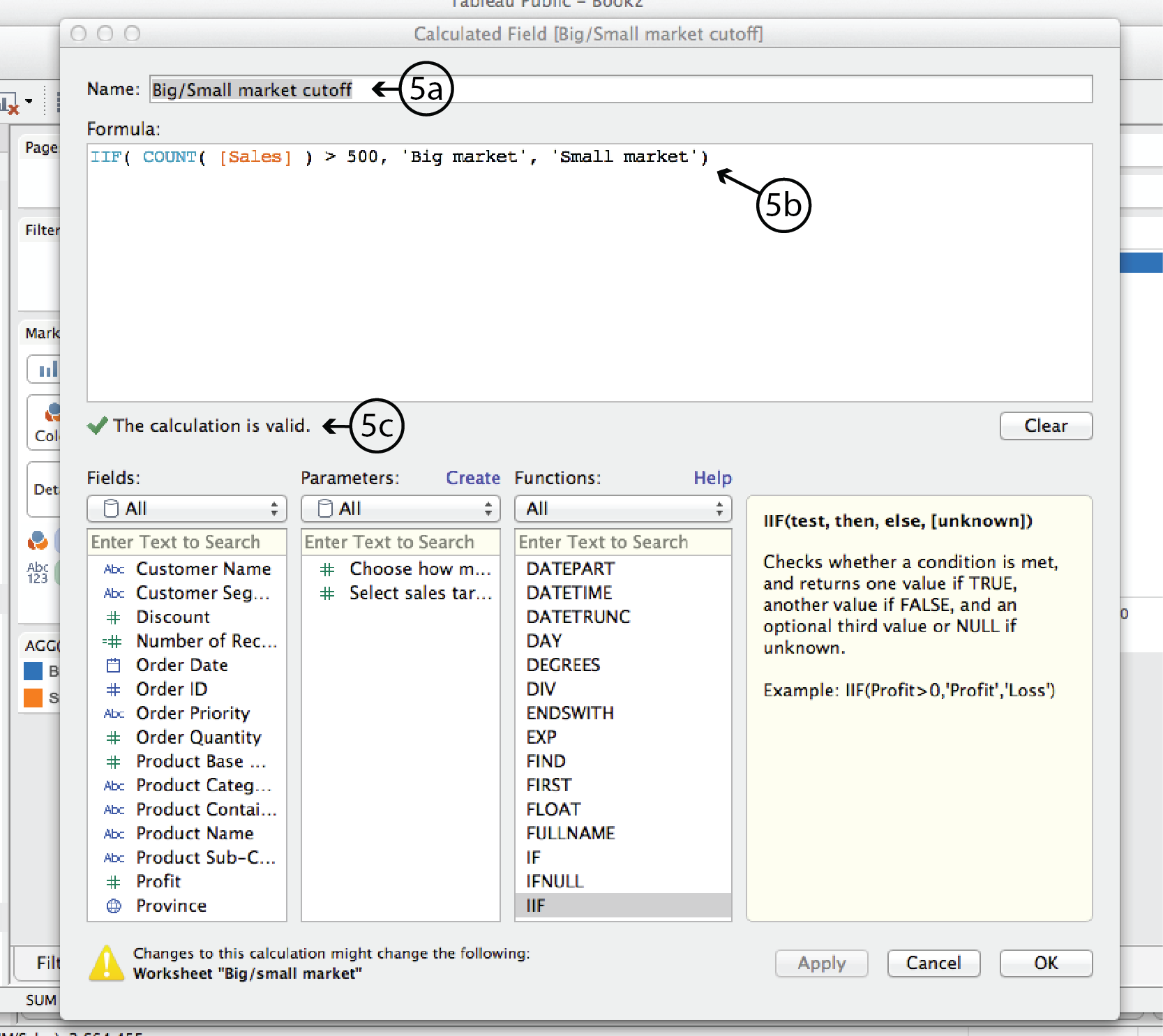
- In the CF dialog, add a Name at the top, such as Big/Small market cutoff. In the Formula window add the following formula:
IIF( COUNT( [Sales] ) > 500, ‘Big market’, ‘Small market’ )In plain english, this formula says is: IF the count (i.e. the number) of Sales is greater than 500, THEN it is a Big market, otherwise it is a Small market.
Tableau will verify that the formula syntax is correct with a green checkmark below the Formula window. Then click OK to close the dialog.
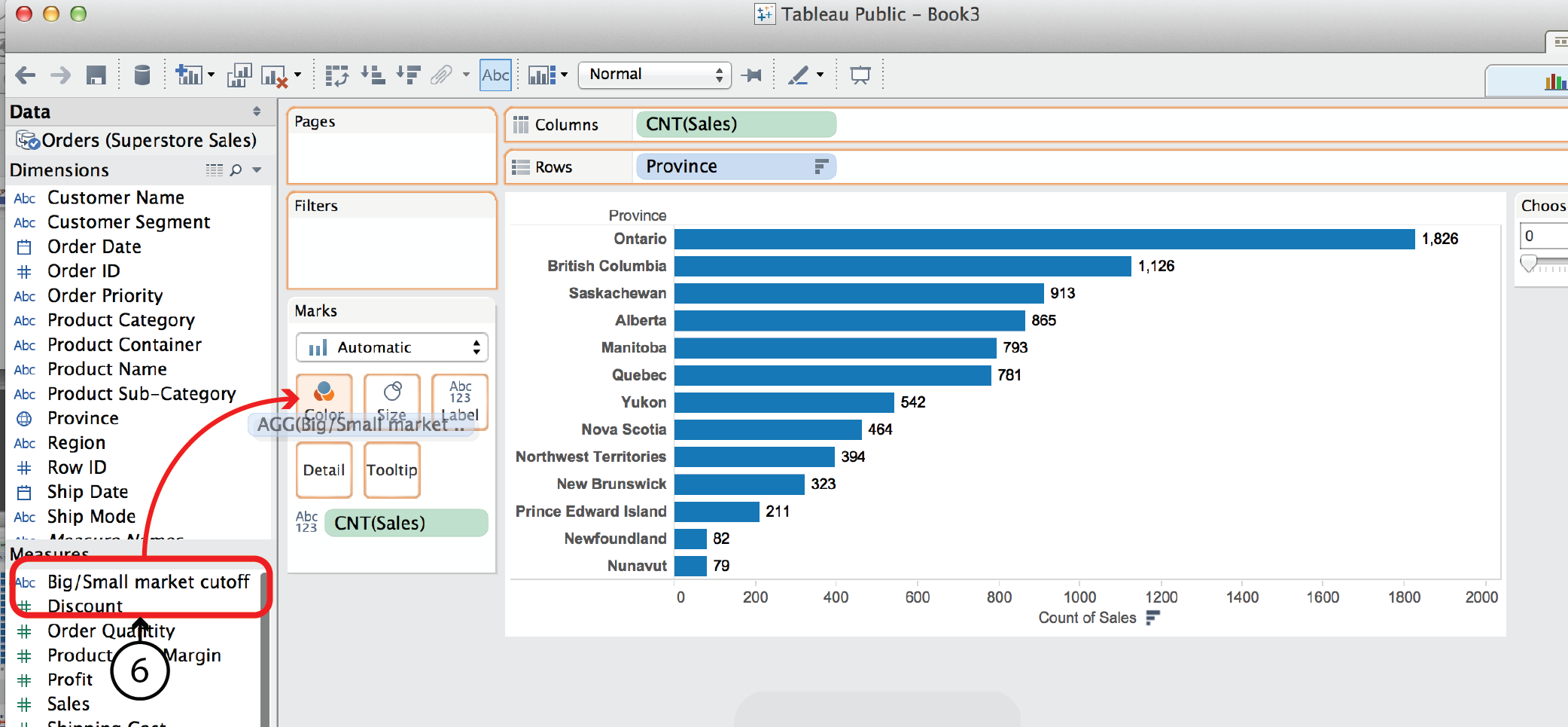
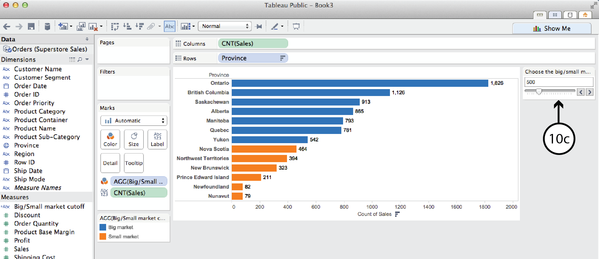
- The newly created Calculated Field is now listed at the top of the Measures list on the left. The small asterisk to the left of the name indicates that it is a CF. Now you can drag it ¬from there to Color on the Marks Card. Tableau will colour code the bar chart according to whether the province is a big or small market and add a colour legend.
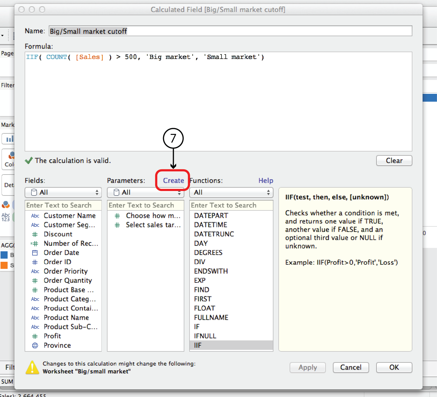
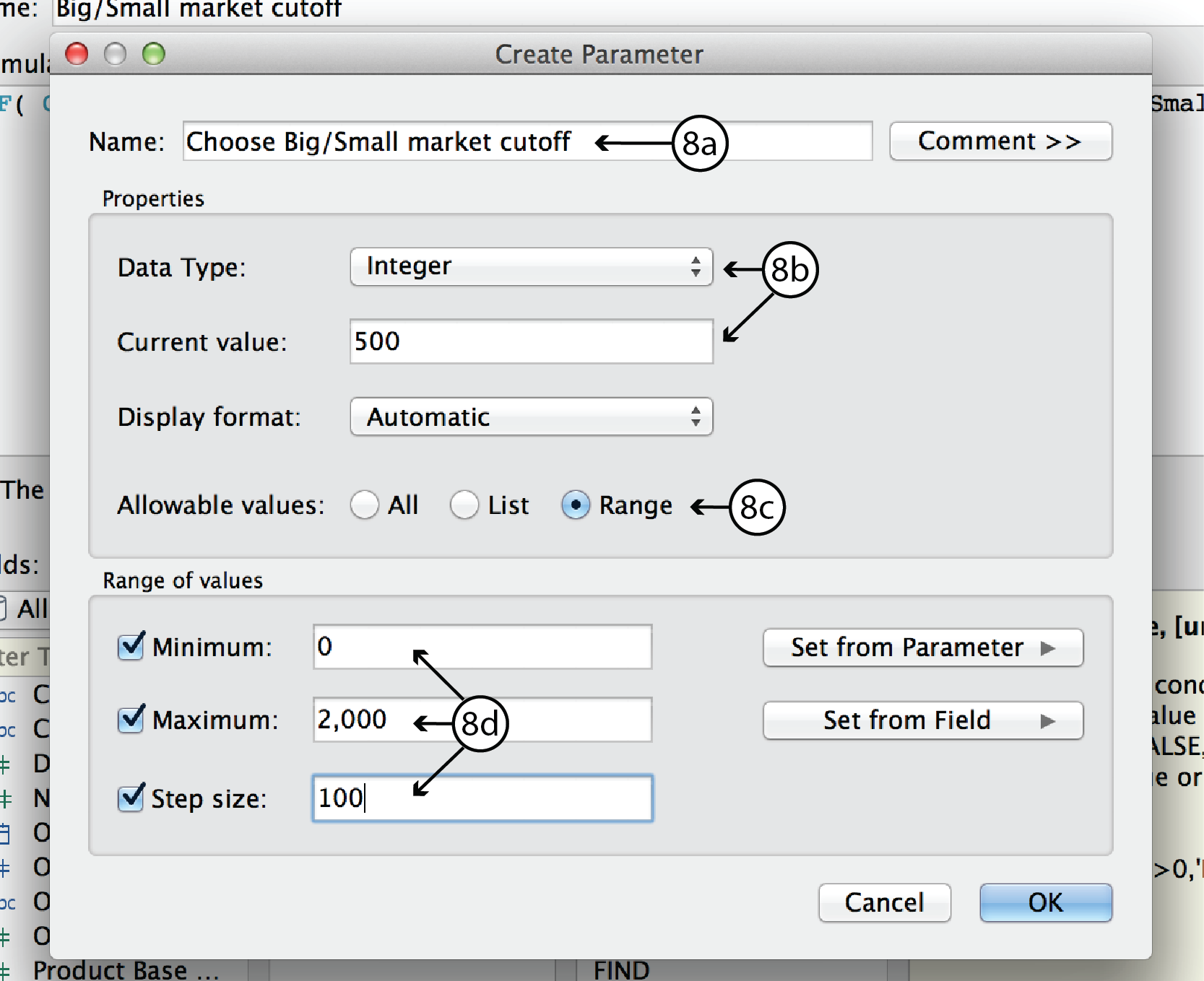
- In order to make the Big/Small market cutoff interactive, you have to first replace the number 500 in the CF with a parameter, and then add the parameter control to the worksheet. To do that, right click on the Big/Small market cuttoff CF in the Measures list and select Edit to open the CF dialog. At the top of the Parameters list, click Create to open the Create Parameter dialog.
- In the Create Parameter dialog, enter a name such as Choose Big/Small market cutoff. For Data Type, choose Integer. For Current Value, choose 500 or any other default value you want. Leave Display format as Automatic. For allowable values, choose Range. Since we know that the range of sales orders goes from roughly 0 to 2000, select Minimum and enter 0, select Maximum and enter 2000, and select Step Size and enter 100. Click Okay to return to the CF dialog.
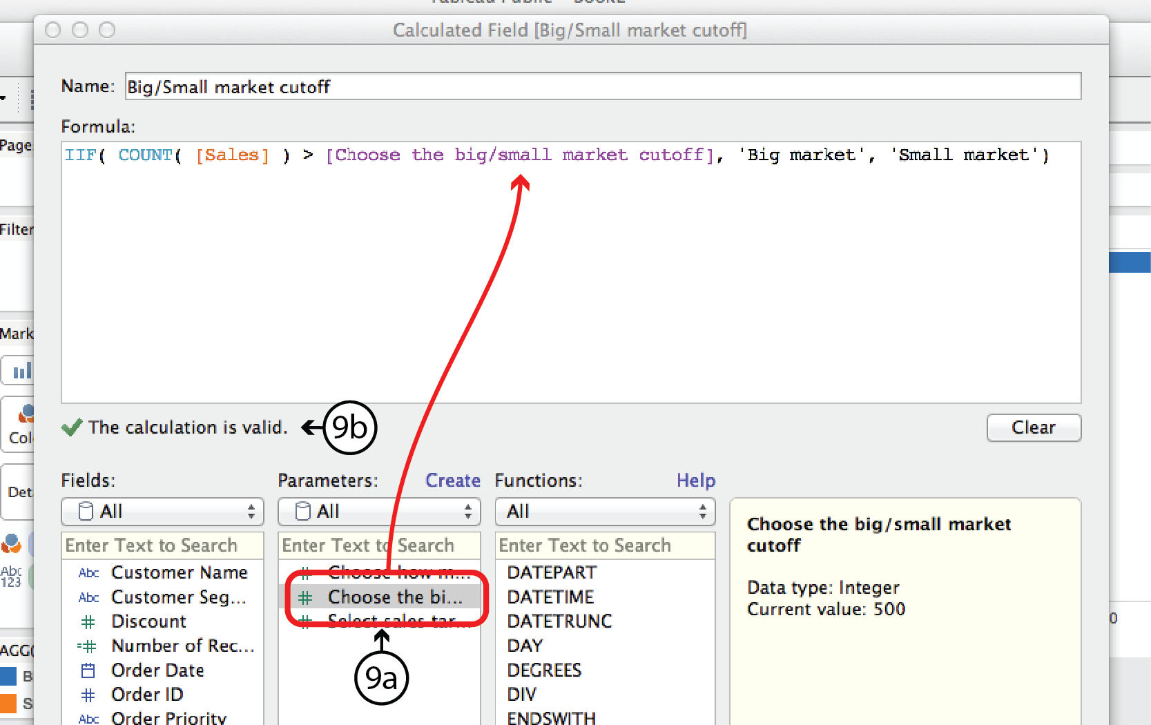
- In the CF dialog, you should see the new parameter listed in the Parameters list. Now you can replace the number 500 in the Formula with the parameter by highlighting 500 and then double clicking on the new Parameter. If all goes well, Tableau will confirm that the formula syntax is correct with another green checkmark. If so, click OK.
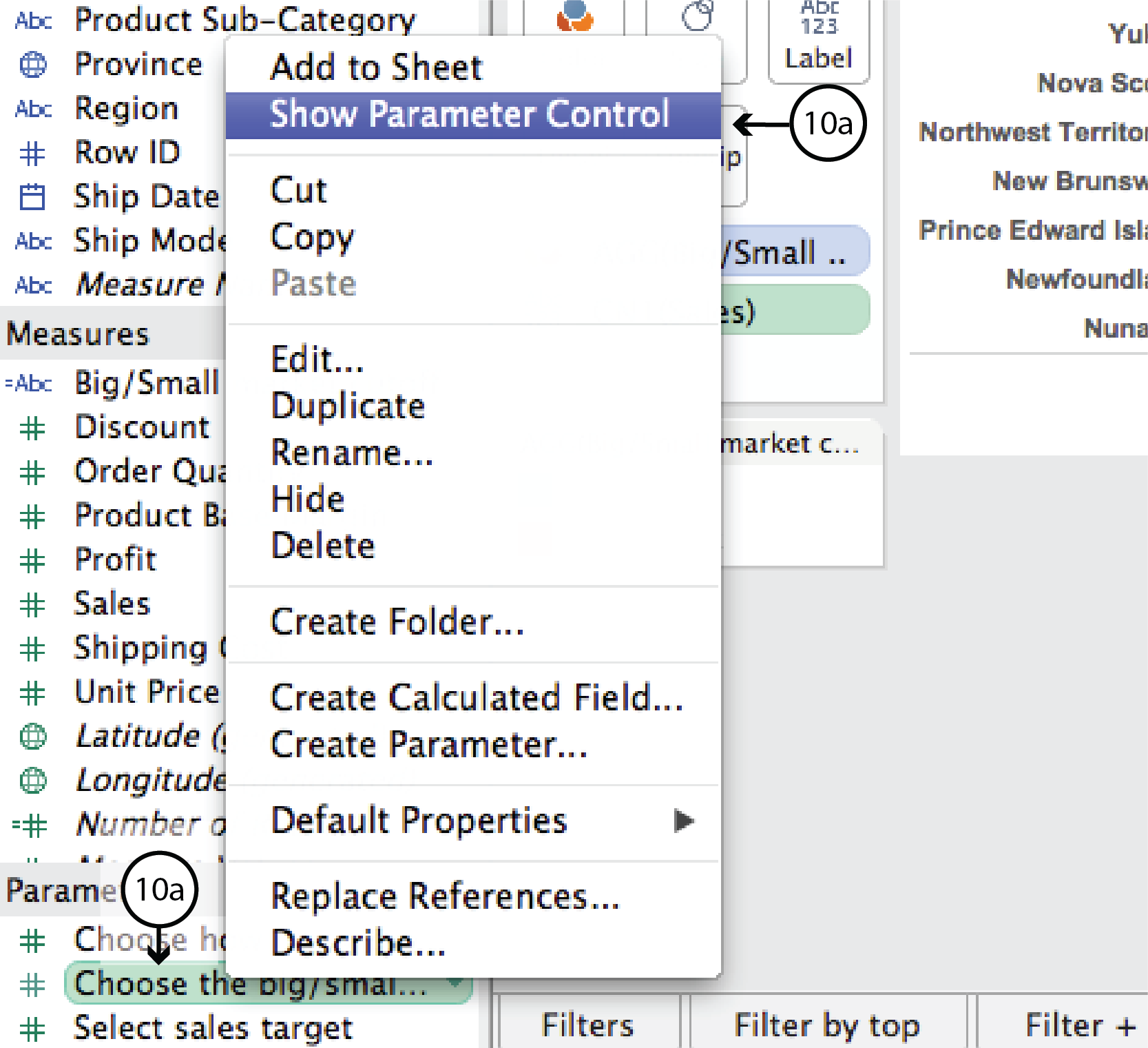
- The new Parameter is listed in the Parameters menu on the bottom left of the worksheet. This time, though, Tableau did not automatically add it to the worksheet. To add it, right click on the Parameter in the menu and select Show Parameter Control. This brings a combination Type-in and Slider Parameter control onto the worksheet that lets the user control where the big market/small market cutoff is.
DataViz in 6 Weeks is my blog about teaching Introduction to Visual Analytics at OCAD University in Toronto. Comments, follows and shares welcome. #DataVizInSixWeeks
Anne Stevens
I am a multidisciplinary designer working in data visualization, interaction design and innovation. I am particularly interested in non-screen based physical representations of data and tangible user interfaces.