Data Viz in 6 weeks. Wk 3: Perception & cognition

The Good, The Bad and the Ugly
This week’s icebreaker was The Good, The Bad and the Ugly. Working in groups, students picked apart sometimes strong but mostly weak InfoViz examples, such as:
-
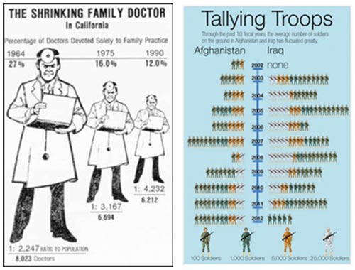
The Shrinking Family Doctor, that uses one symbol to represent three different variables and represents the closest in time as being the furthest away in perspective.
Tallying Troups, that maps quantity to colour.
Pie charts whose segments add up to more than 100%.
The unnecessary use of 3D or geographic base map information.
Perception and cognition – why bother?
- • If the intent of data visualization is to find patterns in data, communicate meaning, tell stories, augment cognition, complement perception, aid memory and help with decision making – all things that require our eyes and our brains – then it is useful to have a grasp of some basic principles of perception and cognition and be able to work with them, not against them.
- • In the process of designing an information visualization masterpiece, it is easy to become overly familiar with our own work the longer we work on it. We lose sight of the design’s weaknesses and over estimate its strengths. Concepts of perception and cognition give us objective tools to analyse our own work and improve the odds that the meaning being encoded in the visualization will actually be communicated and received as intended.
- • Computers are extremely good at some processing tasks: rapid number crunching, extreme precision, storing and recalling large volumes of data. The human brain is very good at others: lateral thinking, pattern recognition, creativity and working with fuzzy data. A good data visualization combines the processing power of both computer and human, leveraging the strengths of each complementarily.
I’m no pschologist
Three university degrees under my belt and somehow I’ve never taken Psych 101. Nevertheless, here’s what I’ve cobbled together about perception and cognition from various sources:
- • Myth: perception is a bottom-up process whereby information comes in through our senses and is then processed by the brain.
- • Myth: we are passive receivers of information about the outside world.
- • Myths: our eyes are like camera lenses and images on our retina are like photographs that capture everything within our field of vision, equally well.
- • Myth: our awareness of the outside world is continuous and seamless.
- • Reality: our brains have evolved a number of ways to function extremely efficiently. Our eyes and brains give us the sensation of seamless awareness of the external world despite functioning more like a just-in-time delivery system. If the brain hadn’t evolved this way, it would have to be the size of a beach ball to be able to continuously process all that sensory data and stimulation – not to mention taking care of everything else that it has to.
- • Reality: different parts of our brains work differently. Our primitive brain is fast and automatic. It does not rationalize; it reacts. It is very efficient, requiring little working memory, even to multitask. This is why we can drive stick shift, operating clutch, gas pedal, turn indicators and steering wheel at the same time, all the while holding a conversation and ignoring the radio in the background. By contrast, processing in the brain’s frontal lobes is much slower. It can involve logic, reflection, empathy, deliberate goal-setting and reading, but requires more working memory and is more single-task oriented than the automatic processing of the primitive brain.
- • Reality: perception and cognition are two-way streets, combining both bottom-up (incoming sensory data) and top-down (biases, past experience, assumptions) processing. Top-down processing is what Marshall McLuhan was referring to when he said, “I wouldn’t have seen it if I hadn’t believed it.”
- • Reality: not all perception is created equal. Preattentive perception is different than attentive perception.
Preattentive perception
It is often said that the human brain is a pattern recognition machine. I think of it more like a pattern addict. It just can’t stop finding patterns in things; can’t get enough of them. It does so before you can even think about it because it is part of the brain’s rapid and automatic primitive processing.
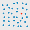
When I say: find the red circle in the diagram below, you’ve probably already seen it before you finished reading this sentence. That’s preattentive perception.
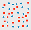
But when I say: find the red circle in the diagram below, you have to consciously search for it. That’s attentive perception. It takes more visual working memory, time and conscious effort. It involves more cognitive load.
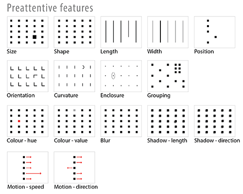
Preattentive features
Designers can take advantage of preattentive visual featues to communicate effectively and efficiently. Not all preattentive features, however, are created equal. Some have more impact than others.
Gestalt psychology
Gestalt psychology also sheds light on how our brains process visual information and construct objects out of the sea of sensory data. According to the Gestalt Law of Similarity, for example, we tend to group similar objects into larger wholes. It is easier for the brain to keep track of one large group than umpteen smaller objects. Other Gestalt Laws include Closure, Proximity, Symmetry, Continuity, Common Fate and Figure/Ground.
Paul Butler’s Visualizing Friendship (at the top of this post) is a great example of the preattentive perception and the Gestalt Laws of Closure and Figure/Ground applied to data visualization. We see a map of the world, even though the data provided is less than complete.

Paul Butler. “Visualizing Friendship”. Facebooks friends worldwide.
Jacques Bertin’s visual variables
In visualization design, a chart with one dimension of data is pretty easy. A multi-dimensional data visualization with different dimensions mapped to different visual features is trickier. To be succesful, it has to avoid interference and noise from preattentive features and Gestalt phenomena. This is where Jacques Bertin comes in.
Bertin’s 1967 Semiology of Graphics is a comprehensive theory of visual variables and the strengths and weaknesses of human perception applied to the graphic coding of map data. Equally relevant to data viz today, it is another example of the debt data viz owes to cartography.
Which brings me back to the examples from The Good, The Bad and The Ugly above:
- • The Shrinking Family Doctor uses one visual variable (size) to represent three different data variables, which is not possible.
- • Tallying Troops maps quantity to colour. It is hard to read because we don’t perceive different colours as bigger or smaller than each other. As a result, the viz requires a lot of hard mental work to understand the data. First, you have to count symbols, then refer to the legend and multiply by magnitude associated with a given colour, then remember that total as you repeat for each row.
Part 2, Tools: Tableau Public
The second half of each class is dedicated to hands-on work with different open source data viz tools. This week’s tool was Tableau Public
. In the time available, we only scratched the surface but the class found it pretty impressive.
Pros:
- • User-friendly
- • more designerly than Many Eyes
- • Dashboards
- • It embeds easily in a blog or website, preserving interactivity without the annoying Java warnings that plagued Many Eyes
- • Automatically generates latitude and longitude for place names
- • Additional measures (i.e. variables) that weren’t in the original dataset can be generated inside Tableau. I.e. it is not necesssary to back out of Tableau, to go back to the original dataset, revise, re-save and re-import it.
Cons:
- • One BIG shortcoming: why oh why is there still no version of Tableau for Mac? Hello!!
- • Also, like Many Eyes, nothing you do in Tableau Public is private – but, heh, that’s what you get for free, right.
Next week
Data viz design best practices
DataViz in 6 Weeks is my blog about teaching Introduction to Visual Analytics at OCAD University in Toronto. Comments, follows and shares welcome. #DataVizInSixWeeks
Anne Stevens I am a multidisciplinary designer working in data visualization, interaction design, innovation and critical design. I am particularly interested in non-screen based physical representations of data and tangible user interfaces.