Data Viz in 6 Weeks. Wk 2: Visualization Types
Icebreaker: Ripping Yarns
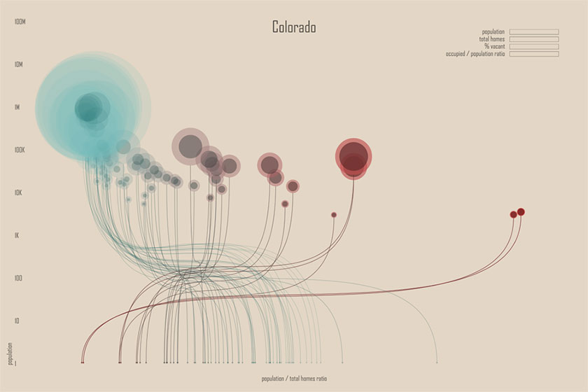
Before diving into the serious content below, the class was divided into groups and each group given an enigmatic or obscure visualization like the one below. In the absence of helpful labels, legends or other explanatory information, their challenge was to study the visualization, use their imagination, come up with their best ripping yarn to explain the meaning of the viz and then present it to the class. This led to some discussion about whether the viz could be classified ‘artsy’ because it didn’t properly label the axes (more on this below).
Part One – Visualization Types
When William Playfair published his bar chart of Scottish imports and exports in the 1780s (arguably the first use of the bar chart), he was limited to a static black and white image and print reproduction. Data visualization today is not so limited. Computers offer nuanced colour and rendering, interaction, zoom, filter, live data and massive processing power, and visualizations can be much richer and layered.
The challenge for designers is to understand the range of available visualization types and then be able to combine them to represent multi-faceted data or multiple data sets. To do that effectively, without just creating a lot of noise, they need a grasp of different visualization typologies and their strengths and weaknesses with respect to different data types. The first part of this week’s class was a survey of visualization types, starting with the basics (bars, lines, pies) and moving toward more complex forms.
• The basics: bar charts, histograms, lines, scatterplots and area graphs
• Pies and Coxcomb diagrams
• Networks and hierarchies: trees, icicle trees, sunray trees, matrices, node-link diagrams, network maps, treemaps
• Spatial structures: topgraphic maps, choropleth maps, graduated symbol maps, cartograms
• Temporal structures: timelines, flows, Sankey diagram, clocks, spirals
• Textual structures and data: wordle, word tree
• Multivariate data: Parallel coordinates, star plots, Coxcomb diagram, small multiples diagrams and matrices
Typically, new visualization types are developments on old ones. The treemap and the sparkline diagram that were popularized in the 1990s were variations on existing forms. If designers understand the full range of possibilities they can leverage the strengths of each, working with them rather than against them, to combine and create new multi dimensional data visualizations.
Which brings me back to the ‘artsy’ visualization from the beginning of class. It is a combination of basic forms (line, bar and scatterplot) but with a twist (two x-axes). The visualization is enigmatic; it doesn’t give everything away on the first glance. It doesn’t simply hand you an answer and then let you move on like a one dimensional bar chart. It makes you look twice and look closer. That is it’s power and that’s what I like it so much.
Here are a couple of useful sources for more information on visualization types:
• Jeffrey Heer’s A Tour through the Visualization Zoo
• infodesignpatterns.com
Part Two – tools: Many Eyes
The Many Eyes workshop in the 2nd half of class was nearly derailed by the need for additional Java updates and mysterious related security settings. The IT department was stumped for a while but, thankfully, had ten laptops up and running by break time, so all the students got to try Many Eyes with their own hands, even if they had to buddy up and share a computer. Failing that, we would have had to resort to a demo on my machine, which wouldn’t have been as satisfying.
The same Java issue seems to make it impractical to embed interactive ME visualizations in a website, though the ME documentation says it is doable. But, I wouldn’t want to include something in my blog that forced the reader to install an update because that’s the fastest way to make her move on to something else. If anyone has any suggestions regarding Java and ME, I’m all ears.
Next week: concepts of perception and cognition; Tableau Public workshop
DataViz in 6 Weeks is my blog about teaching Introduction to Visual Analytics at OCAD University in Toronto. Comments, follows and shares welcome. #DataVizInSixWeeks
Anne Stevens I am a multidisciplinary designer working in data visualization, interaction design, innovation and critical design. I am particularly interested in non-screen based physical representations of data and tangible user interfaces.