In long term care, caregiver networks can be diverse and extended, including various medical professionals, service providers and friends and family. How can data visualization tools help caregivers better understand longitudinal health data and make informed treatment decisions? How can networking tools improve collaboration and communication within the care network?
CCM addresses these problems with a tablet-based prototype that captures, structures, visualizes, aggregates and analyses both formal and informal health data. Formal data includes test results, medication levels etc.; informal data includes more qualitative and subjective information such as a caregiver’s opinion of a resident’s progress towards a particular care goal. CCM also visualizes caregiver networks and fosters collaboration and sharing within them. Tablet based and small enough to fit in a smock pocket, it suits the ambulatory and hands-on nature of healthcare and supports on-the-fly and multi-modal data collection, touch screen interaction, rich visual output and networked communication.
__
Field research
Ethnographic research helped us understand the unique needs and circumstances of the Clemente Ferreira CAIS long-term care hospital in Lins, Brazil, as well as its pain points:
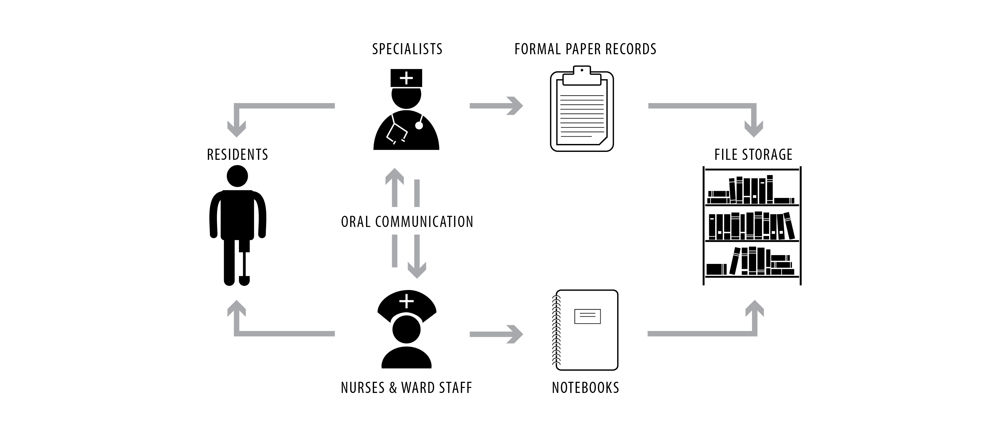
- • In long term care, patient change can be slow and non-linear. Caregivers can easily lose sight of change, patterns and trends.
- • A strong tradition of oral communications amongst caregivers, especially to share informal information not captured in the medical records.
- • Established paper based healthcare records compete with emerging mobile phone practices.
- • Caregiver concerns re. privacy and surveillance associated with the introduction of new technologies.
Scenario development
The first prototype, Metas da Marta (Marta’s Goals), was designed around a hypothetical resident named Marta (a child with a number of developmental disabilities) and her team of caregivers. Marta’s principal caregiver has decided that it is time for her to learn to tie her shoes. Marta’s various caregivers (physio therapist, occupational therapist, social worker, teacher and nurses) then propose ways they can each contribute to that goal based on their own skills, specializations and treatments. For example, the physiotherapist proposes flexibility treatments and balance exercises; the teacher proposes a story book, the nurse offers practice sessions and encouragement. Each one uses the tablet based tool to join in and record their treatments and observations related to the goal using the all its various affordances (downloads, camera, video, voice recording, text, sketch).
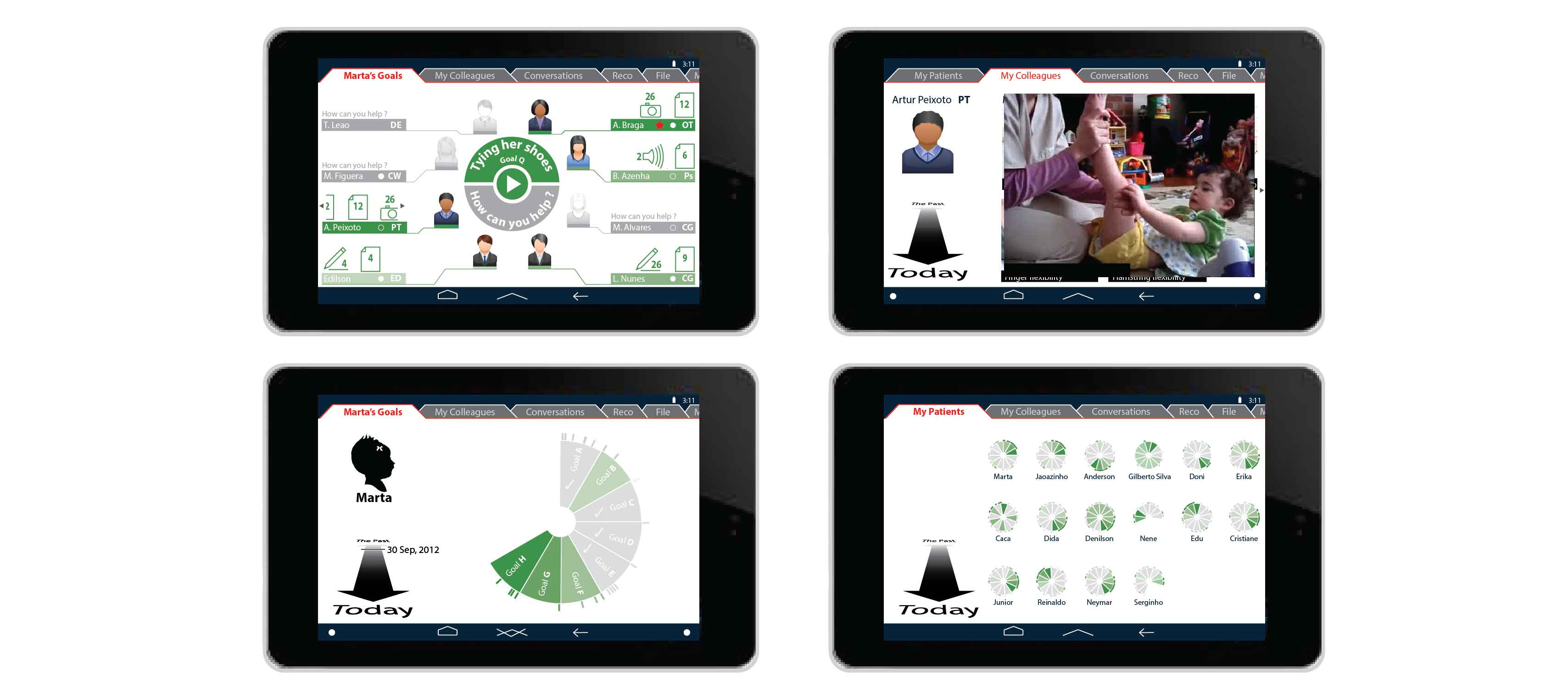
The tablet based tool was designed to foster collaboration around goals tailored to individual hospital residents, to establish benchmarks for measuring progress, and to aggregate data from a network of caregivers regarding that progress.
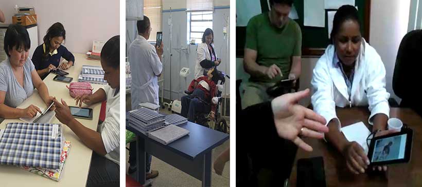
Participatory design workshops
Three days of hands-on workshops with hospital caregivers provided feedback regarding this prototype, as well as two others. It also generated caregiver excitement and buy-in. The following caregiver priorities were highlighted:
- • better understanding of change over time
- • making individualized care decisions informed by real data
- • capturing informal patient data
- • not replacing either the existing oral communications or paper records, so much as augmenting both
Refined design strategy
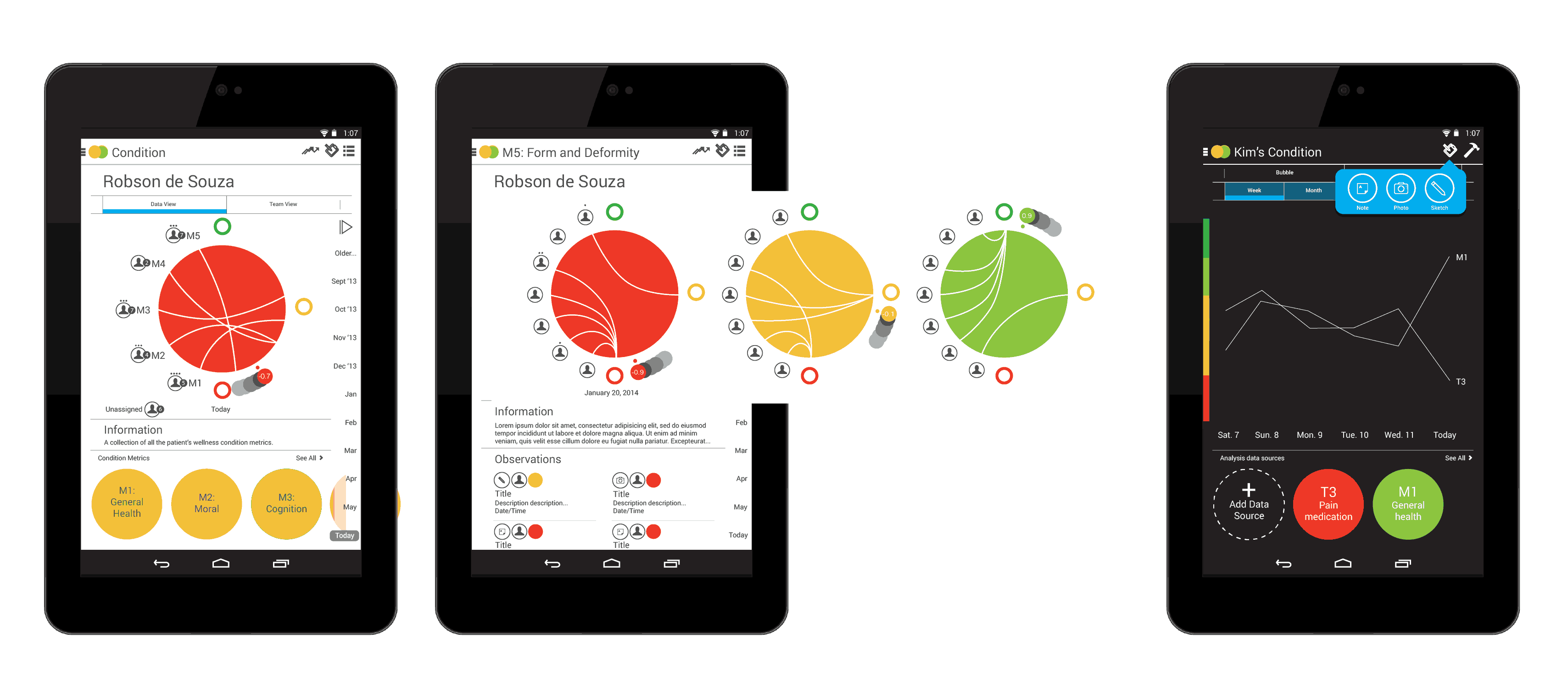
Workshop outcomes led to a number of strategic design decisions that went into the next prototype version. For example, a resident’s well being is described by two complementary categories of information: condition and care. Specialists establish individualized care goals, which are administered by teams of therapists, specialists, nurses and other caregivers. These treatments, in turn, impact a resident’s condition, which inform new care goals and objectives, and so it goes in a circular relationship.
A peer voting strategy uses a straightforward red/yellow/green system, with red connoting decline; yellow stability; and green improvement. The simple system was designed to avoid caregiver input fatigue.
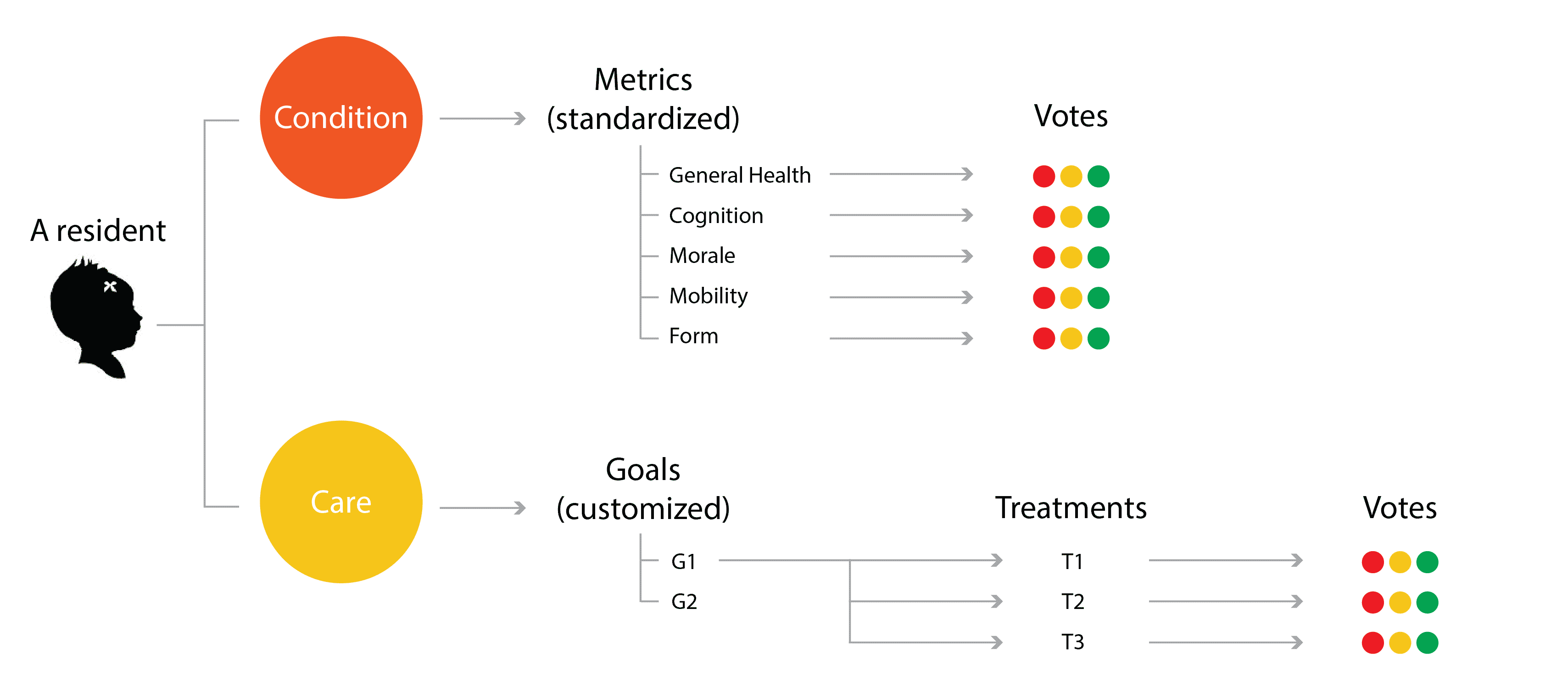
Colour averaging is used to then aggregate and average the votes along the red/yellow/green spectrum.

Navigation and architecture
The original navigation diagram reflected the condition -> metric -> vote and care goal -> treatment -> vote hierarchies of the overall design strategy combined with some additional app functionality, but was incomplete.
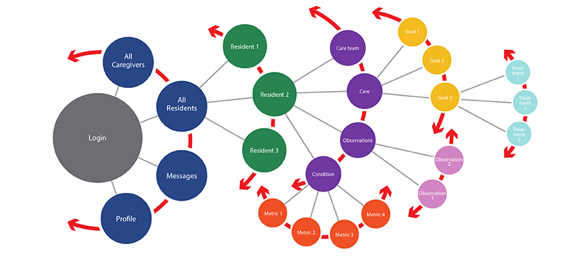
The final user flow diagram looked like this:

Design of visualization and analysis tools
The principal visualization consists of a large coloured circle, for overview. Additional detail regarding individual caregivers, their votes and observations is provided by the icons around the perimeter and the arcs joining them across the circle.
A smaller dot positioned around the perimeter of the large circle reinforces the colour of the large circle through its position on the red/green colour spectrum. It helps to make the visualization accessible to people with colour blindness. Additionally, its tail provides information about context, trend, data distribution and volatility.
User testing
User testing was conducted with low fidelity prototypes. Outcomes were incorporated into subsequent design generations.
Collaboration with back end development
While the UI and UX were being designed, back-end development was also taking place, including: structuring the database, developing the middleware and creating the algorithms necessary for the data analysis.
___
The project has been presented at, and published in, a number of peer-reviewed publications and conferences, most recently IEEEvis-2014.
Deprecated: Function get_magic_quotes_gpc() is deprecated in /home/stevensa/public_html/wp-includes/formatting.php on line 1697
Initially grounded in the real-world problem of increasingly rapid mobile phone obsolescence, my research subsequently adopted hacking, performance and critical design and culminated in two interactive projects: stereoPHONEic and textDIAL. They demonstrate ways to repurpose so-called obsolete rotary dial telephones, combining them with other available technologies, and even human beings at times, to make them function just like smartphones.
stereoPHONEic is a portable music player. The shoulder-mounted handset conveniently positions stereo speakers behind each ear. The dial provides track selection, volume control, pause/resume and stop functions.
textDIAL is a prototype for sending and receiving text messages using the limited affordances of rotary dial phones. To send a message, lift the handset, listen to the instructions, compose your message using the four rotary phone dials and dial SEND when ready. To receive a message when the phone rings, lift the handset and listen to your incoming message read from an overseas call centre.
__
More than a piece of hardware you can hold in your hand, the project viewed the mobile phone as a network of infrastructure and service providers, as seen in this early concept sketch.

__
Additionally, the mobile phone is a set of behaviours. I field tested stereoPHONEic and textDIAL by hitting the streets with them, performing everyday smartphone activities in everyday places. The results can be seen in the video below.

__
Made with rotary dial telephones, Arduino Nano, MP3 shield, Processing, leather, laser cut acrylic, stainless steel service cart
The challenge for this competition, held by the Toronto Region Conservation Authority and the Design Exchange in Toronto, was to create a prototype for sustainable, affordable and viable housing specifically targeted at the mass-production housing market. The design had to appeal to home-builders and –buyers alike.
The solution, Building Blocks Homes, is a modular design. Modular blocks combine to form different housing typologies – detached, semi-detached, row- and stacked townhouses – resulting in neighbourhood diversity both of built form and price point. Modules combine to create two- to seven-bedroom homes.
The 24” framing grid adapts to stick construction, SIPs panels or a factory build, making the design accessible to all builders. Adaptable spaces increase home ownership longevity: a granny suite, adaptable garage and adaptable handicap-accessible bedroom/study add to the modular options. Renovation-ready attics and basements increase the pool of potential buyers.
The two completed houses have exceeded the environmental requirements of the competition and been certified LEED platinum, the highest-possible rating in the LEED green-building rating system.
Made with bleeding edge design, multi-stakeholder coordination and hands-on construction
]]>Deprecated: Function get_magic_quotes_gpc() is deprecated in /home/stevensa/public_html/wp-includes/formatting.php on line 1697
A tabletop data visualization project that uses interactive data artefacts to both represent data and function as a tangible user interface. It creates a kind of war room table for users to work with their hands and collaborate and creates a way to explore complex data sets that is cognitively and socially very different from sitting behind a computer screen.
A pilot study was conducted with industry partner staff using low fidelity blocks made from lego to test two different block interfaces.
Made with real Toronto radio audience data, lego, Arduino, Processing, Adobe Illustrator
]]>What happens when you track your movements for a month and then map the GPS data? The result is a personal map of my comings and goings, my hotspots (home, university, hockey rink, grocery store) and my main streets, as well as a surprisingly limited range of movement.
Made with Processing, PeasyCam Processing library, GPS data
]]>A full-service professional architecture practice that specialized in retail, institutional and residential design as well as heritage renovations. It boasted a notable client list including the University of Toronto, the Schulich School of Business, the Toronto and Region Conservation Authority, Gucci and Club Monaco.
I was the owner and principal architect at FORT and responsible for all aspects of project procurement, design and project management – both in the office and on the construction site.
]]>An Information Visualization that uses the metaphors of human life expectancy and population growth to drive home data regarding the relatively short history of man made satellites in earth orbit.
Growth Rate of Satellites shows the explosive population growth of satellites starting in the 1950′s and ’60s followed by a marked drop-off at the end of the Cold War in the late ‘80s.
Life Span of Satellites compares the life spans of satellites and humans to demonstrate just how many satellites die in their infancy.
Made with data from Union of Concerned Scientists, NASA, Center for Space Standards and Innovation, the UN, Center for Disease Control and Prevention and Wikipedia, and Adobe Illustrator and Photoshop.
]]>By mapping real CBC Radio 1 audience data to sound volume and antenna angle, this prototype represented one module of a larger live data installation.
Multiplied by the number of stations in the GTA, the resulting soundscape
would represent relative audience numbers as well as daily and hourly content patterns. For example, it could reveal convergences of news at the top of the hour or traffic reports during morning drive time and divergences of content at other times of day.
Made with Arduino Nano, Processing, radio antenna, metal lunch box
]]>If you built forts when you were young, then you remember how cool it was to have your own fort, your size, and just the way you wanted it. Chances are, you built forts from whatever you had at hand (wood, boxes, sheets, upturned chairs) and you understood forts long before you knew, or could spell, “architecture”.
Far from simple and naive structures constructed haphazardly by children, well designed treehouses distill architectural design down to its essentials. They are customized for each user and each tree; they are designed for tree health and human safety; and they delight kids of all ages.
Made with the passion that inspired the naming of my architectural practice
]]>